
WITNESS HEMLOCK
A data-driven animation telling the history of the Hudson River Valley through the eyes of an eastern hemlock tree
Credits
Concept by
Anna Van Lenten + Genevieve Hoffman
Data visualization Design + Animation by
Genevieve Hoffman
Written and Edited by
Anna Van Lenten + Nancy Macagno
Photo Research by
Anna Van Lenten
Hemlock cored by
Paul Krusic, University of Cambridge
Science advisors
Lamont-Doherty Earth Observatory
Brendan M. Buckley, Ed Cook, Nicole Davi, Francesco Fiondella, Caroline Leland, Dorothy Peteet
Harvard Forest
Brian Hall, David Alan Orwig, Neil Pederson
United States Forest Service
Randall Morin
Witness Hemlock is a data-driven animation that tells the story of the Hudson River Valley through an environmental lens. Using data from an eastern hemlock tree native to the area, the animation shows the tree growing over the years, pausing for annotated images and descriptions of important historical events and people to the Hudson River Valley. Starting at the birth of the tree in 1579, the piece runs 5 minutes and goes through the Native American presence at the tree's beginnings, through industrialization and finally forest protection amid a growing threat of wooly ageldid beetle to the region. The piece was commissioned by Lightfield Arts for its 2019 exhibit in Hudson, New York.
Curator and Lightfield Arts founder Anna Van Lenten approached me with an interesting proposition and a tight deadline. Would I be able to help her create a data-driven animation to accompany a photography exhibit documenting the ecology, history and landscape of the Hudson River Valley, but opening in about a month's time?
She had an intriguing dataset of the yearly growth of an eastern hemlock tree, taken from a core sample from one in the Mohonk Preserve near Poughkipsee, NY, which was 421 years old at the time of the sample was taken in 2000. The concept would allow for the Hudson River Valley's history to be told alongside a visualization depicting the tree's growth over time.
Context
The Hudson River Valley spans across 9 counties north of New York City along the Hudson River: The area once once home to the Lenape people, an indigneous tribe whose name for the Hudson River was Mahicantuck, meaning the river that runs both ways.
Anna wanted to tell the various stories of how the environment and its portrayal has been impacted by various people, events and industries in the Hudson River Valley over the past four hundred years, like the Lenape, early settlers, environmentalists, industrial tycoons, painters and politicians.
A literal translation of an old Eastern Hemlock tree native to the region would ground the historical events as they unfolded over the tree’s life spanning across the centuries. My task was to understand this data, and make it embody a visual connection to a natural organism.
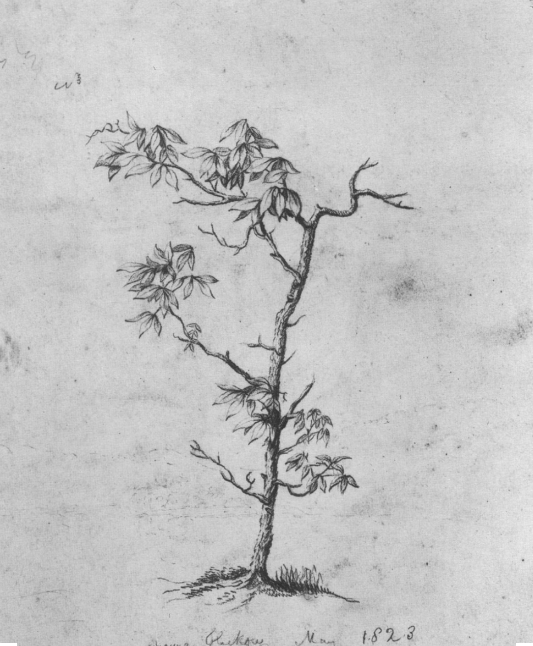
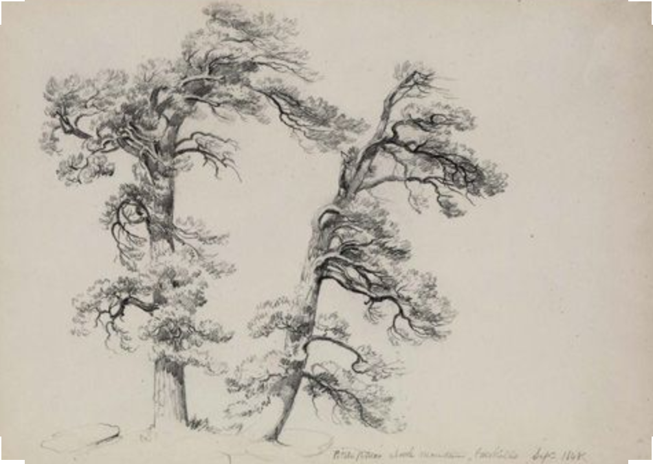
A moodboard for the data driven animation piece. Images selected by Anna Van Lenten

Technical Approach
combining custom software and traditional animation tools
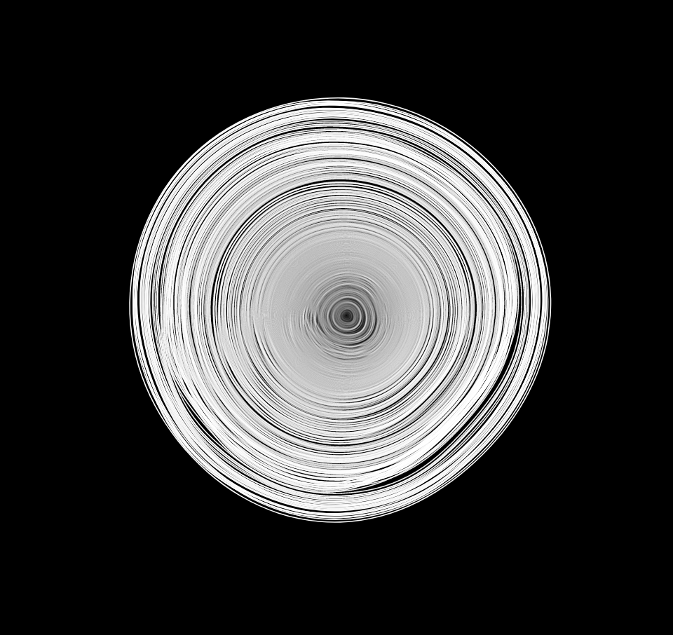
After examining the tree ring dataset, I decided to focus on how I wanted to depict the yearly growth values over time. For an animation, it seemed obvious to show the tree literally growing over time, where the year mapped to one frame of the animation, and the size of the radius or diameter would increase with each year's amount of growth.
I turned to Processing, an open-source software language tailored to fast visual prototyping in code. From a technical standpoint, I knew that I'd be animating the various components of the piece in After Effects, so I ultimately would want to save a sequence of images out at high resolution, which would form the primary visual component of the visualization. I also realized I wanted to use vector graphics to have flexibility in terms of size and scale. Processing allowed me to save a sequence of pdf files, which I brought into After Effects to combine with the other components of the visualization.
I turned to Processing, an open-source software language tailored to fast visual prototyping in code. From a technical standpoint, I knew that I'd be animating the various components of the piece in After Effects, so I ultimately would want to save a sequence of images out at high resolution, which would form the primary visual component of the visualization. I also realized I wanted to use vector graphics to have flexibility in terms of size and scale. Processing allowed me to save a sequence of pdf files, which I brought into After Effects to combine with the other components of the visualization.
Designing the look and feel of the visualization
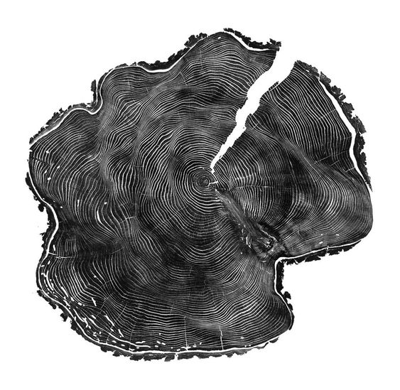
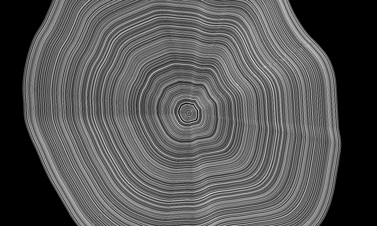
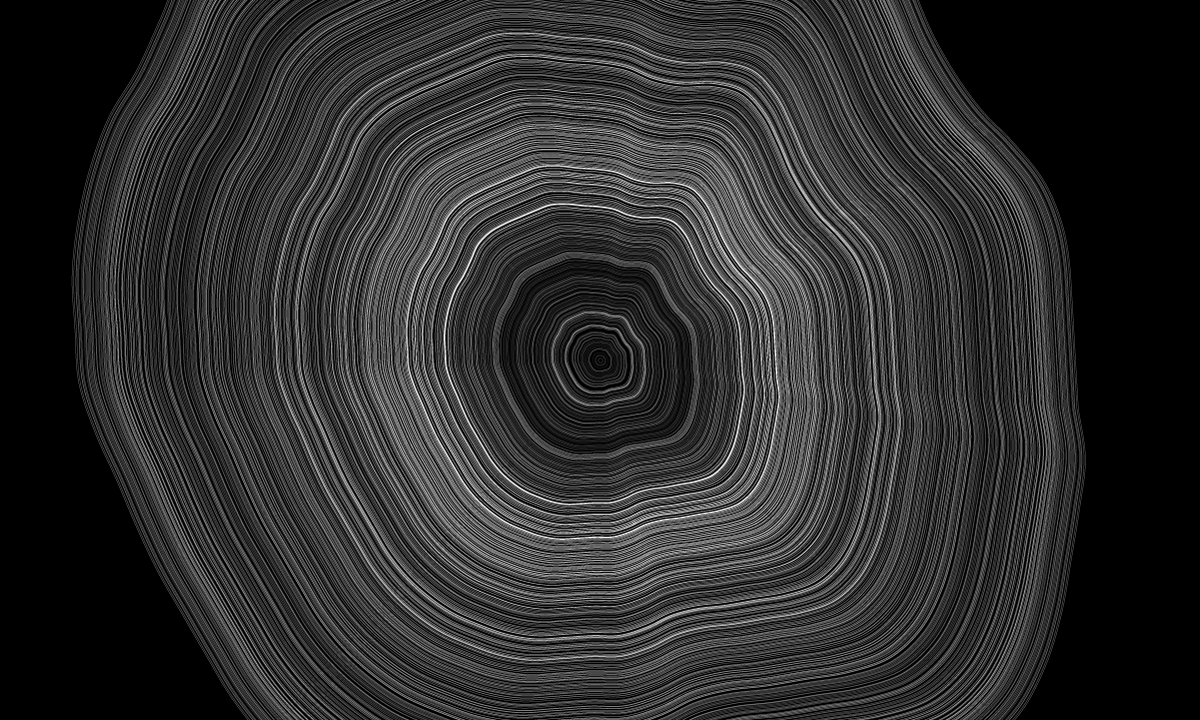
I decided I wanted to go for a very natural interpretation of the tree ring data, with the aim of coding something that looked as close to the rings on a tree stump as possible. I took inspiration from a mood board Anna shared with me, as well as generative visuals by people like Etienne Jacob. Luckily, Dan Shiffman already had a Coding Train video about translating these perlin noise loop visuals into Processing.
Sources of code inspiration in developing my approach to visualizing the tree ring data growth. I can’t recommend Dan Shiffman’s Coding Train series enough, which brought me to the amazing work of Etienne Jacob and others using noise for generative graphics


I started in p5, a JavaScript library inspired by Processing, and created a simple data visualization of the tree ring growth, where the yearly growth was mapped and added to the radius of a perlin noise value creating the irregular shape of the ring.

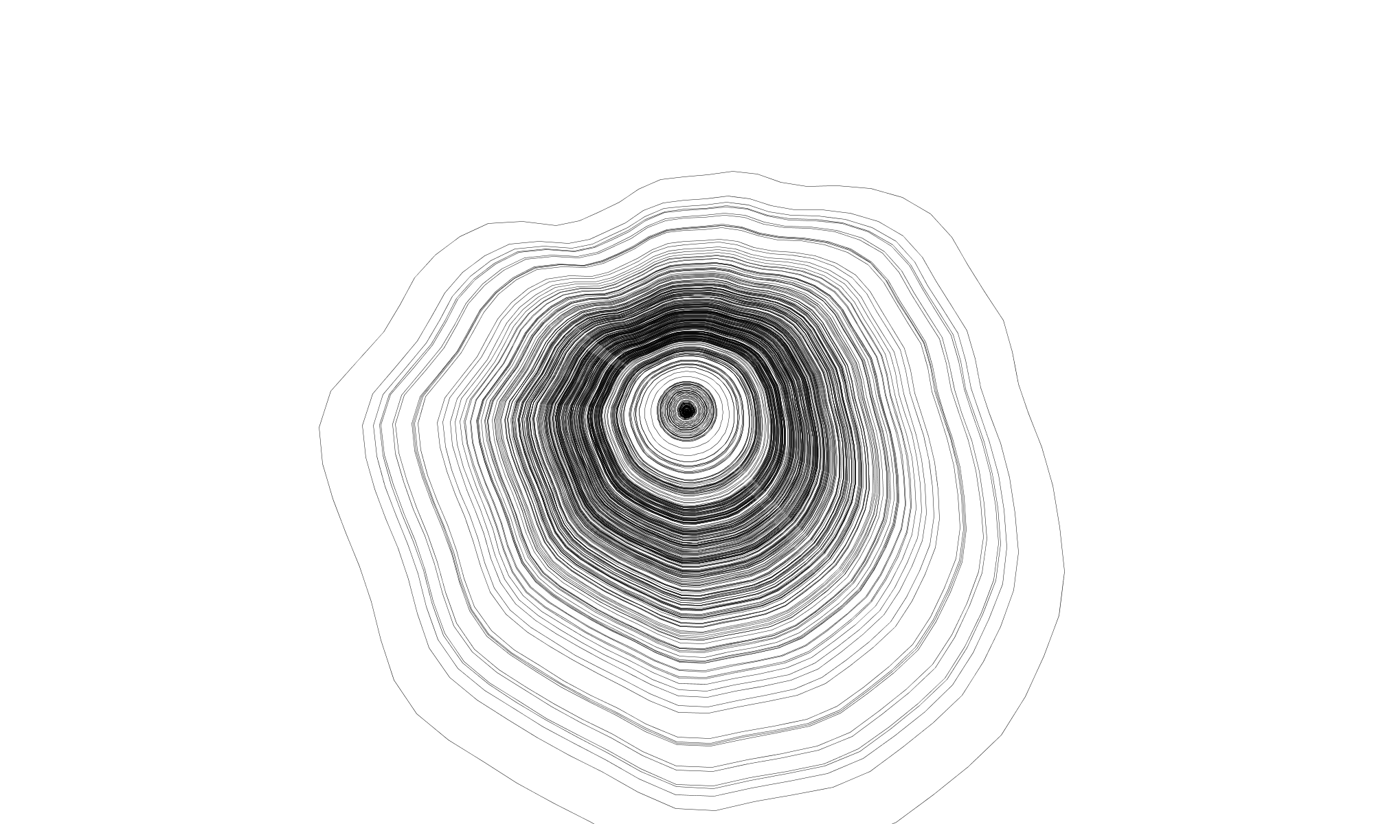


Early visual prototypes mapping the tree ring growth to perlin noise loops of increasing radius
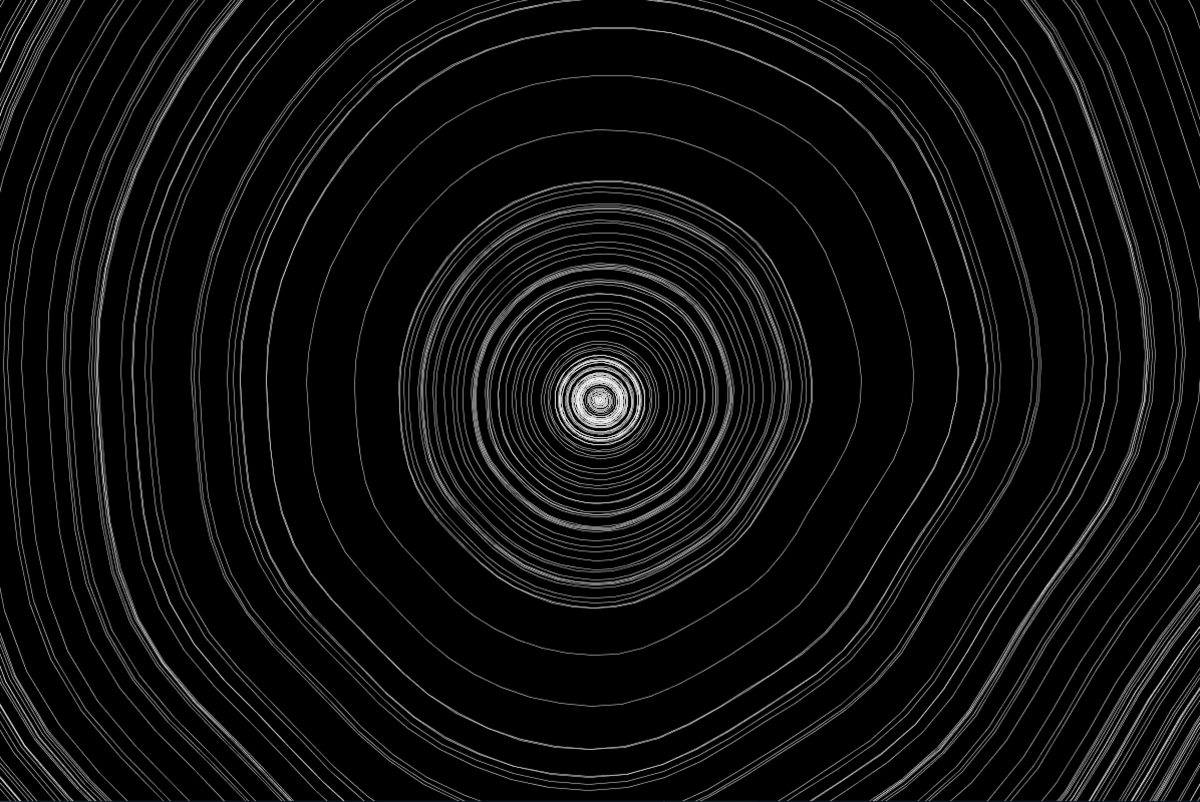
I knew that perlin noise is seeded by various values that can be specified at the start of the script, and that these seeds influence the characteristics of the noise pattern. I saved over 500 visuals of various seed values to manually select for a seed value that had the look of a naturally occuring tree ring that I was going for.
The output of a noise seed test I ran to find the most pleasing tree trunk rings.
I chose seed 465, and off I went!
I decided that the stroke color of the ring should also portray the data, in addition to the ring spacing (which was optimized more for appearance and animation than accuracy). The dimmer the ring, the smaller that year's growth. The beginning of the hemlock's life was slow going, since it was a small tree competing for sun and water among many. Stronger growth predominates in the middle and latter years of the tree's lifespan.
I also wanted to keep the piece monochrome, since the dataset was relatively simple and I imagined a grayscale visualization complementing the colored photos and illustrations more consistently.
Running out of space and changing how the yearly growth maps to brightness values of the grayscale palette


I realized as I was coding the animation that I was quickly running out of space drawing 421 rows of data. The radius of the rings would only accommodate about 200 years worth of data when drawing in 2D space, and I wanted the visualization to be contained within the boundaries of the program. I knew I needed the ability to zoom out on the graphic, or ... another dimension.
3D Camera Tricks and Keyframes
After I arrived at the look I wanted for the tree rings, I ported the code into Processing's P3D mode, which allows for 3D graphics and camera movement. I already had 1 frame of my Processing software corresponding to 1 year in the dataset, and I knew that my animation would be made at 30 frames per second. I also knew that I wanted the tree animation to pause at various key dates, when historical facts and photos would appear around the main visual graphic, annotating the visualization with historical context for that year's growth.
I needed a way to translate the keyframe timecode from my After Effects animation, to frames that my Processing code could interpret, and trigger various camera movements, as well as pausing the growth of the tree ring visual. I stumbled upon a helpful Google Sheets script, which calculates the frame / timecode conversion for various video formats.
I modified the script and made myself a handy spreadsheet planning out the "shots" and frame numbers I needed for each year of annotated historical facts. This made keyframing much easier, where I could copy and paste different timings and coordinate the view of the visualization to animate alongside.
Screenshot of my trusty google spreadsheet helping update timecode values based on updates to keyframe numbers and durations

After a few drafts and rounds of editing, we arrived at timing that felt right for the amount of time it might take a viewer to read the text and take in the images and historical context. Each date that we pause at lasts for 18 seconds. I also wanted there to be additional motion in the animation during these paused periods so I slowly rotate the visual, as well as zoom in and out with the camera to portray the graphic from multiple angles.
The software I wrote checked for specific frame numbers to activate various behaviors in the animation, such as adding more rings, and changing between specified camera angles. It saved out each frame as a pdf, which allowed me to import that as an image sequence in tho After Effects.
Designing for content readibility
I knew I wanted a way to frame the graphic with the written and visual material around it. Once I realized the graphic would exist in 3D space, I knew that the other information would work much better as 2D overlay. The date would remain, speeding up and pausing to indicate where we were in time. This also helped people visually understand that the accumulation of rings corresponded to the date advancing.
I presented Anna with a few visual mockups for the text and images. We went with the option that would accommodate more text. This also had an additional timeline element, where the circles filling in indicated how many historical events would be played through.
I presented Anna with a few visual mockups for the text and images. We went with the option that would accommodate more text. This also had an additional timeline element, where the circles filling in indicated how many historical events would be played through.
Mockups with various options for combining the date, images, and descriptive overlay


The Final Product
After a few back and forths and draft edits, we finalized the timing of all the overlay components and I rendered out the sequence. There’s no audio, and I definitely might revisit this all in After Effects in some future where I know that software much better than I do at the moment, but I’m happy with what came together on a tight deadline.
The full length animation commissioned by Lightfield Arts, 2019
Exhibit
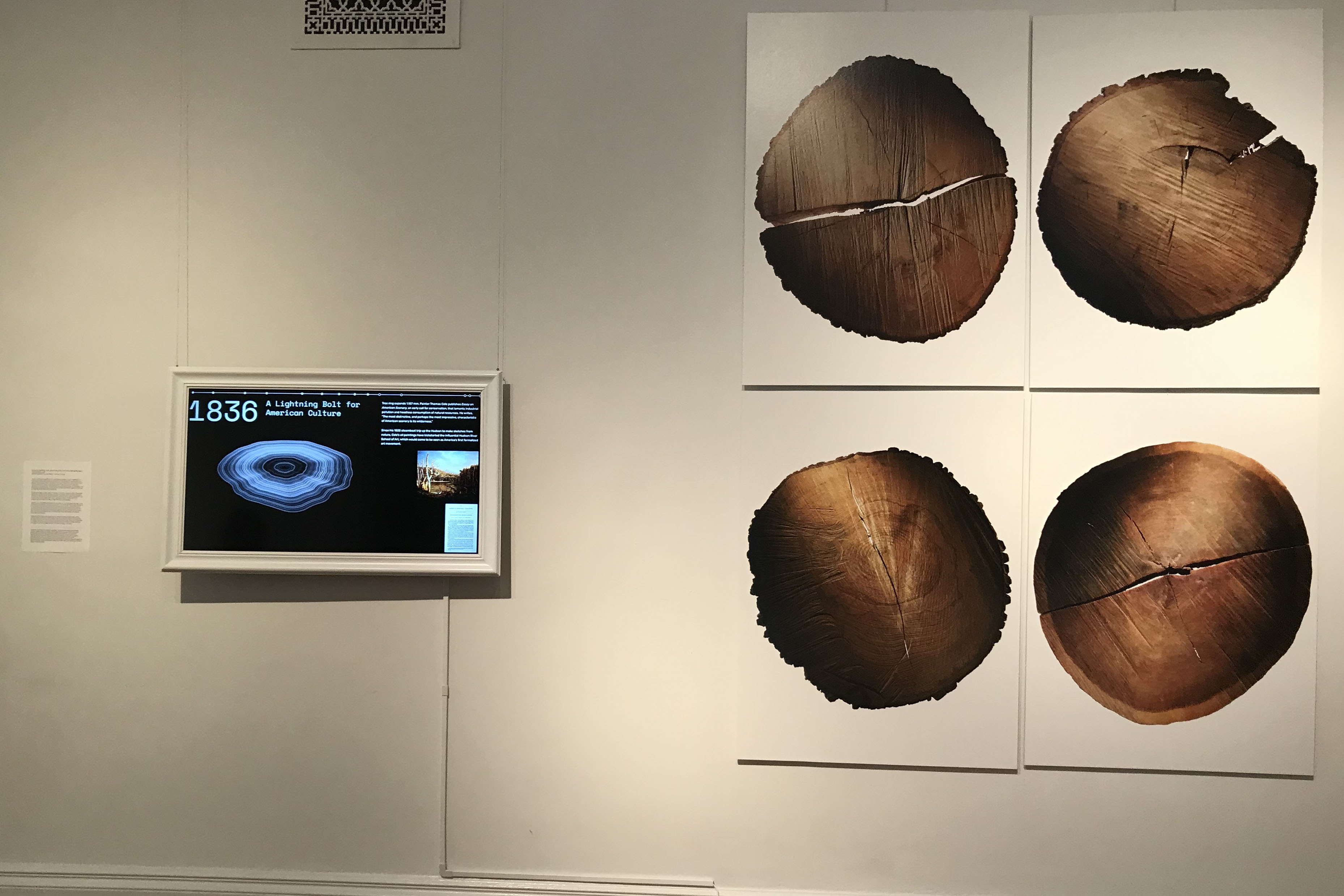
The animation was designed to be viewed alongside the other works in the Hudson exhibit put on by Lightfield Arts, documenting many photographers and painters and their appreciation for the natural flora of the Hudson River Valley. It provides context to the other photography works in the exhibition, and also references the Hudson Valley School painter Arthur Durand, who is represented by two prints in the show.


,,