

WE WERE STRANGERS ONCE TOO
Bringing public data to the busiest place on earth in celebration of New York City's immigrant communities.
Credits
Concept + Design
Noa Younse, Genevieve Hoffman
Creative Direction
Jer Thorp
Fabrication + Installation
TwoSeven
Commissioned by
Times Square Alliance
Curation by
Urban Design Forum
Role
conceptual design, data research, prototyping
Concept + Design
Noa Younse, Genevieve Hoffman
Creative Direction
Jer Thorp
Fabrication + Installation
TwoSeven
Commissioned by
Times Square Alliance
Curation by
Urban Design Forum
Role
conceptual design, data research, prototyping
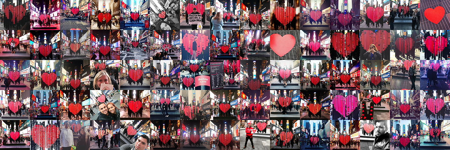
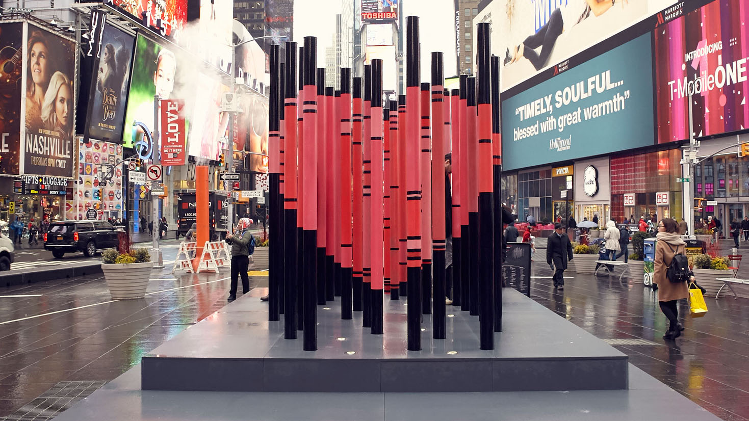
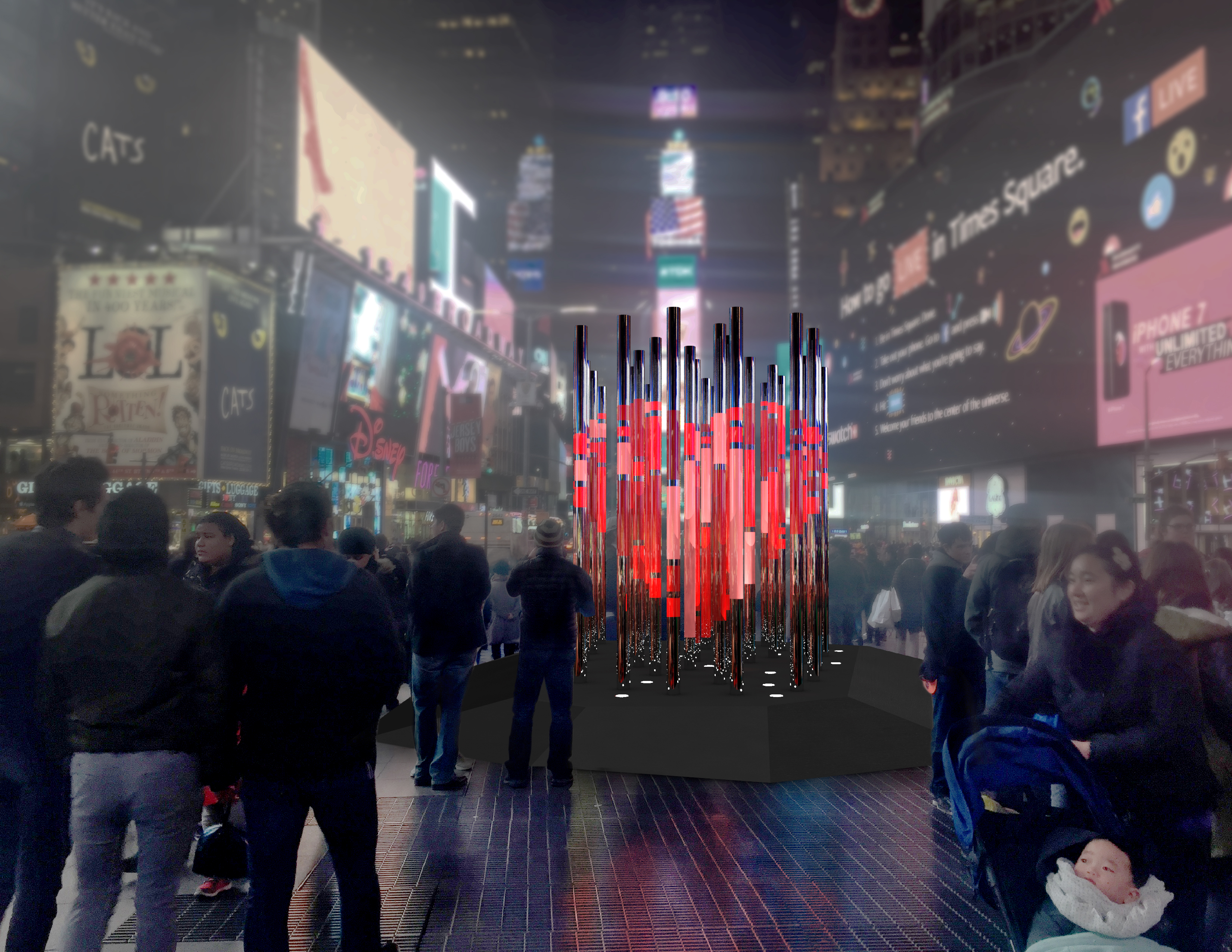
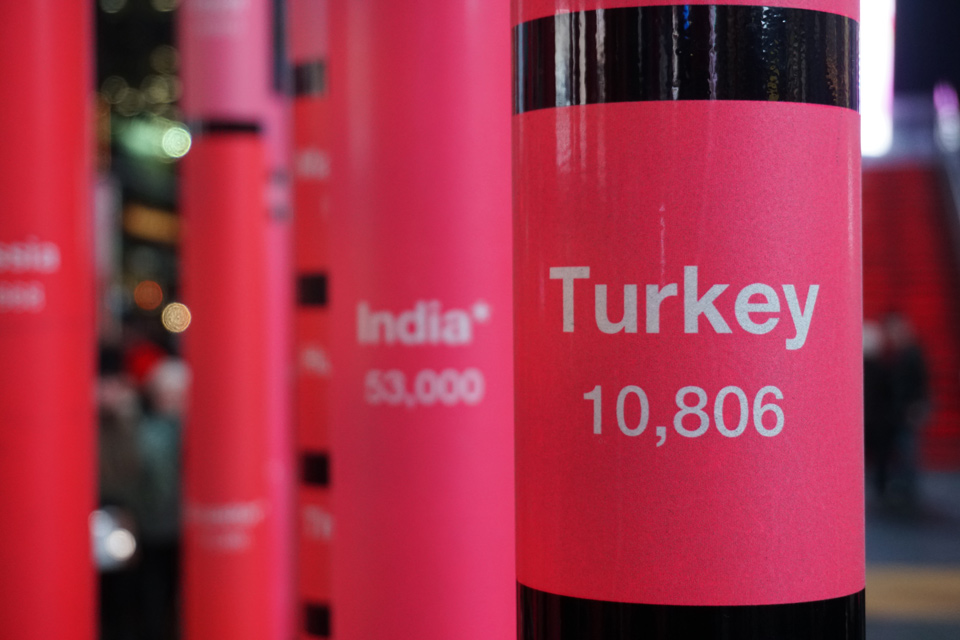
We Were Strangers Once Too is a public data sculpture which highlights the role that immigrants have played in the founding, development, and continued vibrancy of New York City. Made of 33 metal poles each inscribed with the immigrant population in NYC from various countries around the world, a viewer’s shift in perspective resolves the sculpture to an iconic heart when viewed from the statue of Father Duffy in the center of Times Square.
We Were Strangers Once Too was open to the public in Times Square, New York City from February 7 - March 6, 2017. Read the remarks Jer Thorp gave at the unveiling, who as a Canadian immigrant himself personalized our studio’s motivations for creating the piece.
We Were Strangers Once Too was open to the public in Times Square, New York City from February 7 - March 6, 2017. Read the remarks Jer Thorp gave at the unveiling, who as a Canadian immigrant himself personalized our studio’s motivations for creating the piece.
Video documentation of the piece created by the Times Square Alliance
Context
The Office for Creative Research was invited by the Urban Design Forum and to submit a proposal for the Times Square Alliance's longest running public art program, its annual Valentine's Day sculpture commission. Noa Younse and I took the lead on developing a concept and design that would highlight one of the OCR's missions as a design studio - to increase data literacy by bringing art and data to public spaces.
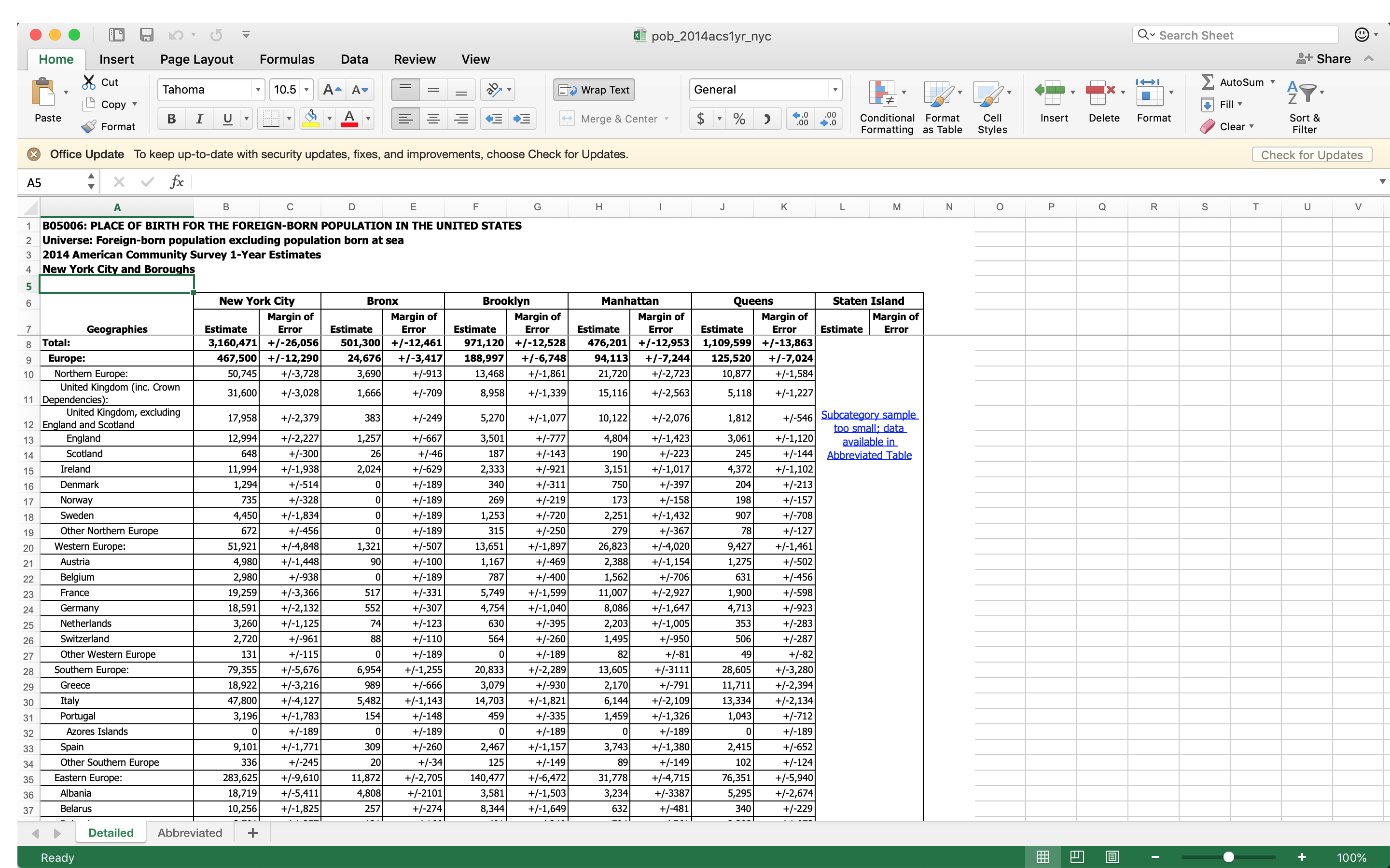
Data used for this project is from the US Census’s American Community Survey, from 2014
We knew we wanted to create a sculpture from local open data, and spent some time combing through NYC's open data portal before arriving at a compelling dataset. We were also inspired by the recent presidential election, in which Donald Trump was elected after a long and divisive campaign filled with xenophobic and racist rhetoric. So when we came upon data collected by the US Census's American Community Survey of the foreign-born population of New York, or the number of immigrants and their countries of origin, we knew we'd found our data.
The sculpture would be unveiled just two weeks after Trump was due to take office, and we hoped that it might be an opportunity to take a stand against the xenophobia he espoused, and use the theme of Valentine's Day to create a sort of love letter to New York City's immigrant community.
By examining the data we learned that an estimated 3.2 million of the city’s 8.5 million residents were born outside of the United States, essentially 1 in 3 New Yorkers. Puerto Rico is considered a US territory, so NYC residents born in PR are not counted in the foreign-born dataset.
Using one-point perspective to unite data, form and metaphor
Because the Times Square Heart traditionally involves some form of a heart we had to figure out a way to use this dataset in a way that would allow us to stay true to the numbers, retain the visual form of a heart, create an engaging experience for the public, and, above all, be durable, fairly inexpensive, and easily built (we would have about a month and a half for the design and fabrication from start to finish). After some deliberation, we arrived at the idea of using one-point perspective to form a heart with the data driving the heart's shading. (redo in own words more)
Early sketch of data acting as a 3D bar chart, but aligning to form the image of a heart from a particular vantage point.
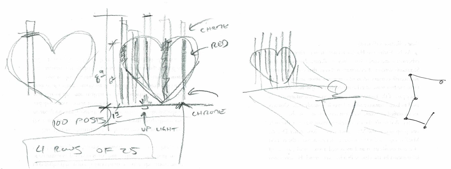
Early sketch outlining the one-point perspective technique and how the poles would align from top and side views
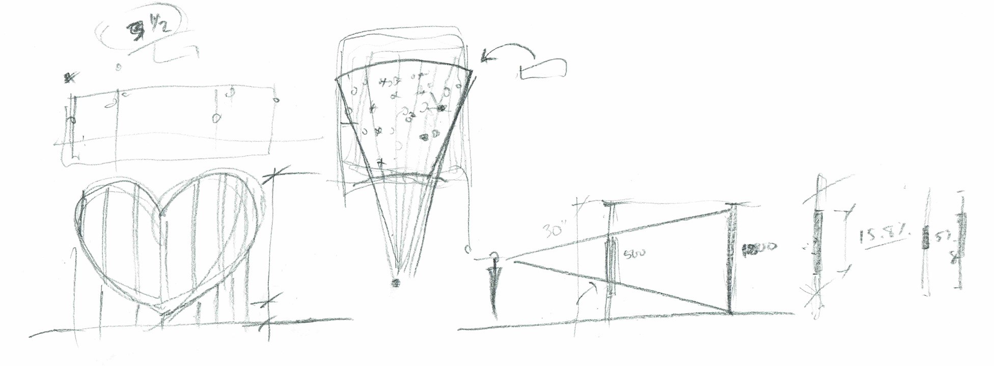
A paper prototype demonstrating how the black curved shapes align to form a continuing pattern across the poles in three dimensions
Computer-aided design
After arriving at our concept, submitting our proposal and being selected to complete our proposed vision, we started the design process in earnest.
The first challenge was accounting for height inconsistencies across Father Duffy Square, the site selected for the installation. We also had to calculate the ideal vantage point for viewing the heart (5’2”), and at what height the perspective was intended to come into view. We took our own survey of the site (pro tip, you basically need to wait until past 2am to be able to take measurements in one of the busiest places on earth), and input that into Rhino to design a platform that could make the poles level to one another. Next, we extruded the heart-shaped volume back in space from the one-point perspective vantage point, and then generated potential locations for poles and their colored portions that intersected with the volumetric heart.
The first challenge was accounting for height inconsistencies across Father Duffy Square, the site selected for the installation. We also had to calculate the ideal vantage point for viewing the heart (5’2”), and at what height the perspective was intended to come into view. We took our own survey of the site (pro tip, you basically need to wait until past 2am to be able to take measurements in one of the busiest places on earth), and input that into Rhino to design a platform that could make the poles level to one another. Next, we extruded the heart-shaped volume back in space from the one-point perspective vantage point, and then generated potential locations for poles and their colored portions that intersected with the volumetric heart.
 Early rendering of the concept
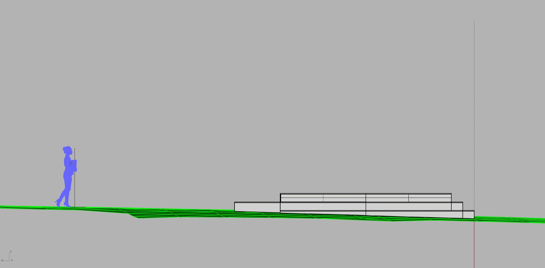
The eye level was chosen to be at around 5'-2" above the viewing heart. The platform had to be designed to adapt to the sloping site.
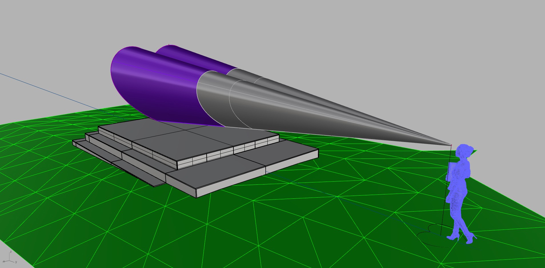
The volune of a heart was extruded from the one-point perspective vantage point to intersect with the area the poles would be located.
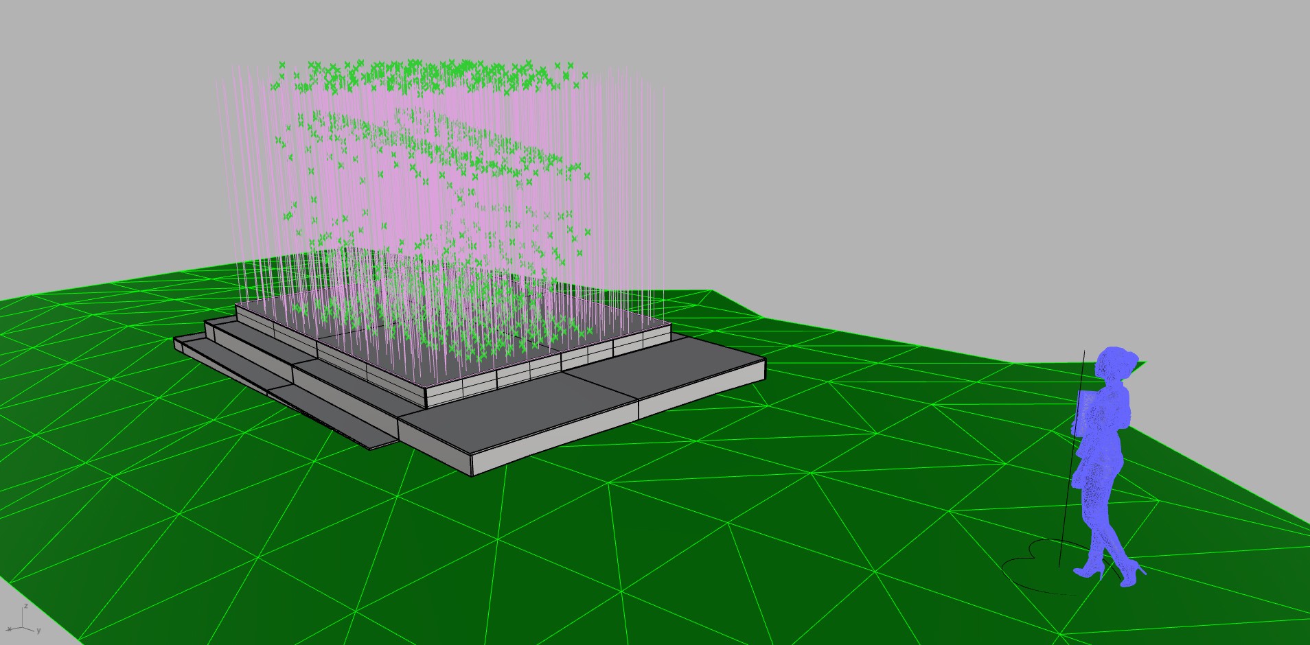
The intersection points [in green] describe the top and bottom of the potential pole, as well as where the heart shape should be.
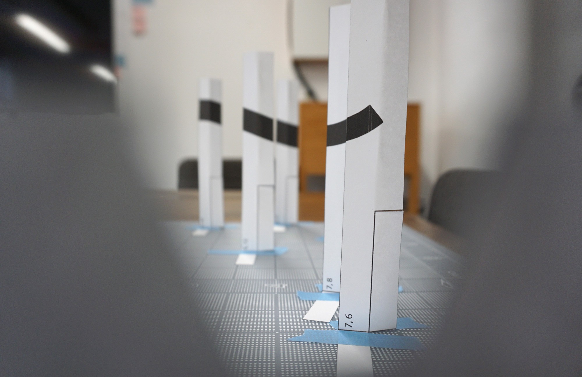
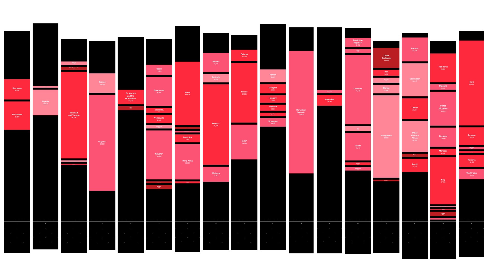
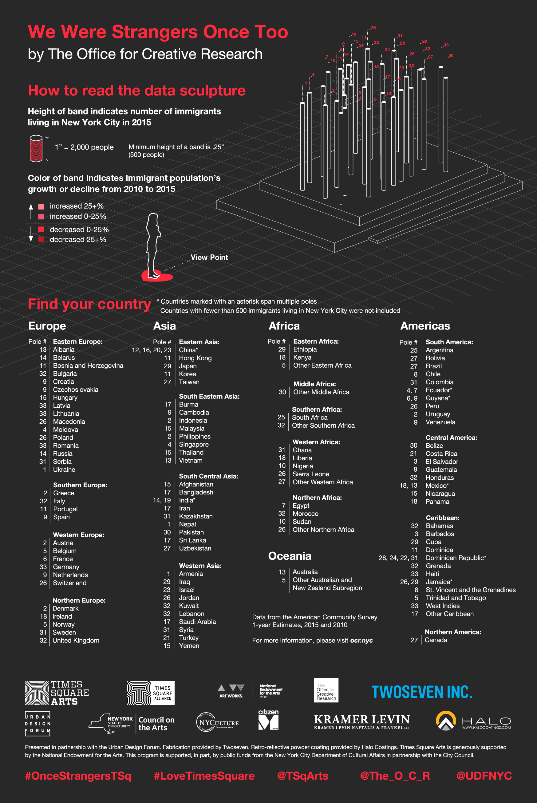
One thing we wanted to ensure (in order to help with easier reading of the piece), was having an inch represent a consistent number of people. This meant sticking with a linear scale. However, some countries like China and the Dominican Republic had more than 300,000 people born there, while others, like Eritrea, had a few hundred. We made the call to focus on countries where more than 500 people were born (apologies to Eritrea and others), and we decided to use a linear scale where 1 inch corresponded to 2000 people. This meant that for the more popular immigrant community origins (like the DR), their populations would span multiple poles. We decided this was better than using an exponential scale, which would allow us to put one country per pole, but would be much harder to interpret and compare the relative sizes of populations.
Detail view of pole where 1 inch = 2000 people
A girl poses with poles reflecting the population of immigrants from China, Hong Kong and Taiwan

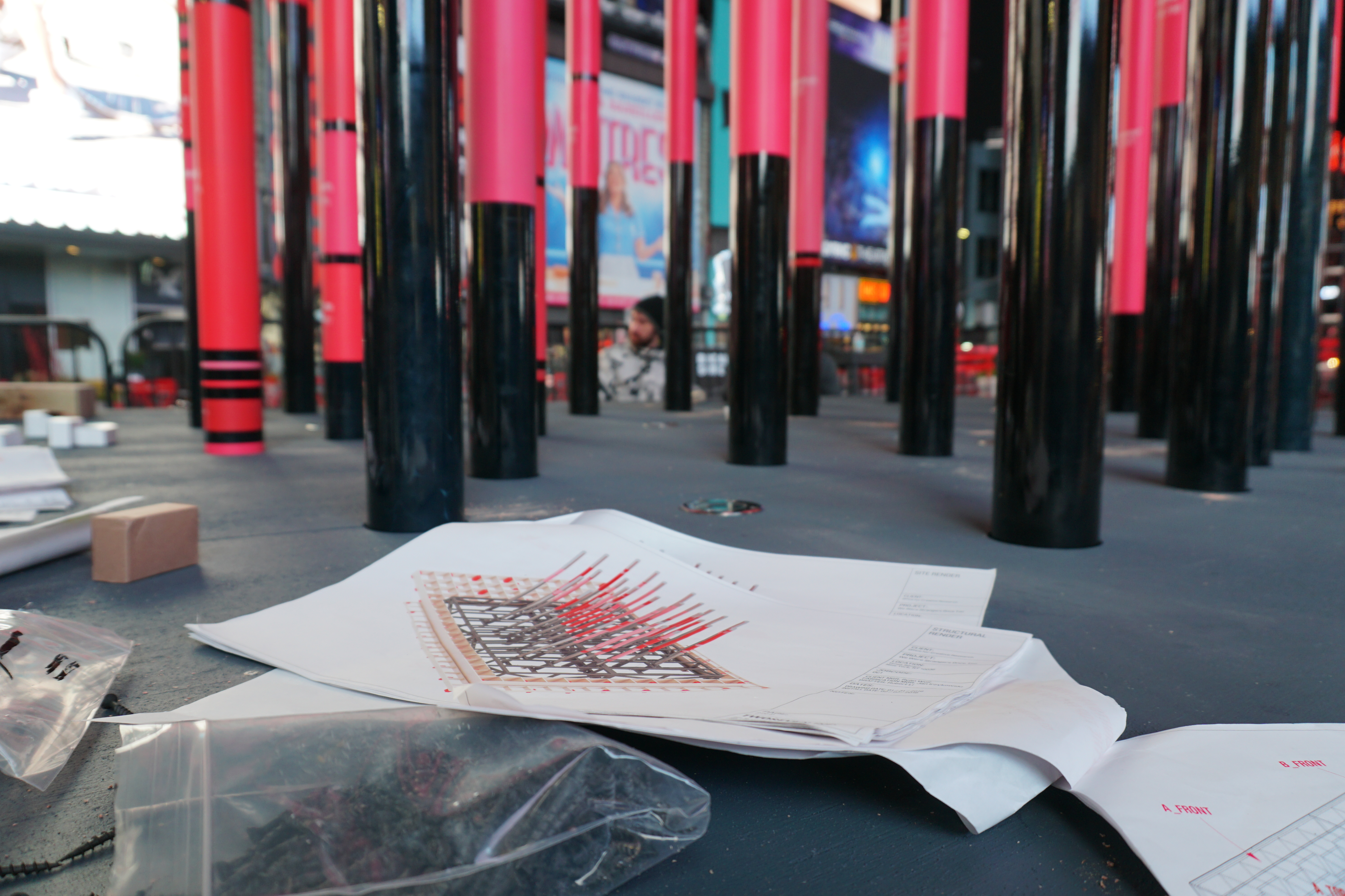
We used a brute-force algorithm (essentially coding multiple iterations of a layout that would achieve a heart from one-point perspective) to place the data on the columns so that the different bands formed the most pleasing heart. Constraints were that the poles fit within the extruded heart shape, so that they all aligned to make a heart from the vantage point. In addition, certain countries where the bars spanned multiple poles needed to be located near one another.
Exploring the layout of the most pleasing heart shape and coloring. Programmed by Noa Younse.
Designing for durability
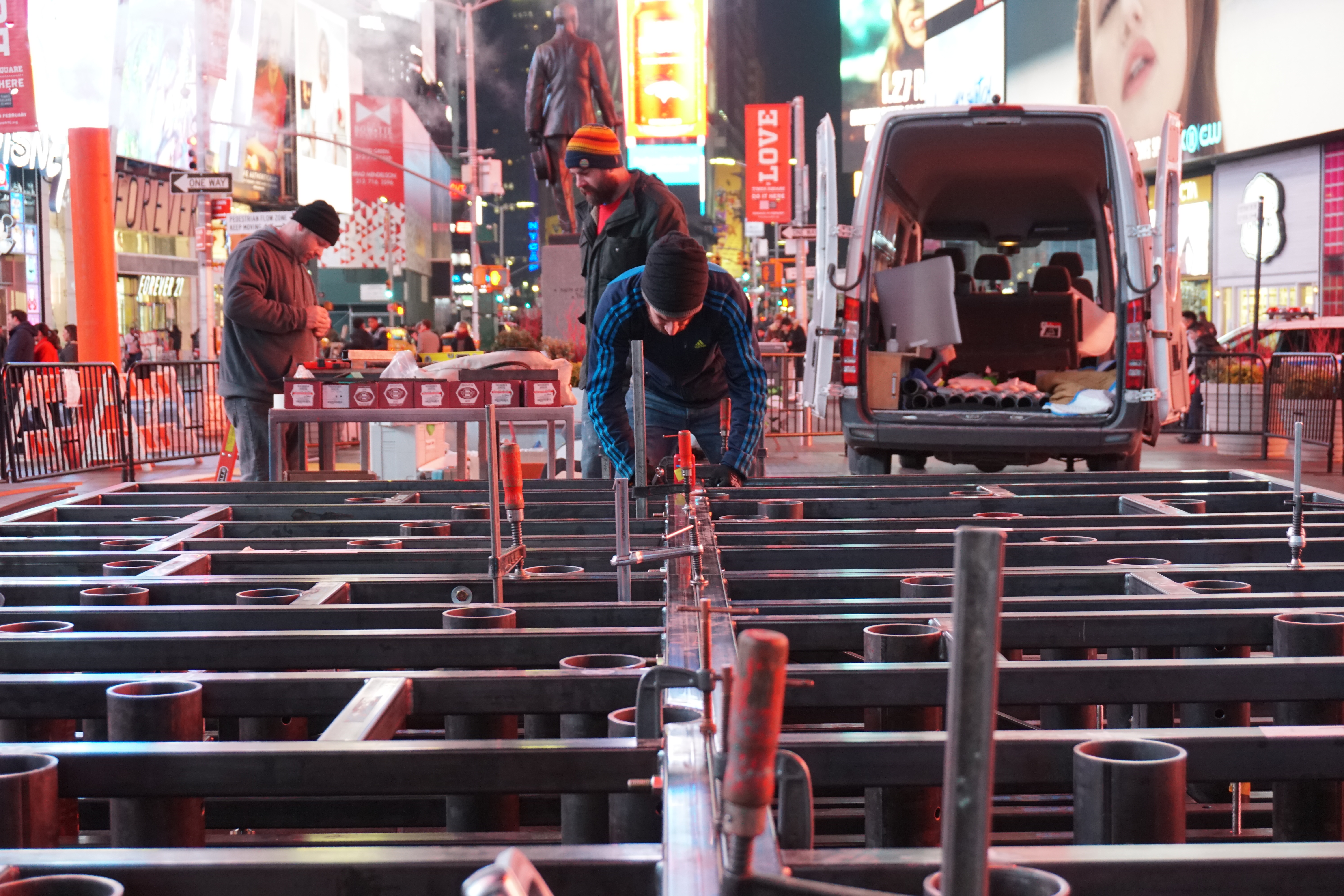
One of the points that the Times Square Alliance emphasized repeatedly was the need for a highly robust design. It would be installed in the middle of Times Square, which receives an estimated 300,000 visitors each day. The sculpture would be outdoors during the middle of winter, and would need to withstand snow, rain and freezing temperatures. Although our studio specialized in creating custom interactive and screen-based work, we decided on a low-tech solution, given the additional constraints of timeline and budget in addition to the outdoor elements. That said, despite arriving at a proposal consisting of wood, steel and some uplighting, we leveraged a variety of technological tools in our design and fabrication process.
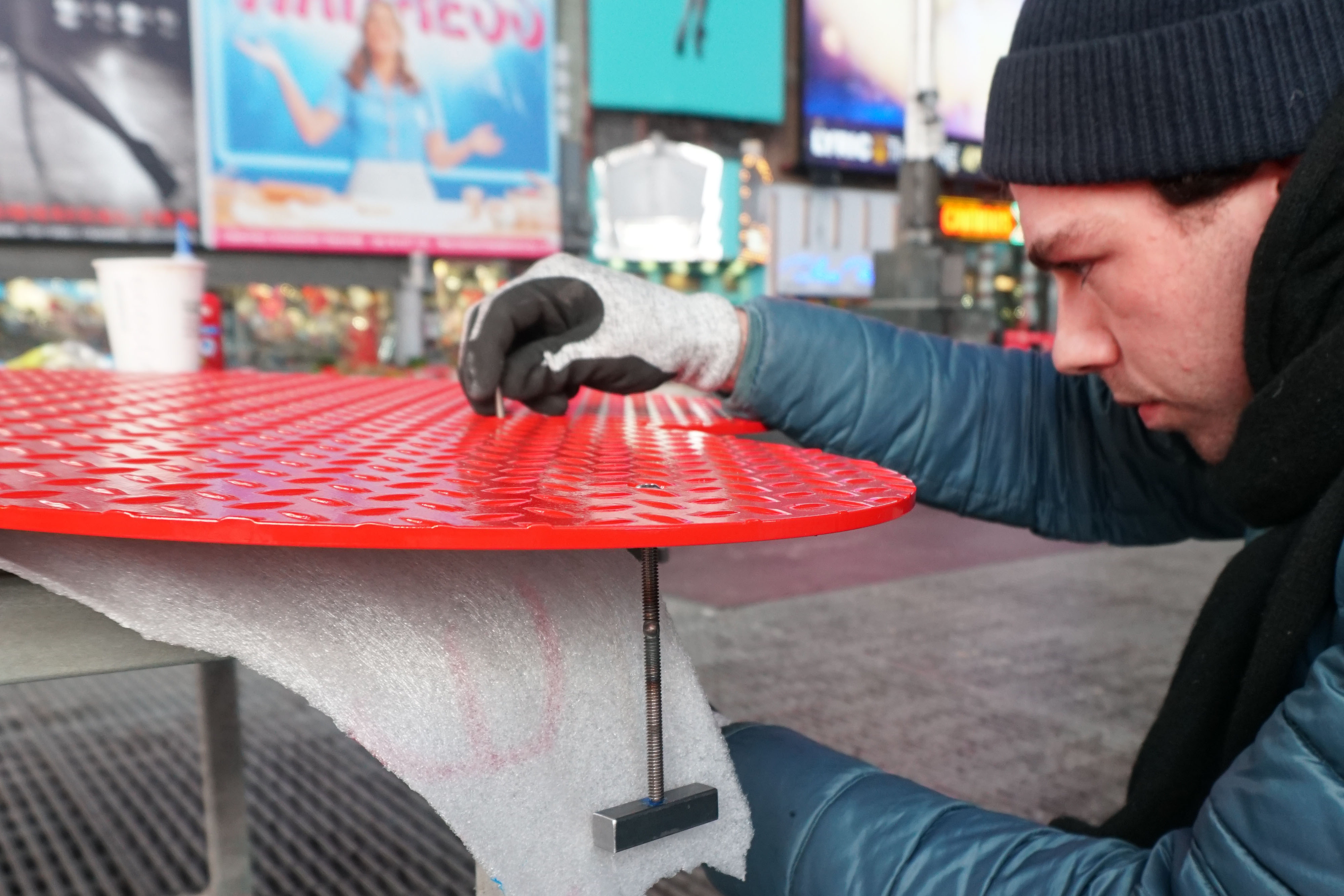
 The colored portions were printed onto the steel metal poles using a custom process.
 An overhead view of the final pole layout in Rhino.
 Verifying the final heart shape in Rhino from the one-point perspective vantage point.
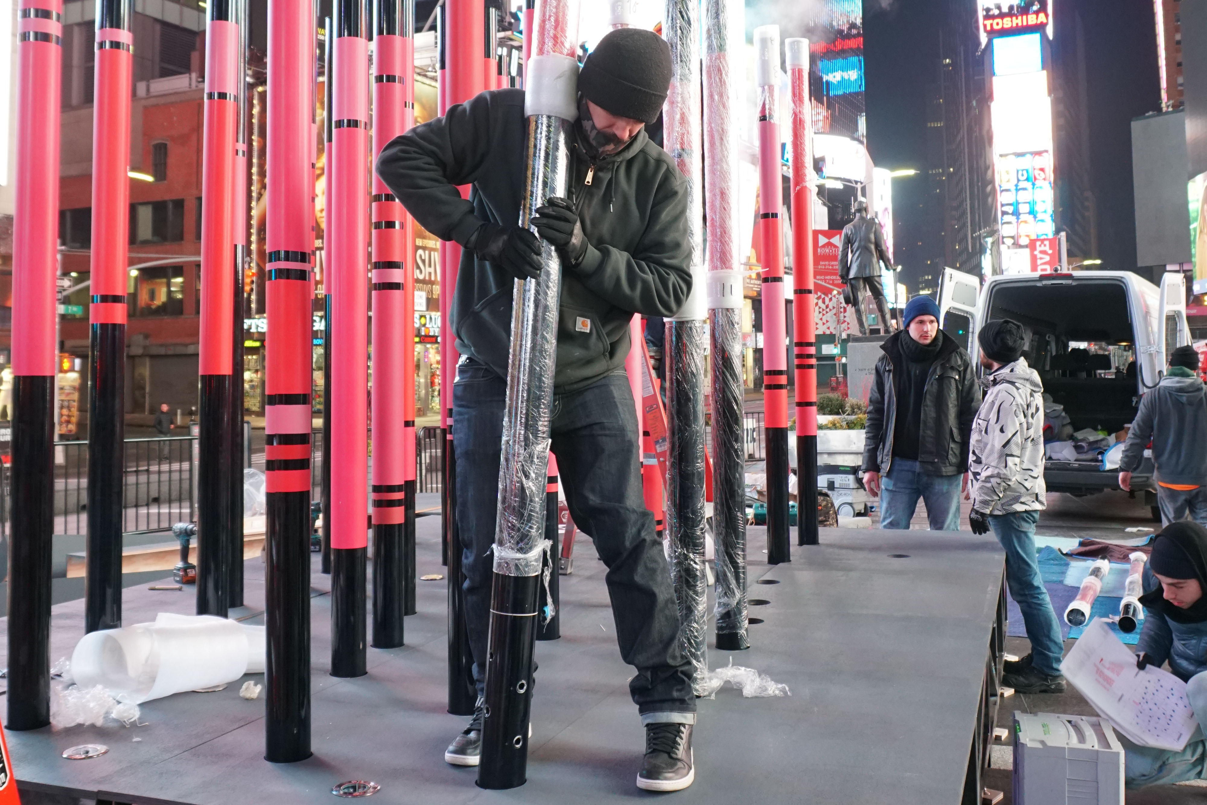
We wanted people to walk between the poles, and in order for them to form the right heart shape given the slight elevation of the site at Duffy Square, they needed to be elevated as well. We enlisted the help of TwoSeven, a design and fabrication company located in Bushwick, to create a steel structure to support the poles. They knew they'd only have 8 hours for installation, so their design took that into account and separated the base into four main quadrants, for easier assembly. They also helped us with the structural engineering necessary to design a sculpture that could withstand people “pole dancing” and hanging on each pole since this would be unattended and installed in public.
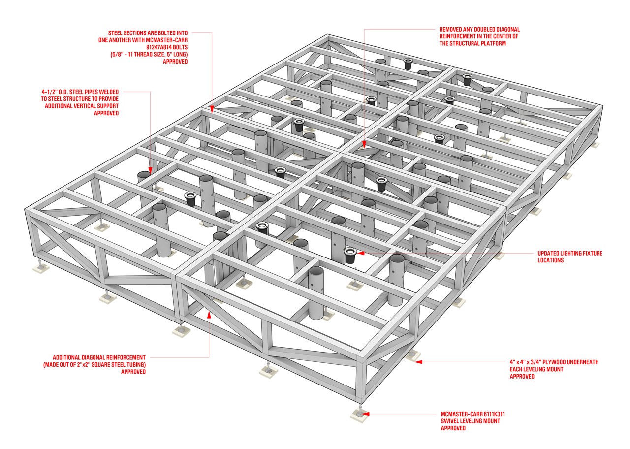 Shop drawing of the steel structural base by TwoSeven
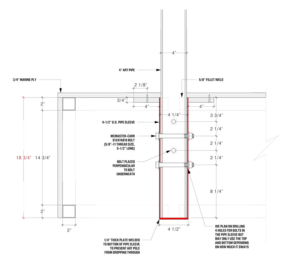 Detail of the bolts attaching the poles to the steel sleve in the base. Shop drawing by TwoSeven.
Next, we needed to design a labeling system to keep track of the poles so that once the colored portion was printed onto them, they would be installed in the correction locations. We ended up creating multiple installation documents instructing the fabricators and installers on how best to proceed so that we’d end up with a proper looking heart.
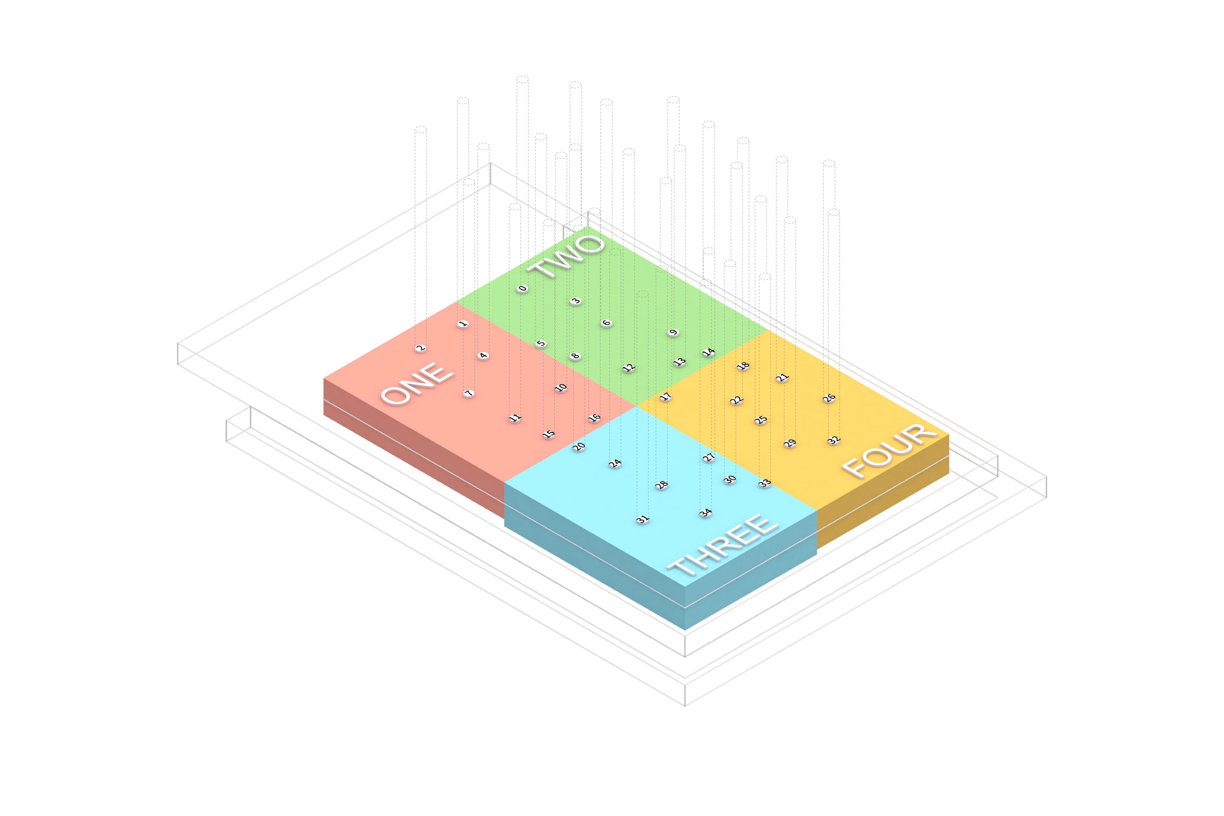
An axiometric view of the platform divided into four quadrants. This allowed us to label each of the 34 poles to ensure they were installed in their intended location.
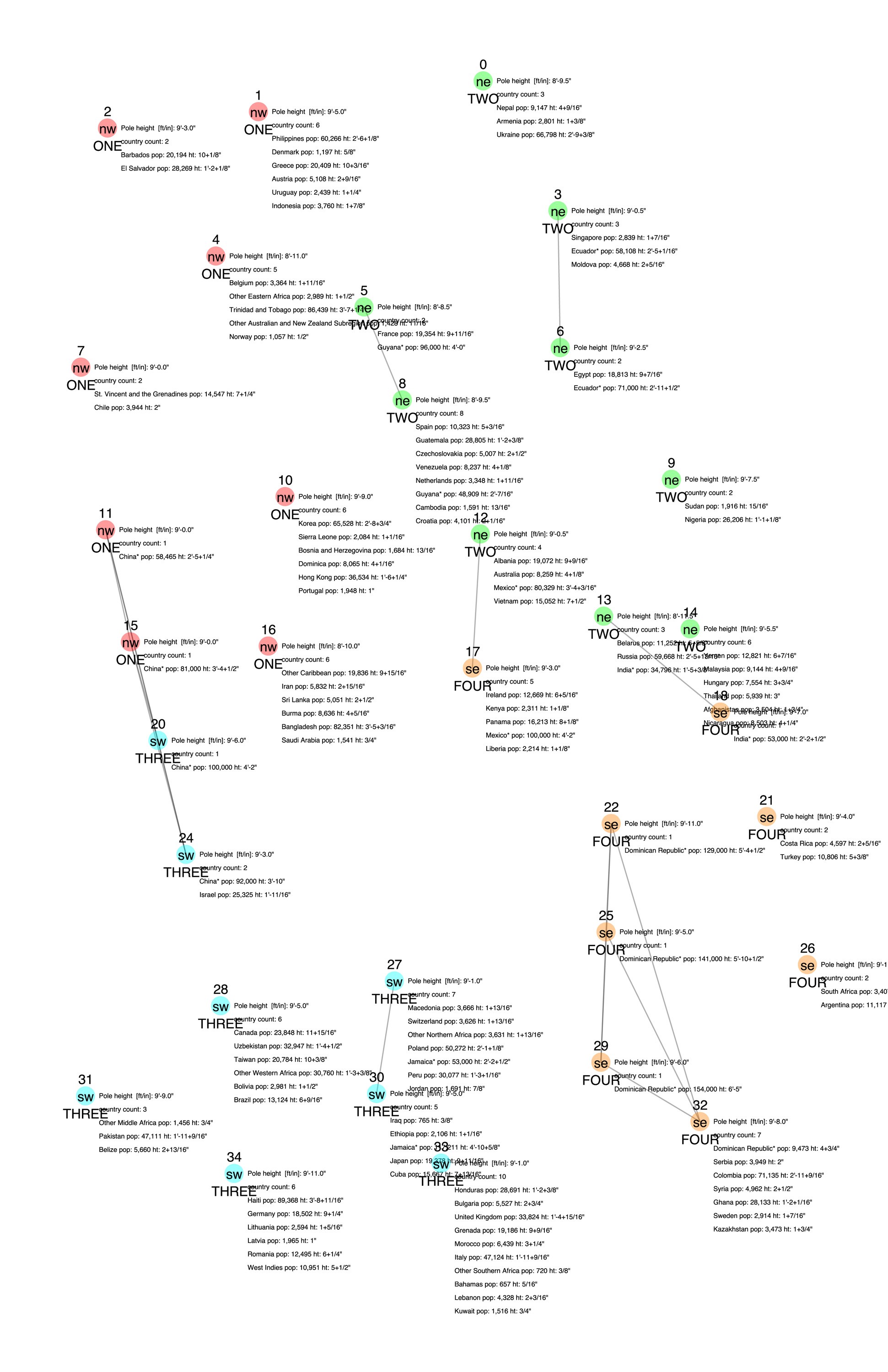
Layout map of poles with details on colored portions and which countries should be on each pole and in what location.
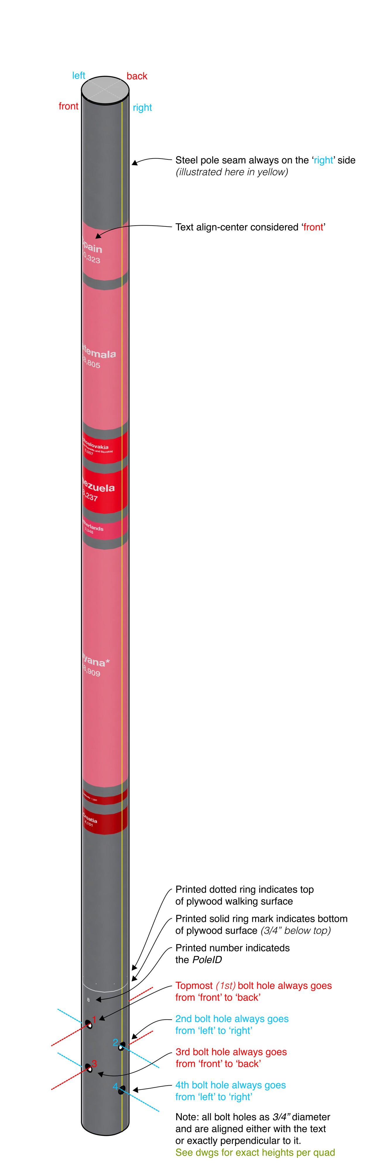
Instructions on how to position poles so that the colored portion faced front and the label faced backwards.
Designing a legend to increase legibility and data literacy
We designed a poster to accompany the visualization, which showed an axiometric view of the poles and a legend for each country, grouping them by areas of origin. It also explained how to read the data sculpture, where an inch of the colored band correlates with 2,000 people. We also shaded the color of the bands based on whether that immigrant community’s population had increased or decreased in the past five years, with the lighter poles grew and the darker poles declined.
Installation
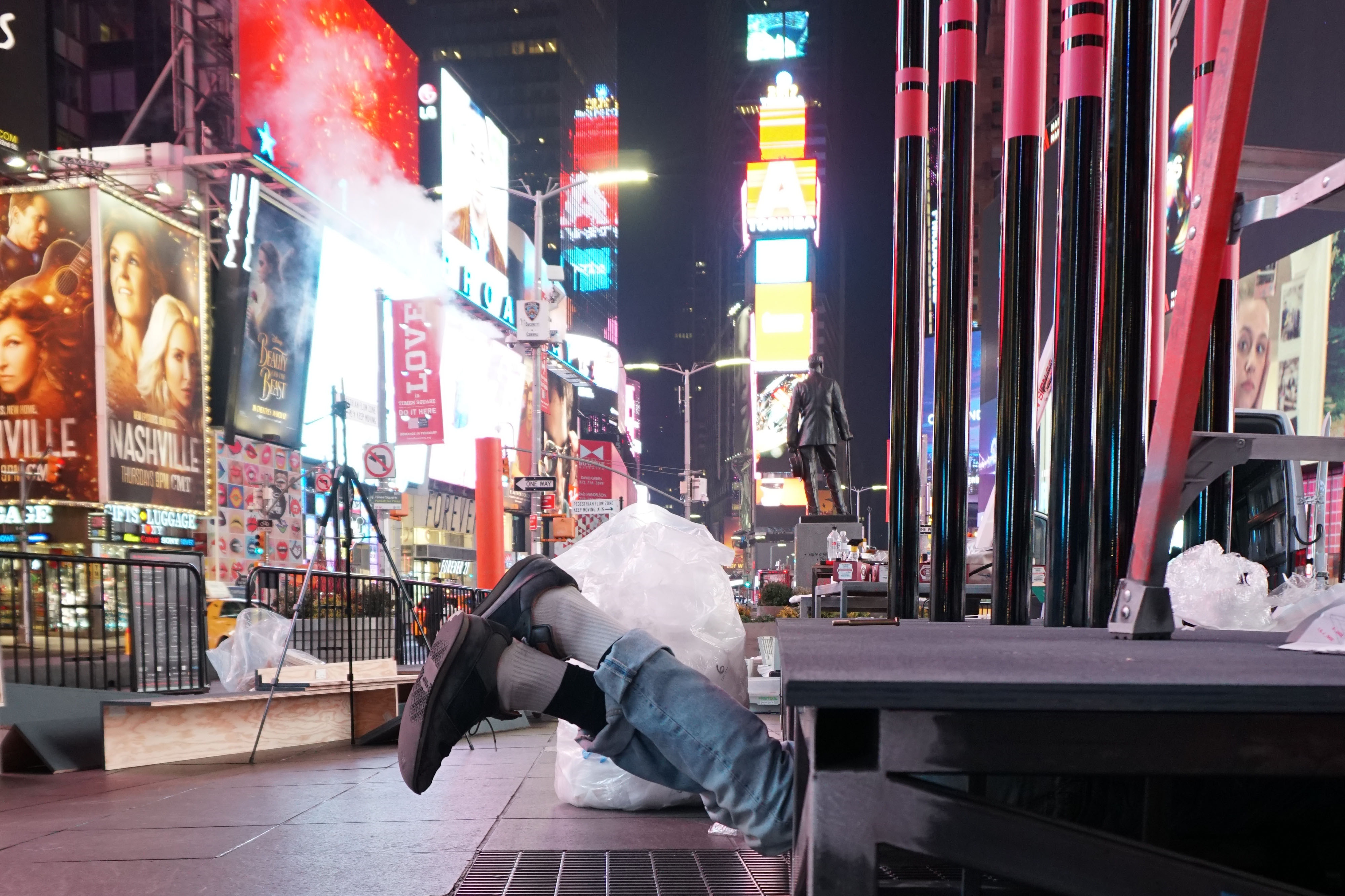
Because Times Square is one of the busiest places on the planet, we had a limited time window to install the piece, namely 8 hours starting at midnight and ending at 8am. The TwoSeven crew did an amazing job and when we saw the heart actually take shape at about 4am on a rainy morning, we were elated.
Response and reflection
It was amazing!
For more information about the process of designing the piece, check out the post Noa wrote up on Medium.
For more information about the process of designing the piece, check out the post Noa wrote up on Medium.