
BIOBOT ANALYTICS - PUBLIC DATA DASHBOARD
A redesign of Biobot Analytics’ public-facing data page evangelizing the importance of wastewater data to monitor the Covid-19 pandemic
Credits
Interactive Design, Prototyping, Front-End Development and Product Management
Genevieve Hoffman
Data Analysis
Max Imakaev
Web Design
Kyja Kutnick
Copy Editing
Claire Duvallet, Rebecca Malizia
Additional Web Development
Maria Kravtsova, Alison Pape, Mike Richards
Data Quality Review
Sasha Halpern, Annie Kuan, Quentin Smith
Role
prototyping, data visualization, front-end development, product management, ux design
As Head of Product Design at Biobot Analytics from 2021-2023, I was the founding product hire at the startup, joining in June of 2020. One of the main projects I worked on during my time at the company was the public-facing view of Biobot's Covid-19 wastewater data. The project underwent a significant redesign in early 2022 in an effort to bring more credibility, trustworthiness and timeliness to the data. As a designer and data visualization engineer, I worked with a small team of data scientists, software engineers, a UX designer and the company's co-founders to transform the layout and enhance the user interaction of the visualization.
Biobot Analytics is a wastewater-based epidemiology company founded by microbiologist Mariana Matus, PhD., and architect Newsha Ghaeli. While they launched the company in 2017 with a focus on combating the opioid crisis through wastewater-based epidemiology, they quickly pivoted to Covid-19 in early 2020. Since then, they were selected as the main vendor to the HHS and CDC for their Covid-19 wastewater surveillance programs.
Biobot Analytics is a wastewater-based epidemiology company founded by microbiologist Mariana Matus, PhD., and architect Newsha Ghaeli. While they launched the company in 2017 with a focus on combating the opioid crisis through wastewater-based epidemiology, they quickly pivoted to Covid-19 in early 2020. Since then, they were selected as the main vendor to the HHS and CDC for their Covid-19 wastewater surveillance programs.
The finished redesign
Sometimes passion projects take on lives of their own
In March 2021, before vaccinations had started to roll out across the United States and most people were working from home, I was employed at Biobot Analytics — a startup specializing in wastewater-based epidemiology. Biobot was the first company to detect SARS-CoV-2 (the virus responsible for the Covid-19 pandemic) via wastewater analysis.
I joined the team in June 2020 as the 10th hire after they had recently completed a two month nationwide probono campaign to analyze wastewater samples from across the U.S. for SARS-CoV-2. I spent most of my time designing our customer-facing products and internal tools.
In May of 2021 I initiated the effort to make a visualization of the SARS-CoV-2 wastewater data from a number of localities that had been working with Biobot for the past year. I wrote the code myself, so as not to interrupt the priorities of other developers at the company.
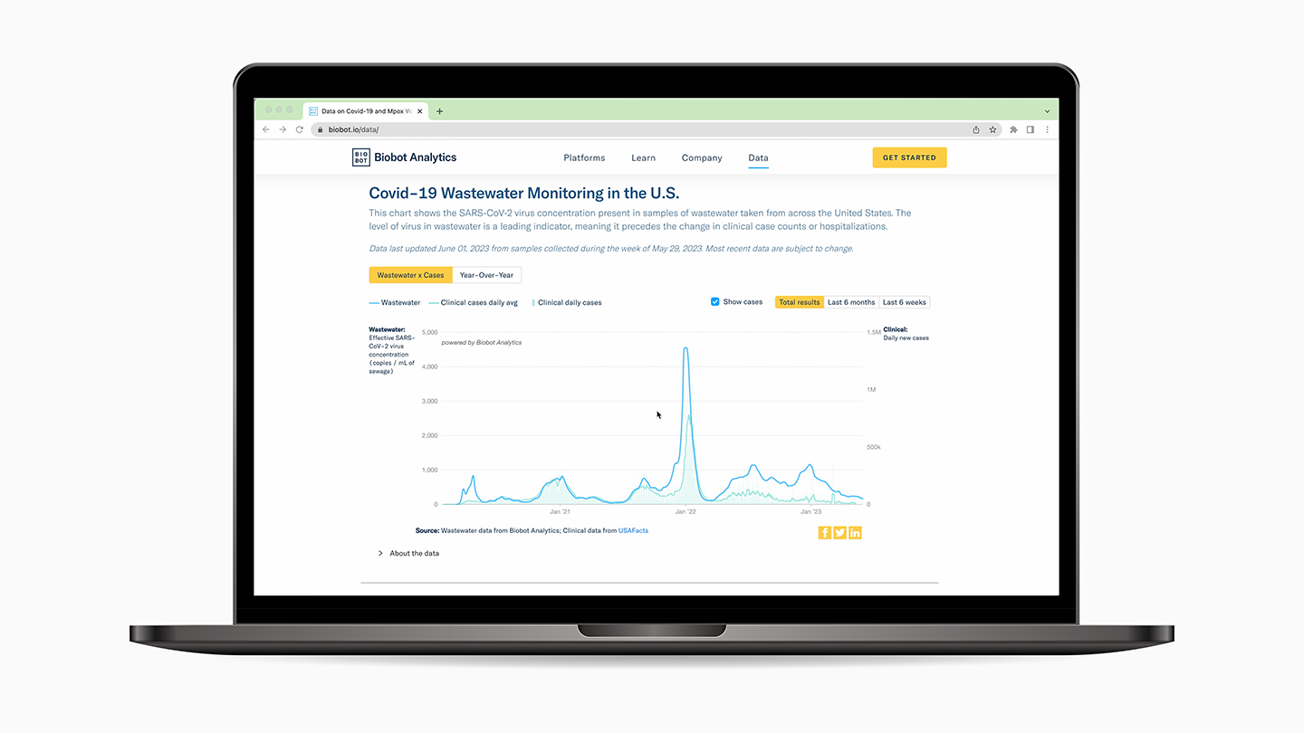
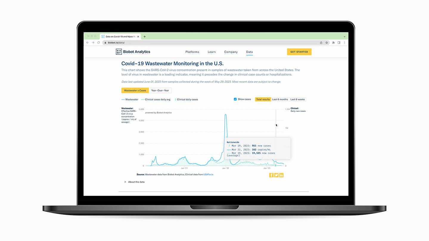
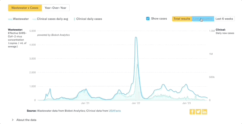
The interactive experience of the data allowed you to see the amount of virus detected in various counties' wastewater over time. It also showed the case data in those counties as a comparison, giving context to wastewater data with a clinical indicator of how much virus was present in the community. This was one of the first visualizations that showed data aggregated across locations, instead of each individual location on its own.
I joined the team in June 2020 as the 10th hire after they had recently completed a two month nationwide probono campaign to analyze wastewater samples from across the U.S. for SARS-CoV-2. I spent most of my time designing our customer-facing products and internal tools.
In May of 2021 I initiated the effort to make a visualization of the SARS-CoV-2 wastewater data from a number of localities that had been working with Biobot for the past year. I wrote the code myself, so as not to interrupt the priorities of other developers at the company.
The interactive experience of the data allowed you to see the amount of virus detected in various counties' wastewater over time. It also showed the case data in those counties as a comparison, giving context to wastewater data with a clinical indicator of how much virus was present in the community. This was one of the first visualizations that showed data aggregated across locations, instead of each individual location on its own.
Challenge: Turning a prototype into a useful resource for public health
The initial version also allowed you to compare a county's wastewater data trend to its regional or nationwide average, a feature made possible by Biobot's extensive network of sampling partners. At this point in the pandemic, there was still considerable skepticism around the reliability of wastewater as a way to measure Covid19, but the visualization demonstrated how well the wastewater data tracked with new clinical cases. This helped build trust in wastewater as a reliable data source over time.
However, due to other company priorities, the visualization was meant to be more of a demonstration — a snapshot of previous data instead of an updating public resource.
After we made the data public in 2021 people started showing interest in the initial visualization, but asked us why it wasn't updating. In order to really make this visualization a reliable public resource, our data needed to update.
And while comparing a county's wastewater data to nationwide and regional averages was innovative, the visualization's UX involved a lot of scrolling, and split the difference between a dashboard and longer-form visualization.
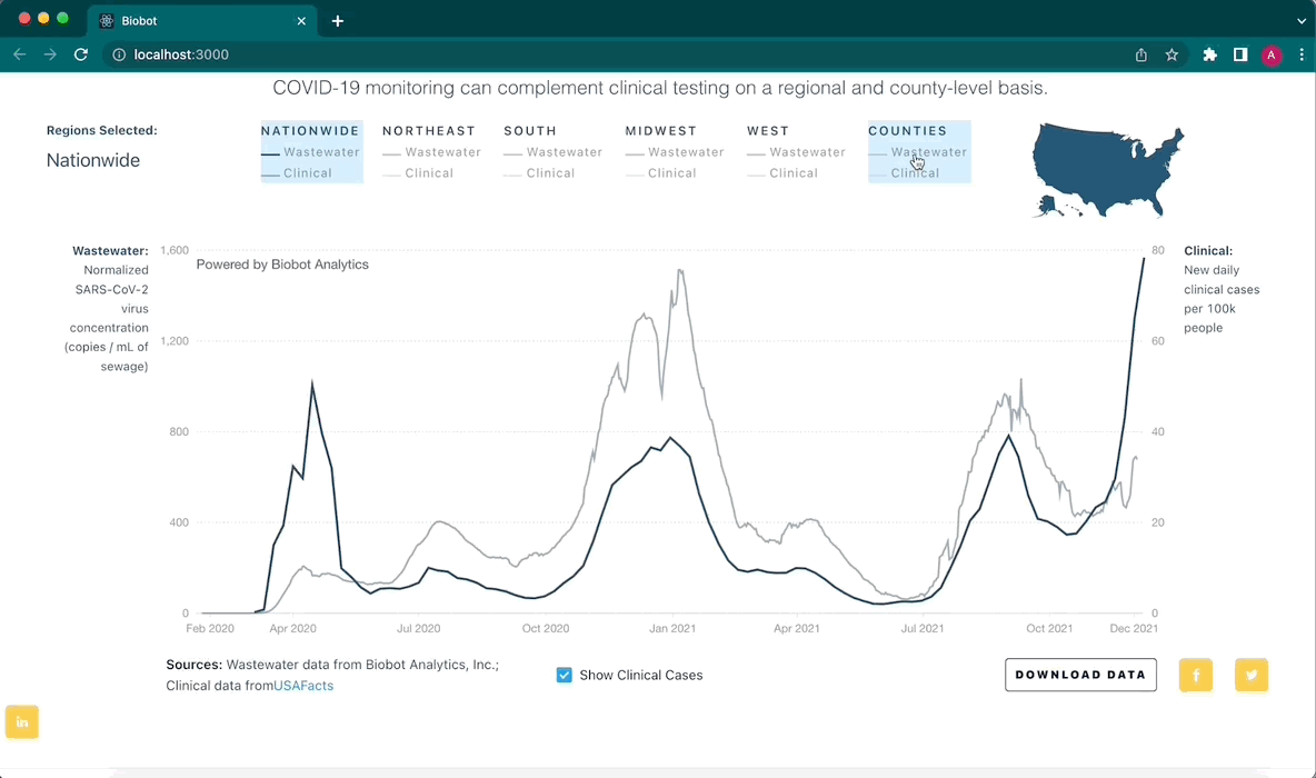
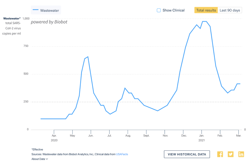
Earlier version of the dashboard
Goals: Validate wastewater as a reliable data source
At the end of 2021, as the Omicron wave began taking hold of the country, our team set off to redesign the public visualization.
The redesign had two primary goals:
At the time, Covid-19 pandemic funds from the CARES Act allowed many municipalities and county health departments to keep an accurate count of all positive PCR Covid-19 tests, which enabled public health officials to manage their response to the pandemic.
Some of these funds were also used to test wastewater for SARS-CoV-2, but some communities with fewer resources could not cover the costs of testing wastewater. The Biobot Network addressed these needs and provided testing services to these localities at no cost.
The redesign had two primary goals:
- Validate Covid-19 wastewater data as a reliable indicator of virus circulating in a community
- Highlight the launch of the Biobot Network, a campaign to provide wastewater epidemiology services to municipalities at no cost to themselves, and share that data with communities and people across the U.S.
At the time, Covid-19 pandemic funds from the CARES Act allowed many municipalities and county health departments to keep an accurate count of all positive PCR Covid-19 tests, which enabled public health officials to manage their response to the pandemic.
Some of these funds were also used to test wastewater for SARS-CoV-2, but some communities with fewer resources could not cover the costs of testing wastewater. The Biobot Network addressed these needs and provided testing services to these localities at no cost.
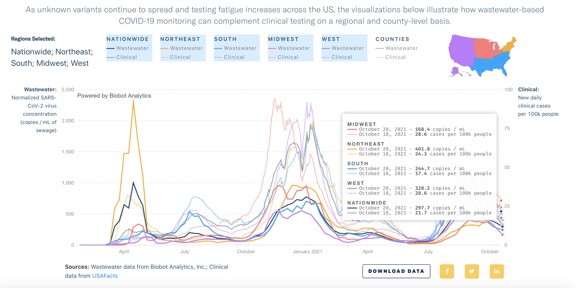
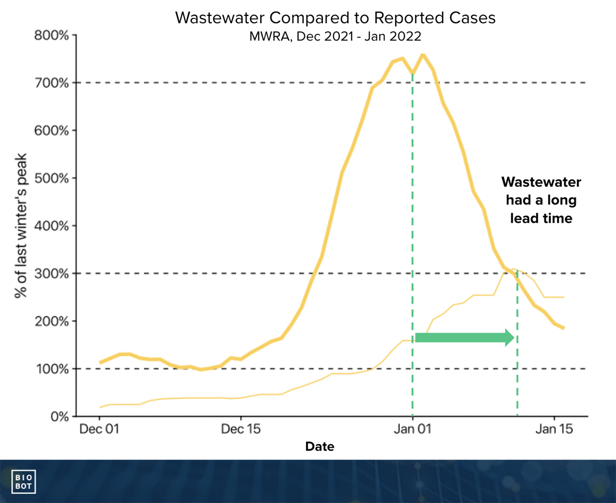 As Covid-19 becomes endemic Wastewater data becomes a significant leading indicator
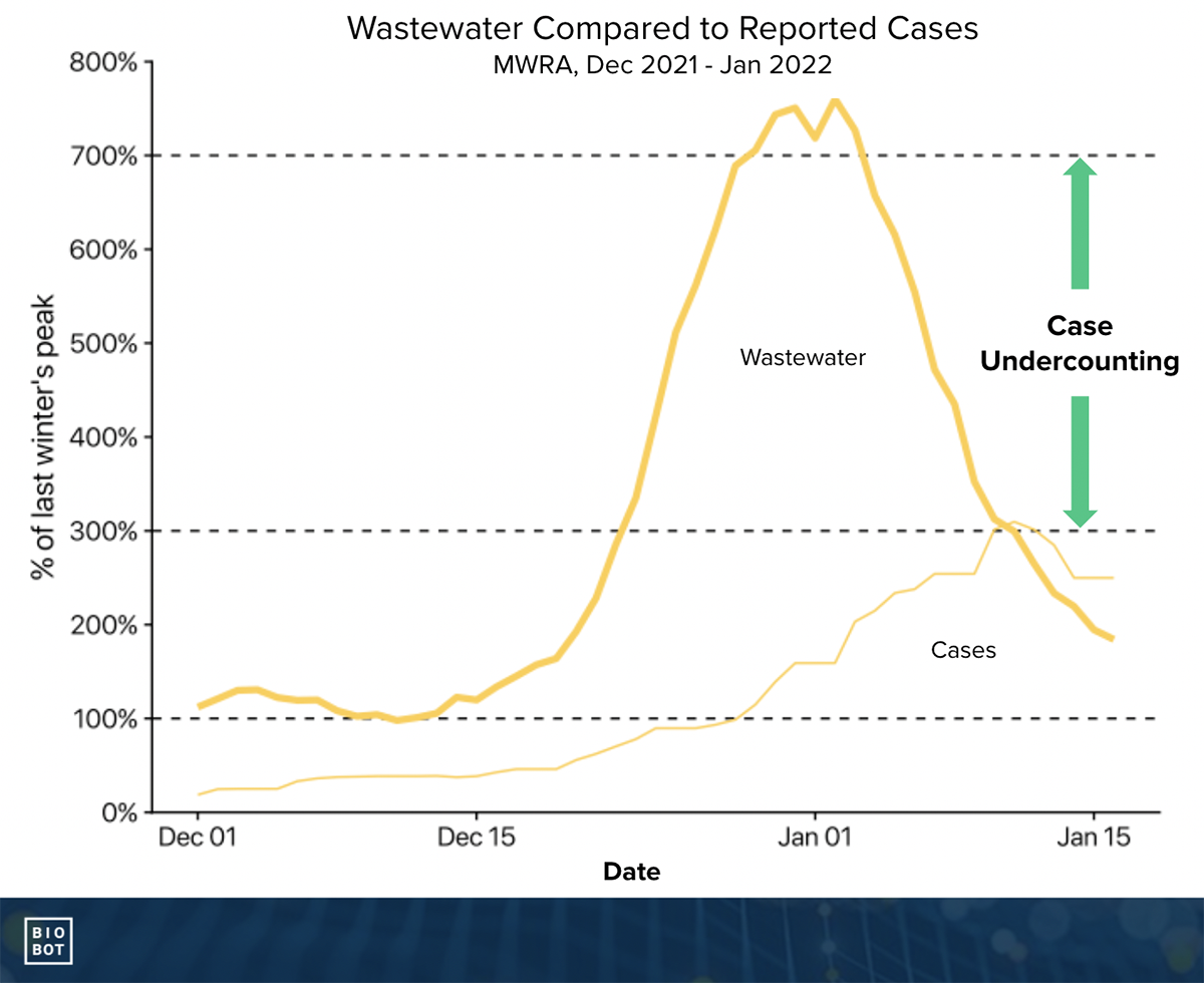 Wastewater data became even more important as Omicron infections went unreported
Earlier versions of the visualization had incorporated a rolling average of new clinical cases to give context to the wastewater data. Comparing wastewater to clinical data primarily showed two patterns:
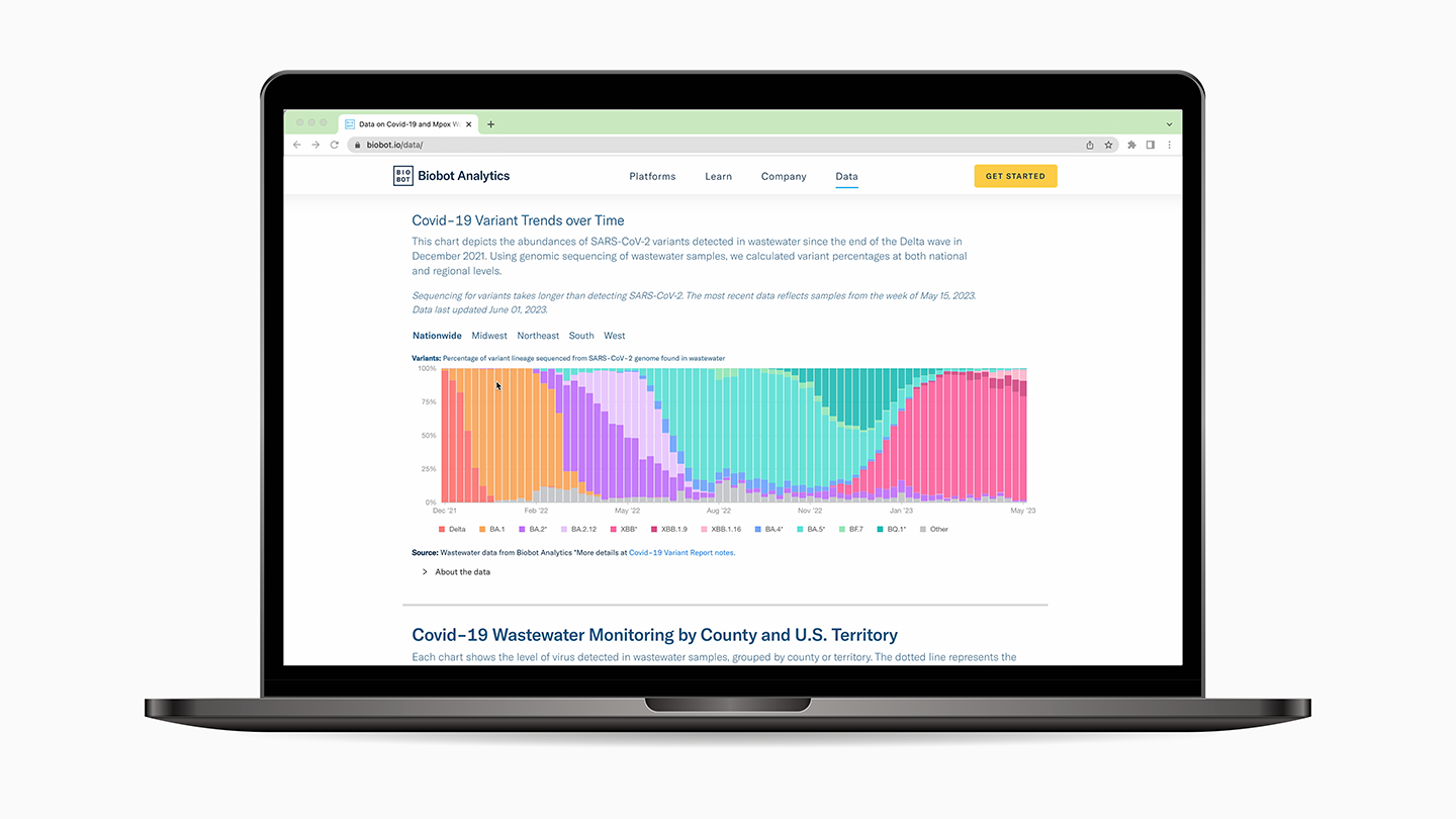
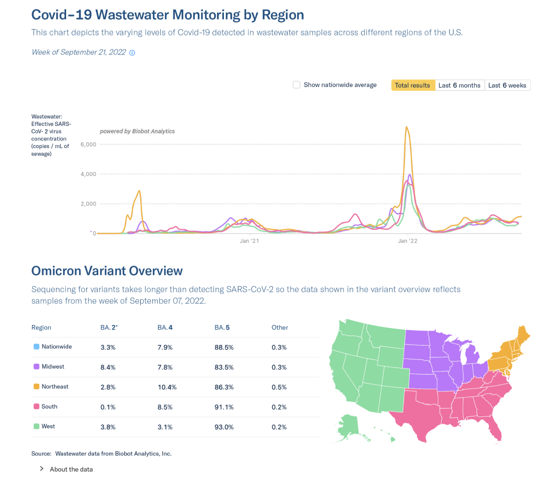
An additional goal of the visualization redesign was to highlight Biobot's capabilities in detecting SARS-CoV-2 variants from wastewater. This was top of mind as the Delta variant overtook the pre-existing Alpha variant in late summer and fall of 2021.
- During times when clinical testing was unavailable, such as the spring of 2020, wastewater was often a leading indicator of the amount of Covid-19 spreading in a community.
- At times when clinical testing was more available, wastewater data tracked very closely to clinical daily new infections, proving to be a reliable alternative data source.
An additional goal of the visualization redesign was to highlight Biobot's capabilities in detecting SARS-CoV-2 variants from wastewater. This was top of mind as the Delta variant overtook the pre-existing Alpha variant in late summer and fall of 2021.
An opportunity for improvements, increased usability and brand alignment
Inspiration and competitive analysis
We looked at several widely-used examples for Covid-19 data to hone in on our goal for the redesign. One of our favorites was the New York Times' Covid-19 data page. I liked that all the various views of the data were visible at a glance just by scrolling, and did not require any user interaction to surface the various aggregation levels of the data.
Other popular dashboards such as the CDC data page were reviewed, however we received a lot of feedback from twitter that our layout and design for the wastewater data was more intuitive and easier to use.

The New York Times Covid-19 Visualization Page
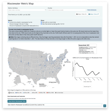 The CDC's Covid-19 Wastewater Dashboard
Using surveys for user research
As the visualization evolved over time, we conducted a month-long survey to gather user feedback. The goal of the voluntary survey was to better understand users of the public visualization, and to get feedback on the utility of county-level data, variants of concern, and desired features or improvements.
The survey ran for 4 weeks. Our primary goals for the survey were to better understand and segment users of the visualization and to find out ways people were sharing the information contained in the visualization. We had debated the utility of building features that made it easier to link specific views of the data visible when viewers toggled UI elements. We were also interested to know how much granularity visitors wanted around the data.
From the survey results, we found that 43% of people shared the visualization, with a third of respondents sharing their county-level data as screenshots. While encouraging, we didn't feel this amount met our threshold for feature development.
County-level data was extremely valuable to people understanding the risks they might encounter where they lived.
As the visualization evolved over time, we conducted a month-long survey to gather user feedback. The goal of the voluntary survey was to better understand users of the public visualization, and to get feedback on the utility of county-level data, variants of concern, and desired features or improvements.
- Understand & segment users of the visualization
- Inform methods used for sharing the visualization
- Understand utility of county-level data
- Inform how many variants of concern are helpful to various customer segments
- Provide ideas for future features
- Begin to create database for future user research
The survey ran for 4 weeks. Our primary goals for the survey were to better understand and segment users of the visualization and to find out ways people were sharing the information contained in the visualization. We had debated the utility of building features that made it easier to link specific views of the data visible when viewers toggled UI elements. We were also interested to know how much granularity visitors wanted around the data.
From the survey results, we found that 43% of people shared the visualization, with a third of respondents sharing their county-level data as screenshots. While encouraging, we didn't feel this amount met our threshold for feature development.
County-level data was extremely valuable to people understanding the risks they might encounter where they lived.
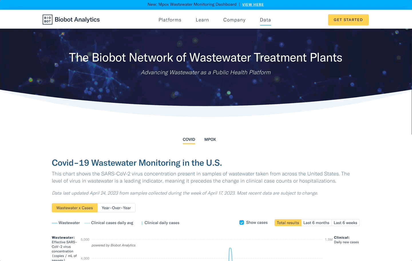
Layout: Separate sections for nationwide, regional and county data
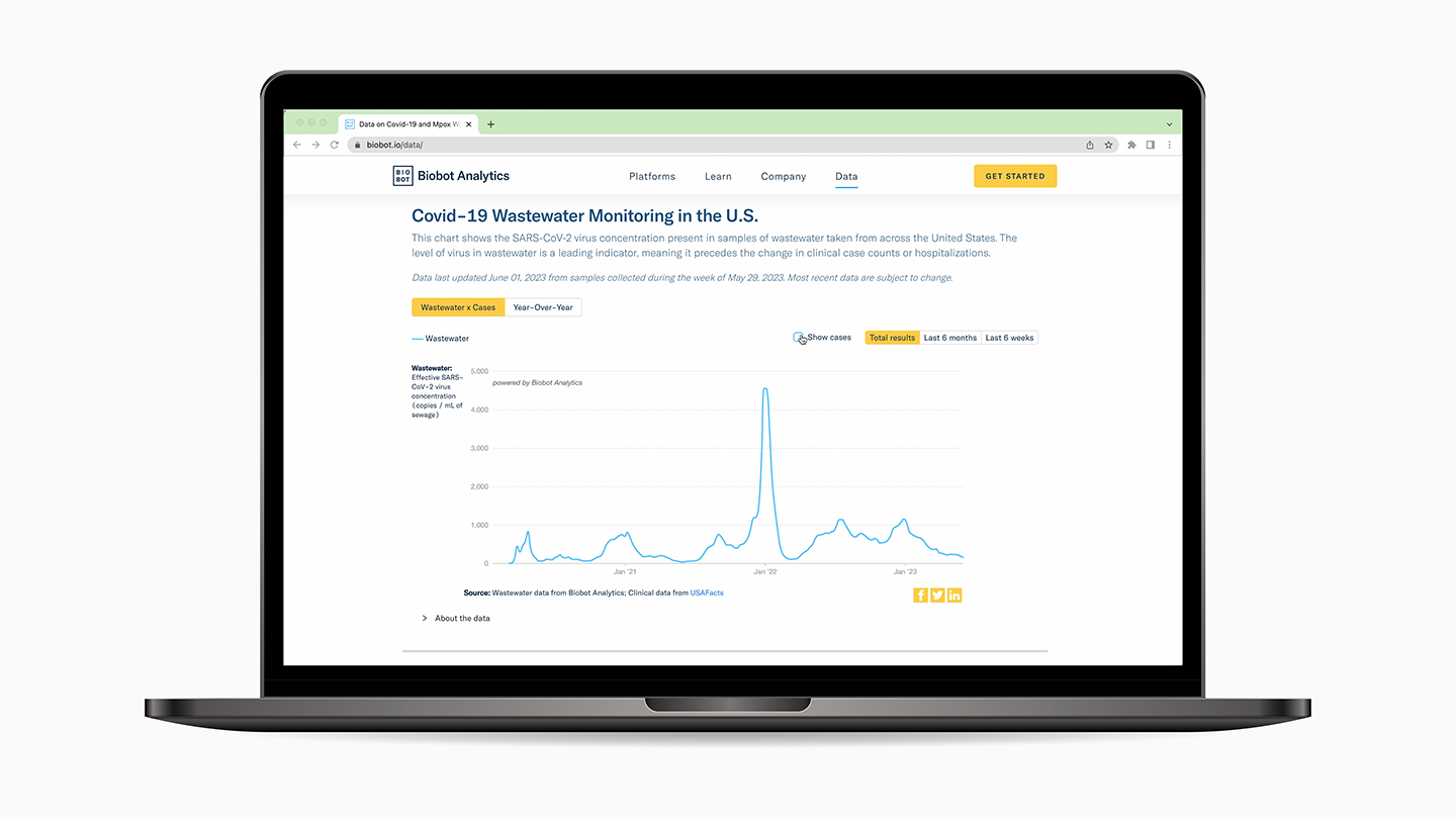
One of the first decisions we made was to break out each level of data – nationwide, regional and county-level – into their own separate sections. This allowed users to quickly glance at the national trends, or scroll to view the level of granularity they were interested in.
One of the first decisions we made was to break out each level of data – nationwide, regional and county-level – into their own separate sections. This allowed users to quickly glance at the national trends, or scroll to view the level of granularity they were interested in.
Show both case counts and rolling case averages
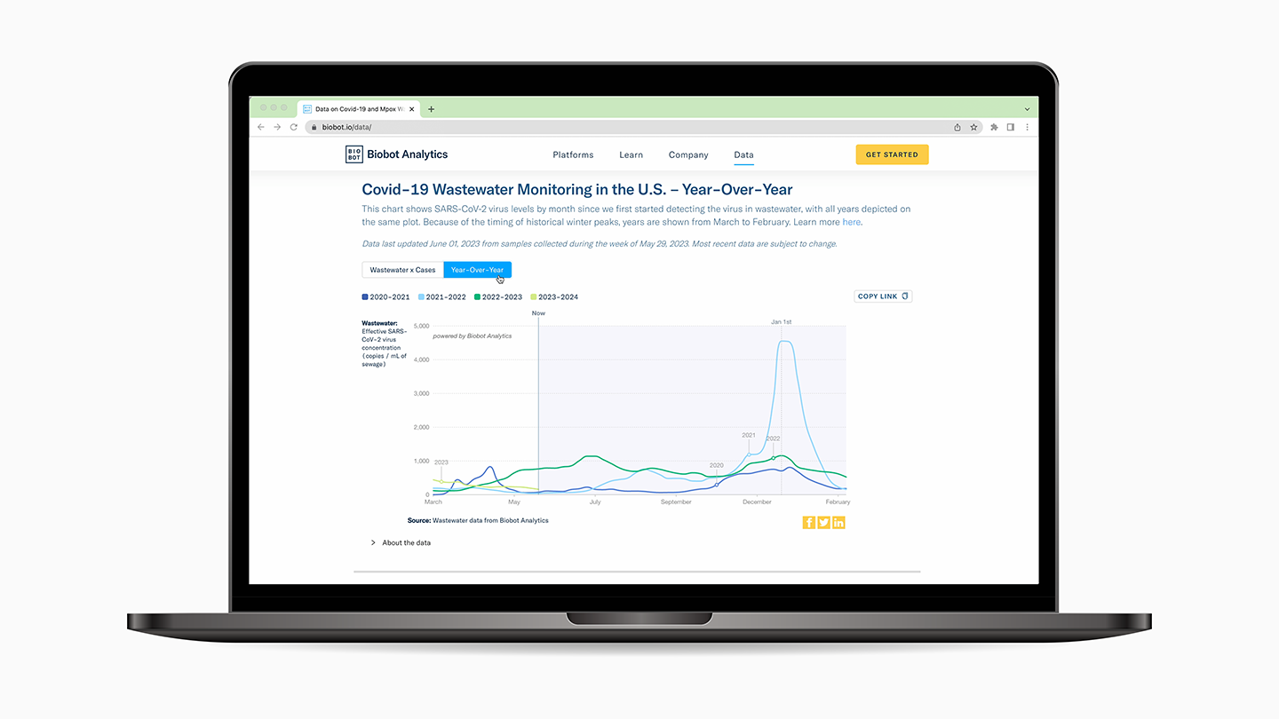
For the Nationwide view, we added daily case counts in addition to the rolling average trend line in an effort to show that the case trend line was a rolling average derived from daily new infections. From our data visualization we were able to identify that the rolling average was more accurate since we saw large gaps over the weekend due to infection reporting delays.
For the Nationwide view, we added daily case counts in addition to the rolling average trend line in an effort to show that the case trend line was a rolling average derived from daily new infections. From our data visualization we were able to identify that the rolling average was more accurate since we saw large gaps over the weekend due to infection reporting delays.

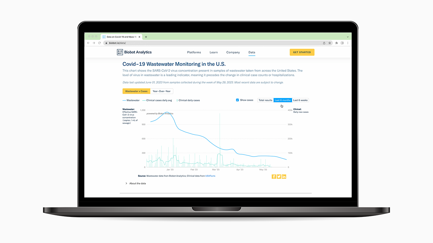
Buttons allowed for easy transitions between timespans
Create shortcuts to see more recent data
The primary UI on each visualization became button shortcuts to toggle from the default all time view to the last 6 weeks or last 6 months of data. The decision to create button shortcuts over a more nuanced slider or date range picker was to reduce the complexity or need for users to manipulate a slider. We wanted the page to feel more like an editorial layout than a dashboard.
The primary UI on each visualization became button shortcuts to toggle from the default all time view to the last 6 weeks or last 6 months of data. The decision to create button shortcuts over a more nuanced slider or date range picker was to reduce the complexity or need for users to manipulate a slider. We wanted the page to feel more like an editorial layout than a dashboard.
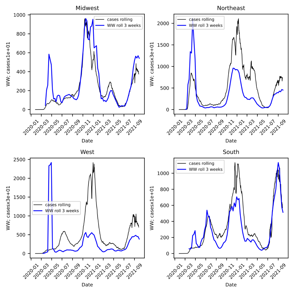
Comparing regional trends and variants
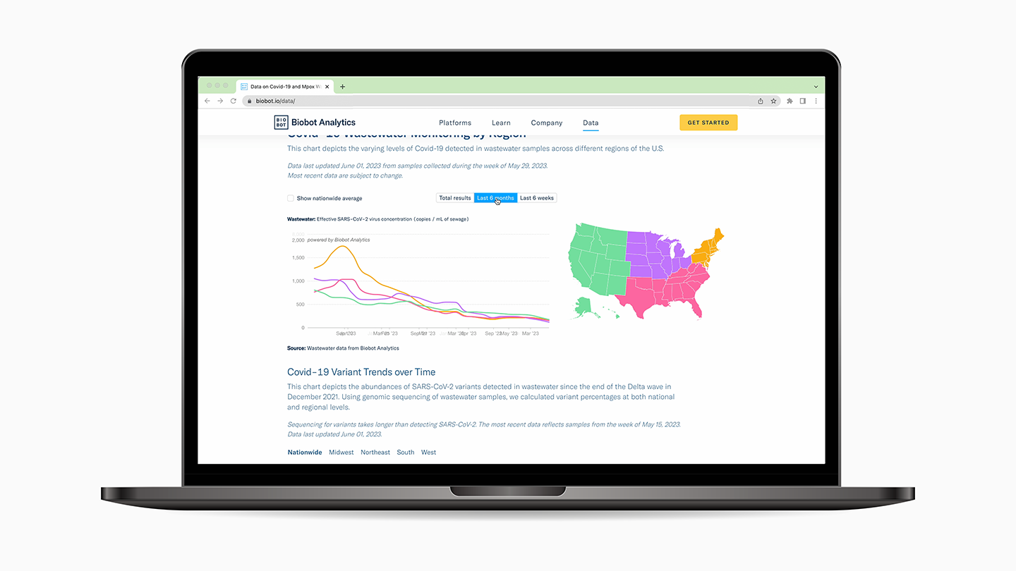
For the Regional view we compared the averaged trend line of each census region - Northeast, Midwest, South and West - to see the variations in Covid-19 across the country. In this section we also added information on the percentage breakdown of which Covid-19 variants were most active across each region.
For the Regional view we compared the averaged trend line of each census region - Northeast, Midwest, South and West - to see the variations in Covid-19 across the country. In this section we also added information on the percentage breakdown of which Covid-19 variants were most active across each region.
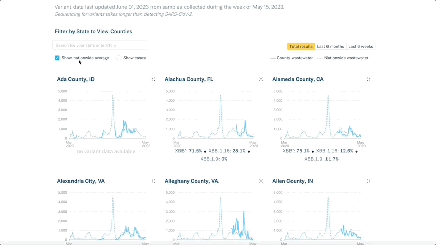
A dropdown menu enables filtering county-level data by state
Using aggregate data to give context to county trends
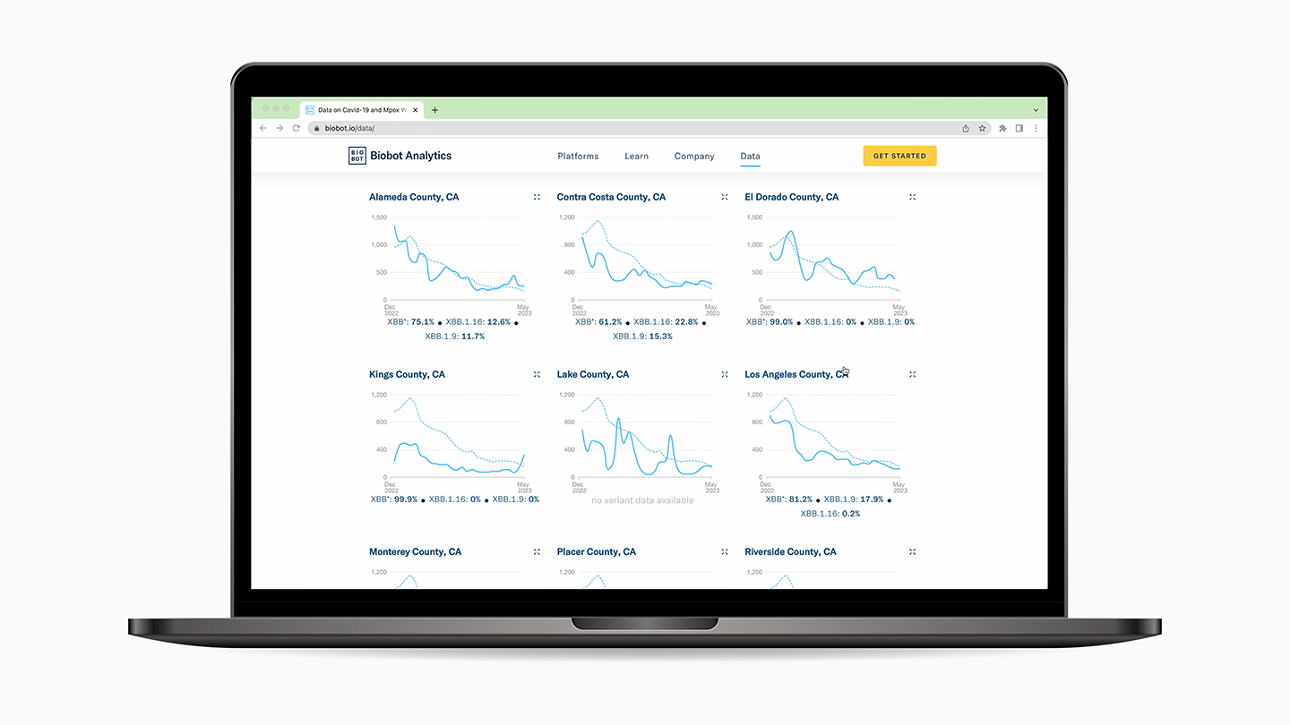
For the County-level view we wanted an easy way to compare trend lines across counties to one another. We also thought it was important for users to search for the counties most relevant to them. A state dropdown menu allowed ways for users to filter counties by state. We removed the functionality to compare a county trend to its regional average, and instead showed that county's clinical case rolling average for context. Later, as case counts became less reliable, we added a feature to compare each county trend to the nationwide average, as a way to benchmark if Covid-19 in that county was higher or lower than the nationwide average.
For the County-level view we wanted an easy way to compare trend lines across counties to one another. We also thought it was important for users to search for the counties most relevant to them. A state dropdown menu allowed ways for users to filter counties by state. We removed the functionality to compare a county trend to its regional average, and instead showed that county's clinical case rolling average for context. Later, as case counts became less reliable, we added a feature to compare each county trend to the nationwide average, as a way to benchmark if Covid-19 in that county was higher or lower than the nationwide average.
Implementing an opt-out contact form prior to data sharing to better understand how our users engaged with the data
When we first launched the public-facing visualization in June 2021, we also shared the data used to generate the visualizations to Github in an effort to give academics and citizen scientists access to this data set for non-commercial use. A number of academics and others interested in forecasting Covid surges used the data set in modeling projects, or as a way to predict various types of surges.
We experimented with various approaches to providing access to this data - first by linking directly to the data below the visualization, then later by encouraging users to get in touch and tell us how they were using the data.
Initial data access approach that allowed users to click a button beneath the graph to download data
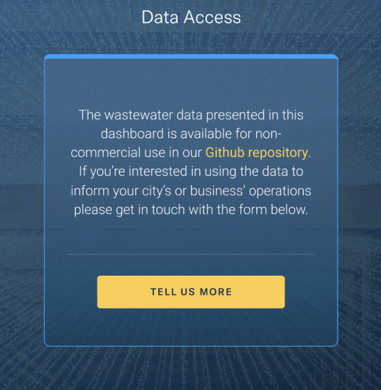 Subsequent approach with a larger call to action prompting users to share how they used the data before downloading
Impact: Increased web visits, press coverage, social sharing and accolades
The redesign of the visualization launched in early 2022, right as the Omicron wave’s peak was starting to level off.
During the Omicron surge over the holidays, at-home testing was much more widely available than during previous waves. In addition, many cases went undercounted due to the milder symptoms associated with the Omicron variant infections. However, the wastewater data told a much different story, and more people hoping to understand the amount of SARS-CoV-2 circulating in their communities looked to Biobot's wastewater data.
With the launch of the redesigned page, traffic to the visualization on Biobot's website increased by 100 fold , going from around 50 visits per day to 5000. To date, the page has received over 1.2 million views, and consistently accounted for 68% of direct traffic to the company's website.
The visualization was linked to by the New York Times, in reference to wastewater data as a better indicator of the Omicron surge, featured on NBC News, and tweeted by Rachel Maddow.
In addition to press coverage, the visualization received an honorable mention in Fast Company's 2022 Data Design Awards.
 The visualization was a finalist in Fast Company's 2022 Data Design category
 Proud moment when Rachel Maddow tweeted about Biobot's wastewater dashboard
Having a real impact in people’s lives as they make decisions about their health and safety
Over time the company received a number of messages from users about how they use the data, and how crucial it is to inform the decisions they make to protect themselves, their loved ones and their community.
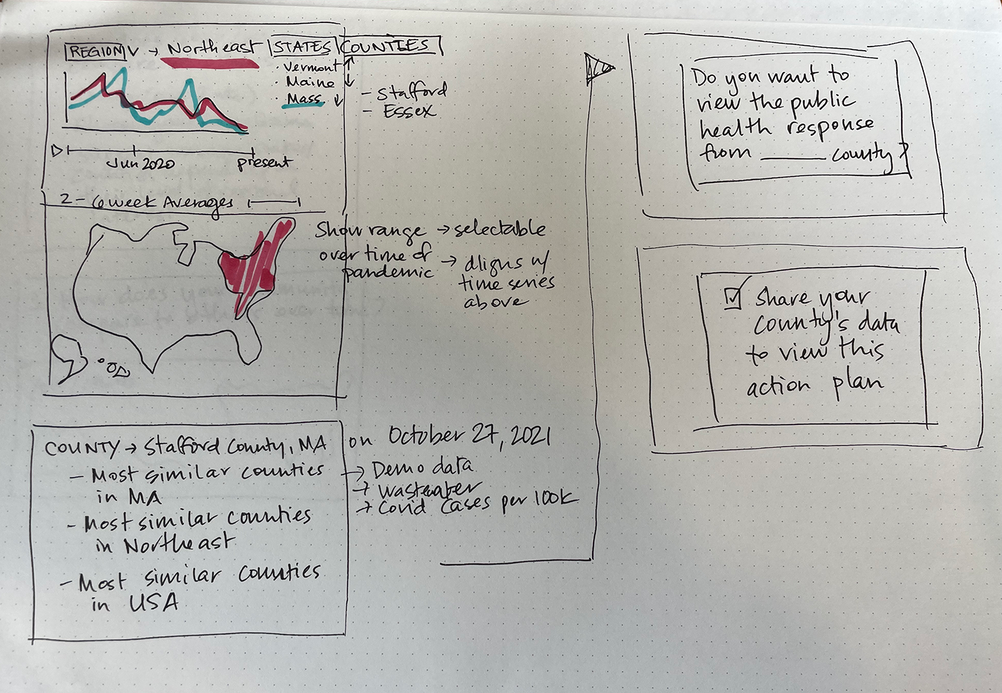
How do you use wastewater data?
Over time the company received a number of messages from users about how they use the data, and how crucial it is to inform the decisions they make to protect themselves, their loved ones and their community.
How do you use wastewater data?
"We develop evidence base PPE enhancements in environments where extra precaution is wanted and necessary. We’d love to provide customers with regional case rate data to help inform customer decisions."
"My family is using wastewater data to watch for the next surge. We change what we do (dental appointments, shopping in person, etc.) based on viral levels."
"My family is using wastewater data to watch for the next surge. We change what we do (dental appointments, shopping in person, etc.) based on viral levels."
"I am a psychotherapist who sees vulnerable populations and I track wastewater locally to ensure I am keeping myself and my clients safe when seeing them for in person sessions. Thank you for your work in compiling and sharing this data!"
"To track Covid near the office and home, now that it's the only useful data available."
"To follow national, regional, and local trends. It's the only reliable data we have for community level trends."
"To track Covid near the office and home, now that it's the only useful data available."
"To follow national, regional, and local trends. It's the only reliable data we have for community level trends."
"To determine how safe it is for the kids to be with their friends/school without a mask."
"I am using it to inform my behavior so that I can minimize the chance of infecting myself or another with what is still a novel virus, known to cause damage to multiple body systems. I am high risk for PASC and since the government has reduced its transparency about transmission rates, I rely on wastewater data to keep myself safe."
"I am using it to inform my behavior so that I can minimize the chance of infecting myself or another with what is still a novel virus, known to cause damage to multiple body systems. I am high risk for PASC and since the government has reduced its transparency about transmission rates, I rely on wastewater data to keep myself safe."
Learnings: Make it easy to find relevant data
The editorial layout was an appealing visual identity for the public face of Biobot’s data, and allowed for features to be added over time
The redesign effort confirmed that sometimes in data visualization, less can be more. Dashboards with a variety of UI elements can be very powerful, but are often better suited to power users over casual visitors. Since this visualization was meant to be the public face of Biobot's data, the editorial approach helped users find the data they were interested in by browsing instead of searching.
The editorial layout created an appealing visual identity and allowed for additional visualization features and pages to be added over time.
I'd also add something about validating a new data source and creating an accessible UX for all individuals
I'd also consider adding something about evolving over time as the landscape / data changed over time and how that is important to keep up with an ever changing pandemic, and be a pioneer in the field.