

OCR JOURNAL - A PHRENOLOGY OF PROJECTS + PUNCH CARD MUSIC BOX
Data art and visualizations exploring what github commits and slack chatter can tell us about the ways we work
Credits
concept, software prototyping, data analysis, design
Role
concept, fabrication, documentation
concept, software prototyping, data analysis, design
Role
concept, fabrication, documentation
When I first joined The Office for Creative Research, one of the first projects I worked on was to develop my contribution to The OCR’s first edition of a printed publication, The OCR Journal.
As a new member of the team, I decided to understand the previous projects the studio had made since their inception two years prior. I found datasets in the github repos that housed the code for these projects, as well as the slack organization we were all a part of, and used for daily communication about projects, posting process images and research in the channel.
The result of my investigation took two forms : a more traditional data visualization of the various projects, team members and activity analysis, and a data sculpture of a music box with a score generated from github commit patterns.
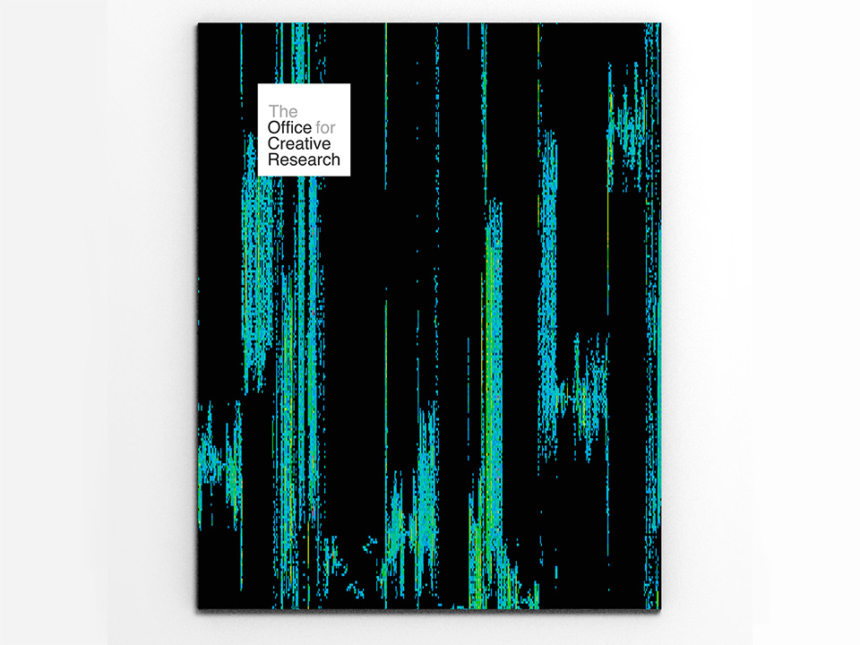
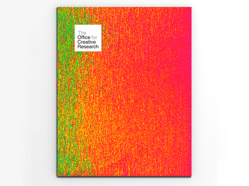
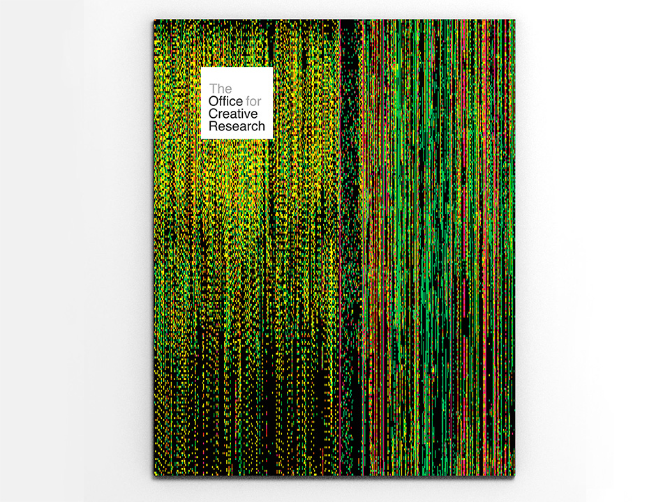
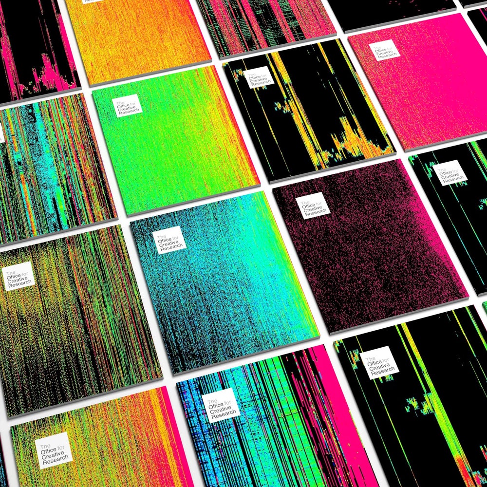
Four copies of the OCR Journal, 1st edition. We made unique covers for each copy of the journal, leveraging data from another project which lent itself nicely to abstraction. Covers generated by Noa Younse
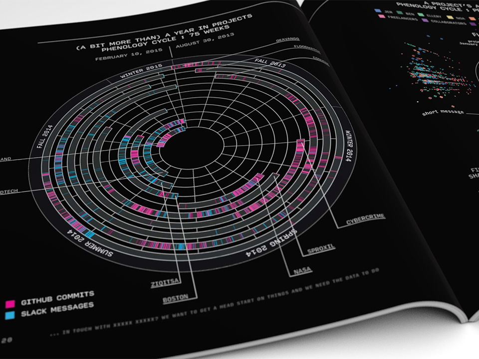
A phrenelogy of projects
I started by using the Github API to download the commit history of all the projects I wanted to visualize. There ___ in all. I accessed each team members’ github commit history, and started to analyze their different working habits, most productive days, and other patterns.
Next I looked into the Slack API to see if I could get a computer-usable format of the messages on each project channel. This way, I could see how the discussion around a project might complement the record of active work done on github.
Next I looked into the Slack API to see if I could get a computer-usable format of the messages on each project channel. This way, I could see how the discussion around a project might complement the record of active work done on github.
The introduction to the visualization in the OCR Journal
The result used a radial graph to show the project timelines as concentric circles, showing their overall progression and relation to one another in time since the start of the company. I visualized the github commits and slack messages within each project’s timeline, showing the peaks of activity
75 weeks worth of projects visualized in a radial timeline
Subsequent visualizations show the breakdown of participation of each team member per project. Github commits were analyzed to compare if members were deleting more lines of code than adding, which changed the length and placement of the line marking a commit along a center radius. Slack messages were also visualized differently around the github commit lines according to whether the team member had written a message, posted a link, or uploaded a media file.
Print files showing the visualizations of project activity and duration. To complement the radial approach, I also laid out the projects in a more legible linear timeline


I also looked at github and slack activity to see which days people were especially active (or not). I kept a radial approach to this visual as well, breaking up the circle along the seven days of the week. Each hour within the day turns brighter the more github and slack activity that occurs across the project during that time of day.
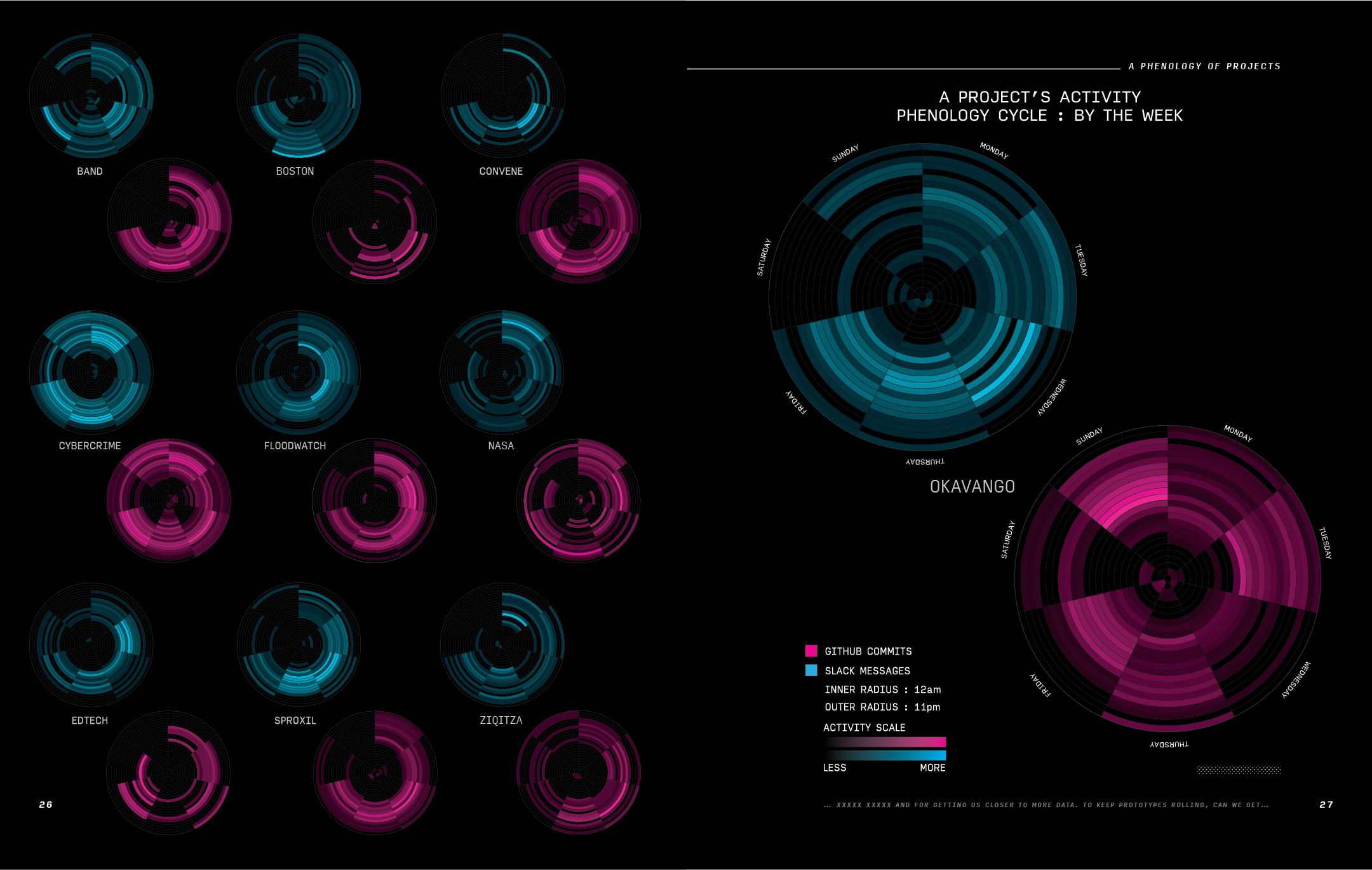
Print files showing the by the week comparison of team activity
PUNCH CARD MUSIC BOX
Translating github commit habits into a score for making music
Created for the 2015 OCR Journal
Role
concept, coding, design, fabrication
Role
concept, coding, design, fabrication

Print file for Punch Card Music Box instructions
I wanted to experiment with a more artistic interpretation of some of the data I was working with for the phrenelogy visualization. I decided to try a more literal translation of a visualization I had been looking at on Github’s website. On every user’s page there’s an activity chart about the dates they’ve been the most active in the past year.
Screenshots of three team members’ github activity charts. Can you guess whose is whose?
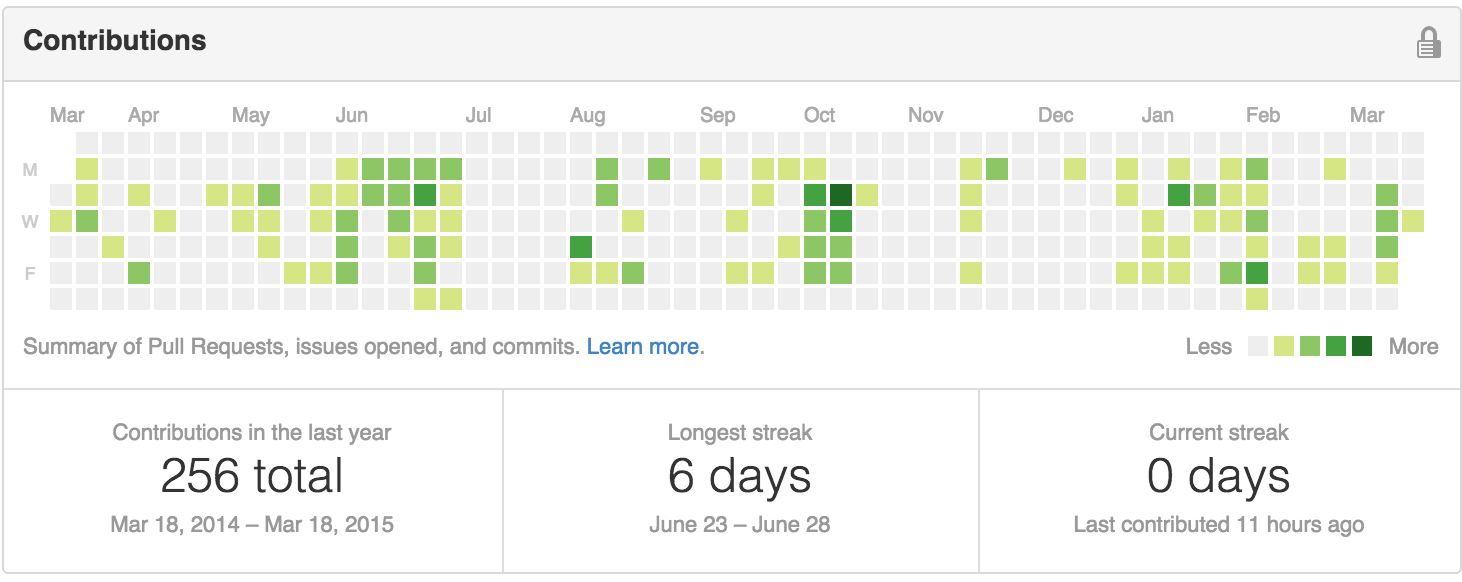
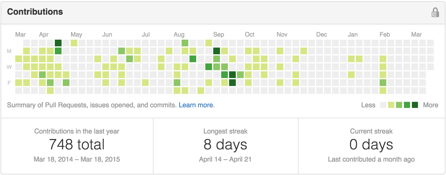
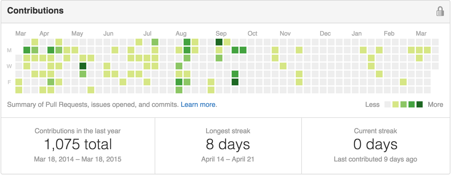
The layout made me think of how punch cards used to be made to program computers, and how the same number of rows in the github visualization would match scores I already had for a music box mechanism I had attached to a coffee tin for amplification. I treated each day as a hole if there was any activity at all.
Print layout design for the musical score to be cut out of the journal and used in a music box to hear. Data from OCR team members Ellery, Ian, Jer and Noa
