
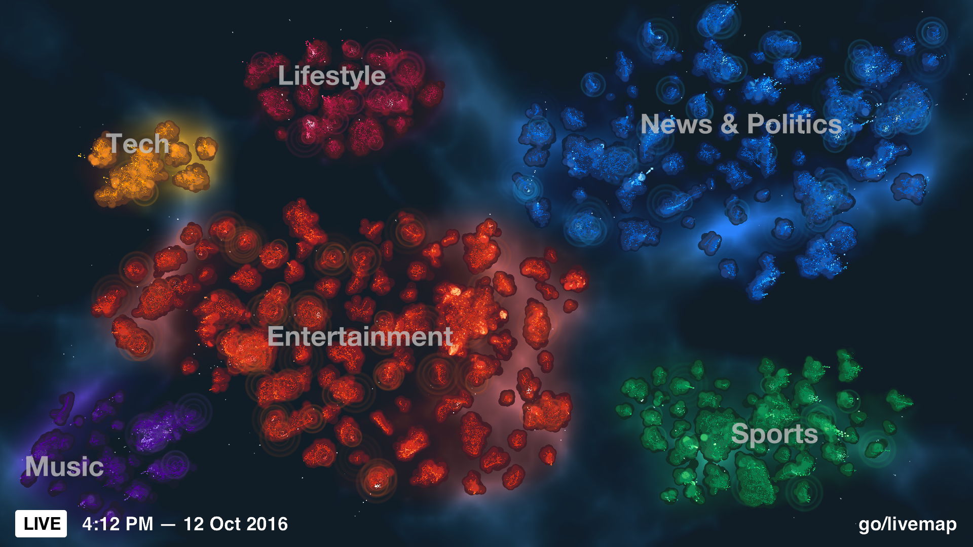


MANIFOLD LIVEMAP
Navigating new geographical representations of the world's largest public conversational tool
Credits
Creative Direction
Jer Thorp
Project Management
A'yen Tran
Creative Lead + UX Design
Genevieve Hoffman
Design Prototyping Noa Younse, Bill Lindemann, Chris Anderson
Visual Design
Gabriel Gianordoli
Spatial Design + Architectural Rendering
Noa Younse
Software Development Marcus Pingel, Ryan Bartley, and Chris Anderson
Role
creative lead, research, user experience, prototyping
Manifold is a data-driven experience of the largest public conversation tool. It is a visualization tool that reveals new
geographies of Twitter and allows for a deeper
understanding of the way information flows across
them. Designed to be installed throughout the social media company's headquarters, it exists as a high resolution interactive tool, as well as a passive experience of live data installed on screens throughout the company. We also did extensive research and prototyping for an interactive multi-screen experience, where different screens would allow for both macro and micro-scale exploration of the platform's data. Manifold was installed in the company's San Francisco headquarters in August of 2017. It has been renamed Aurora and is currently maintained by internal developers at Twitter.
I led the research, design and development phase, overseeing multiple employees and contractors to design, develop and install the piece in Twitter’s SF headquarters.
I led the research, design and development phase, overseeing multiple employees and contractors to design, develop and install the piece in Twitter’s SF headquarters.
Documentation of the final piece just before it was installed at Twitter’s HQ
Context and Cascade
While working at the New York Times R&D Lab, The Office for Creative Research co-founders Jer Thorp and Mark Hansen created a visualization of New York Times articles being shared on Twitter, called Cascade. This was one of the reasons Twitter came to the OCR to conceive of what the "newsroom of the future" might be for a social media platform inextricably linked to how news is sourced, followed and shared online. We had the opportunity to examine the platform from a collective point of view, whereas the many people interacting with it experience a small portion of content curated according to their interests and whom they follow.

Image of Cascade, courtesy of Jer Thorp
Research Stage - The manifold aspects of Manifold
We underwent an in-depth research stage where we conceived of the concept, user journey, spatial design and prototype for the multi-screen tool and live data visualization of the platform.
Our research stage began with a charette, where we sketched various ideas for what we wanted the experience to be, and how we could consider the virtual space of social media as a navigable place.
Our research stage began with a charette, where we sketched various ideas for what we wanted the experience to be, and how we could consider the virtual space of social media as a navigable place.
Our research process began with a design charette to brainstorm ideas of navigating through the experience
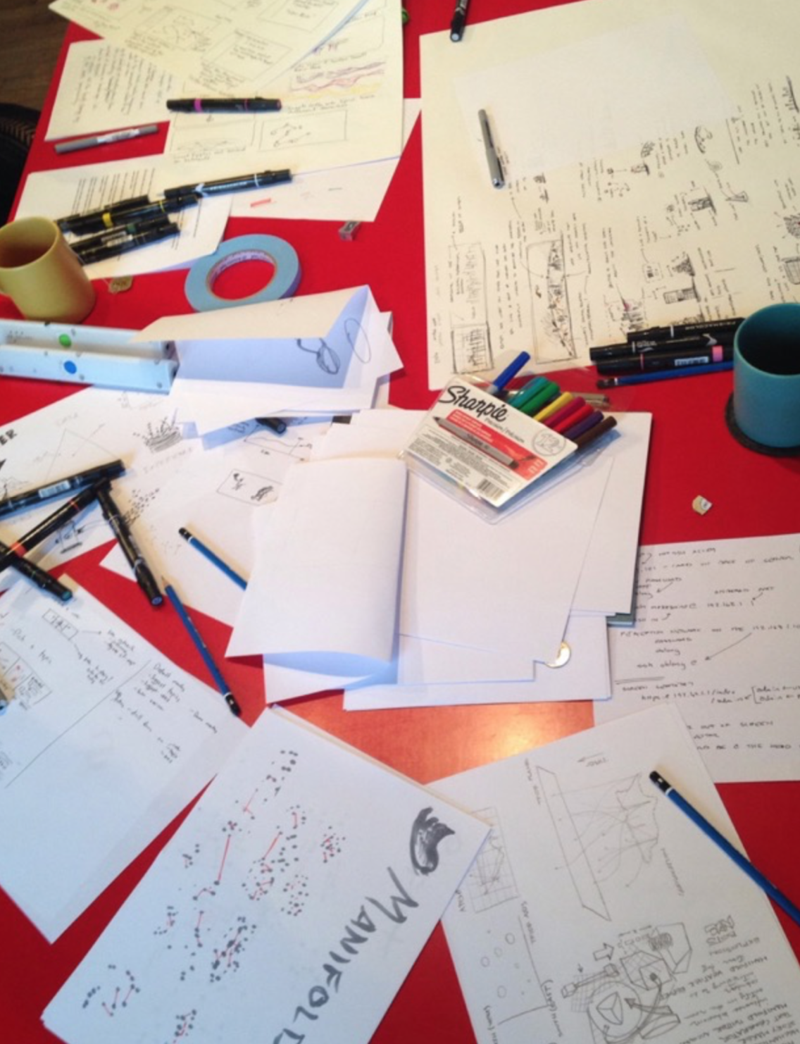
We landed on the idea of a manifold way of looking at Twitter - from many viewpoints all at once - a concept which has a foundation in math, physics, as well as comics.
The many definitions and metaphorical connotations of the piece’s title, Manifold, inform the experience. As an adjective, manifold means “many or myriad.” As a noun, it means “a whole that unites,” but also a “curiosity of many diverse elements.” The ability to zoom in and out of the diverse elements and details that make up Twitter as a whole was a crucial organizing principle of the experience, and one reason why Manifold as a title felt right.
Calabi-Yau manifolds are multidimensional shapes that are important in string theory for describing the shape of hidden dimensions of the universe. A 2D cross-section of a 6D Calabi-Yau manifold.
Images courtesy of Wikipedia.
Images courtesy of Wikipedia.
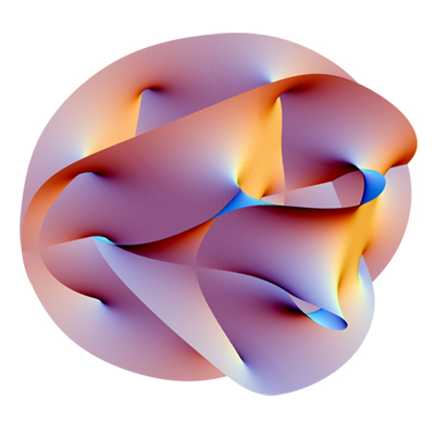

Another cross-section of a Calabi-Yau manifold. String theory claims that every point in spacetime is actually a tiny 6D world with the structure of a Calabi-Yau manifold.
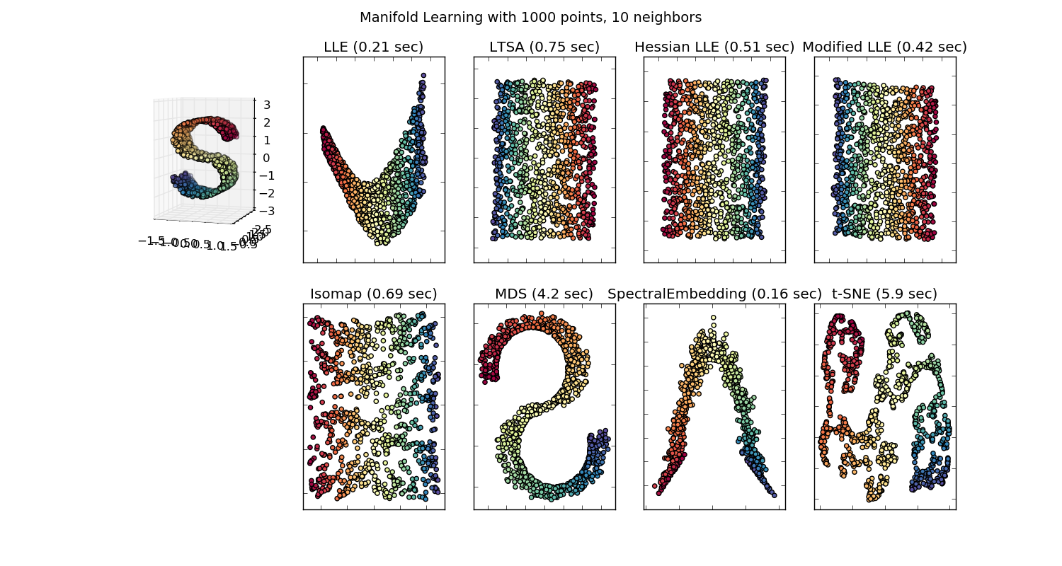
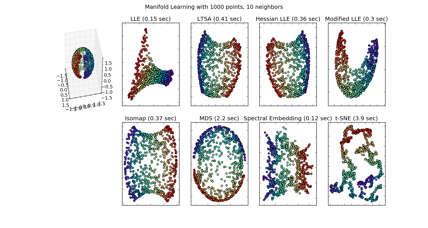
While researching, we were also happy to discover that Manifold Learning is a part of scikit, a set of machine learning tools packaged for python, and represents a set of clustering algorithms that data and computer scientists use to sort high dimensional data. In math and physics, Manifold Dimensions or Manifold Boundaries are unending surfaces, which appear straightforward to anyone placed within them, but represent complex and interconnected spaces that co-exist.
Various results of Manifold Learning dimensionality reduction algorithms from python’s scikit library
In automotive design and electrical work, manifolds are exhaust systems with multiple piped chambers, or the nexus of wires coming together. And last, the actual inspiration for the title comes from Marvel Comics, Manifold is a character who, "using his hands, can mold reality to tear open space and time, connecting one place to another, thus allowing him to teleport to just about anywhere."

Exhaust Manifold for Lexus RC F

Marvel’s Manifold comic book hero
The idea of a Manifold as a space that can reorganize itself with ease according to the specific interests of the viewer, and transitions between different scales of these spaces, was fundamental to creating a delightful but informative experience without being too overwhelming or disjointed.
t-SNE and the Map of Twitter
An internal hackathon at the company had created a tool called the Map of Twitter, where a t-SNE like layout of the top followed accounts on Twitter ended up revealing different clusters of shared interests, due to the majority of people choosing to follow accounts related to a specific topic - like comedy, car racing or cooking - so that users with many followers in common tended to represent a singular interest.
We leveraged this pre-existing layout of users, and built a system to follow the tweets of those accounts, which would be stored and analysed to produce a picture of the conversation happening on the platform at any given moment.
We leveraged this pre-existing layout of users, and built a system to follow the tweets of those accounts, which would be stored and analysed to produce a picture of the conversation happening on the platform at any given moment.
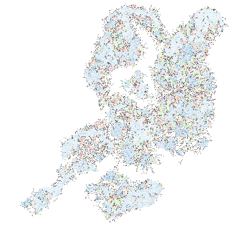
Left: Our first attempt at a t-SNE layout of the top 300,000 accounts on Twitter.
Middle: Laying out clusters based on internal labels
Right: Attempts to subcluster the largest group of users in Entertainment
Middle: Laying out clusters based on internal labels
Right: Attempts to subcluster the largest group of users in Entertainment


Next, we used Processing to create custom prototypes of what we might do with this Map of Twitter, where users functioned like topography, forming a sort of base for their engagement, like the tweets they made and the hashtags they engaged with. We were motivated to understand how these users were connected, and which Twitter users might be active at any moment.
Left: Starting to animate the tweets and hashtags across users in real-time
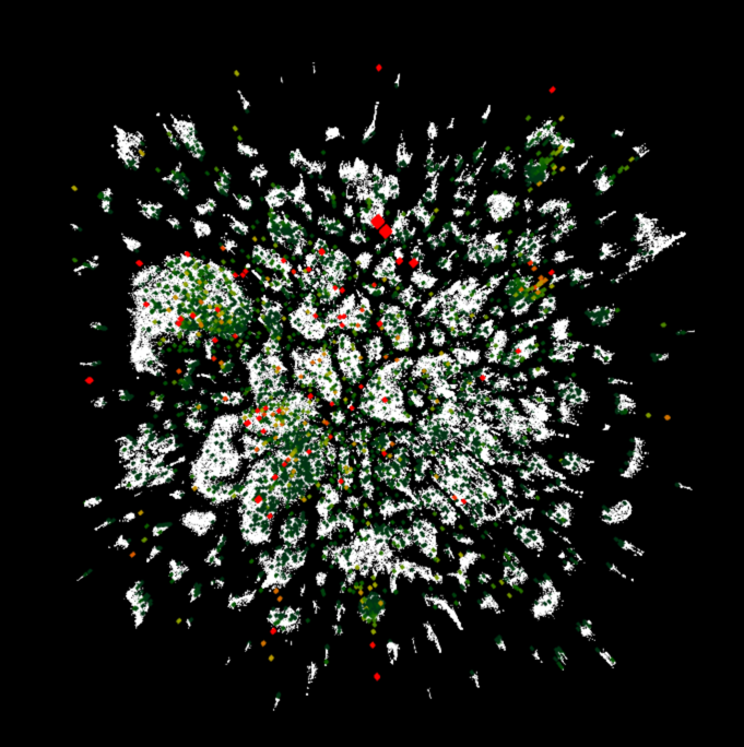
Screen capture of an early prototype inputting the top 300,000 users grouped by shared followers. Follower count elevates the user along the z-axis. Prototype by Noa Younse.
Screen capture of an early prototype of the top followed users in grey, with their tweets in yellow bubbling up in real time. Prototype by Noa Younse.
Screen capture of an early prototype of the top followed users in grey, with the hashtags popular across users near to one another ranging in green (least popular) to red (most popular). Prototype by Noa Younse.
Moving from data exploration to a rich interactive experience
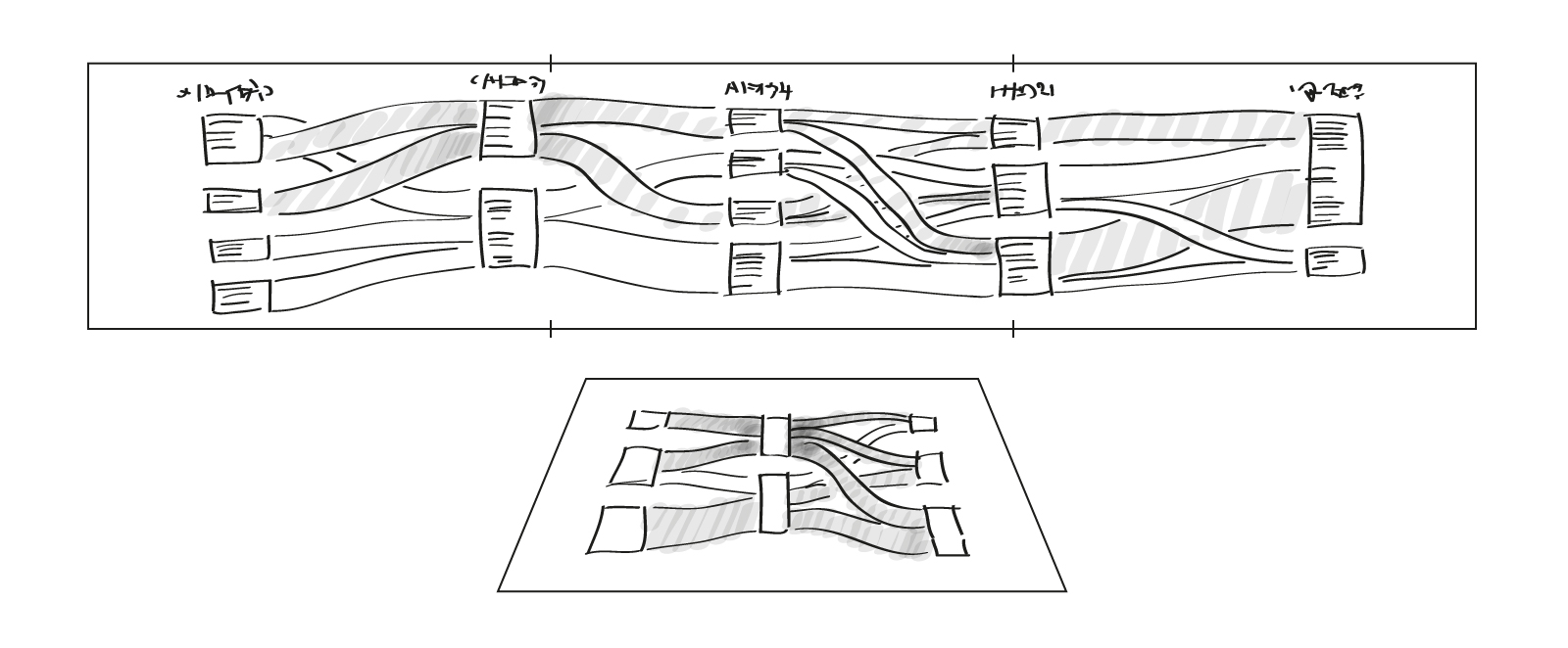
Once we’d done some initial brainstorming and data exploration, I worked with fellow Creative Researcher Noa Younse to create concept sketches of what a larger experience of Manifold could be. We presented an annotated version of these sketches to Twitter at the end of our Research Phase in order to create a functional prototype of the ideas sketched out.
Entry Into Experience
We envisioned an experience where VIPs could come to Twitter and Manifold would show them where they were located on the map


User View
This view would show a user which accounts on Twitter they interacted most with, as well as patterns of their tweets over time

Propagation View
Showing the impact of a single tweet as users across the network engage with it - retweeting, replying and liking.


We also envisioned the ability to compare propagations of various tweets to one another


Community View
Showing a user’s community of similarly followed users. Users are clustered by followers they have in common, revealing communities of users with “shared interests.” These clusters of users would form a basis for the live topics and hashtags they were engaged with at any given moment
Showing a user’s community of similarly followed users. Users are clustered by followers they have in common, revealing communities of users with “shared interests.” These clusters of users would form a basis for the live topics and hashtags they were engaged with at any given moment


Trending Topics View
Like Propagations, which offered a closer look at the engagement with a tweet, the trending topics view would do the same with a hashtag. This view would examine the most popular hashtags from any cluster of users and show the volume of tweets using it over time


Different hashtags might be visualized with different material properties based on the type of engagement users had with the hashtag.
Initial patterns identified:
- cyclical trends (weekly hashtags: #tbt)
- events in the future that the public discusses and anticipates (#Brexit)- unanticipated newsworthy events (#Flight1549)
Initial patterns identified:
- cyclical trends (weekly hashtags: #tbt)
- events in the future that the public discusses and anticipates (#Brexit)- unanticipated newsworthy events (#Flight1549)


This view would also compare the geographic breakdown of where the hashtag most occurs

Navigation Overview
The triptych acts as a viewport as the user flies over the Map of Twitter.
Pointing the wands at the top of the triptych allows the user to drag
down a viewport overlay, a 2D plane where the user can visualize trends
happening in real-time.
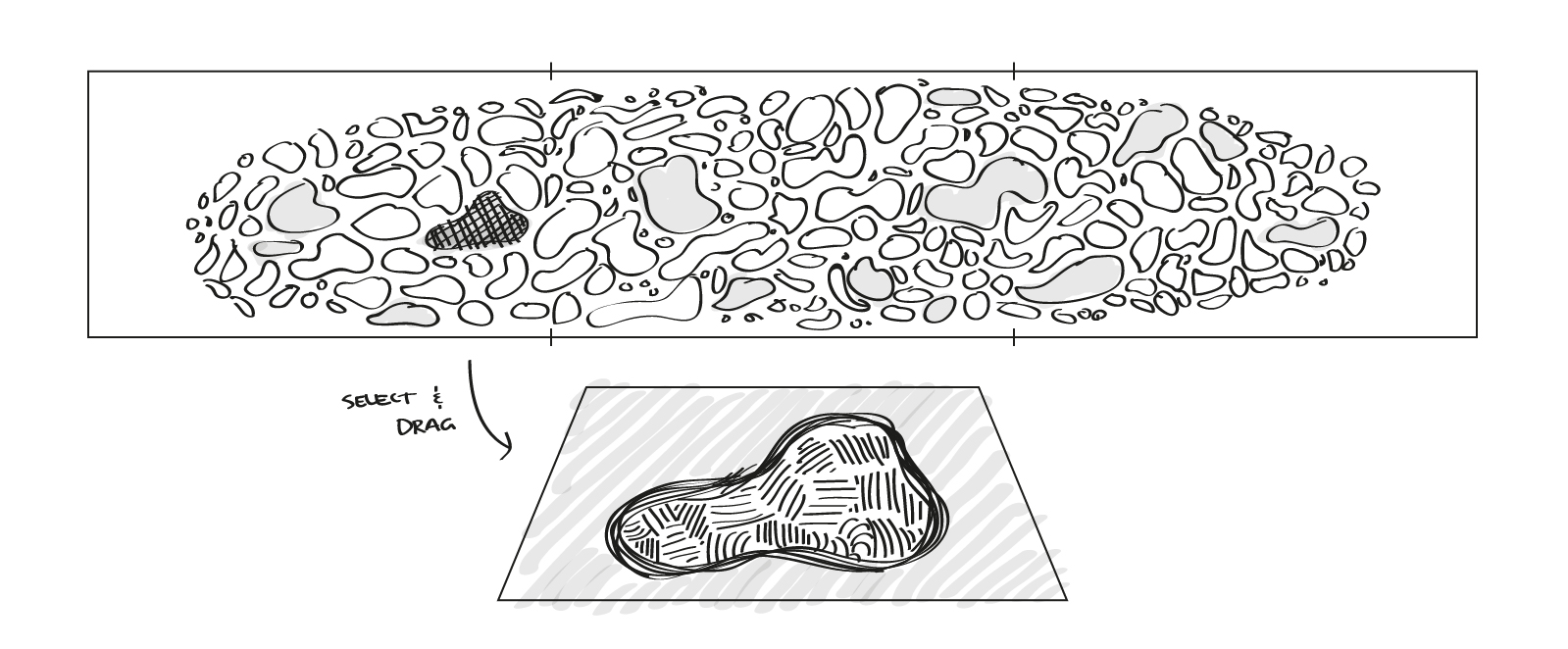
The tabletop depicts the ground plane below the user. It also acts as a
petri dish or microscope to examine detailed views of a user or community
and the tweets that pertain to them. Using the wand, users drag avatars or
communities onto the tabletop to explore them further.

At any moment, users can pin interesting views or visualizations onto vertical corkboards, saving these views for later. These views could act as
breadcrumbs, where clicking them again could zoom into that view on the
triptych.

Gestures
Specific gestures would initiate ways to view data placed on the tabletop,
or to select data from the triptych to explore.
Pushing the wand forward or backward would allow you to zoom in and out over the world and the scale of viewing it
Pushing the wand forward or backward would allow you to zoom in and out over the world and the scale of viewing it
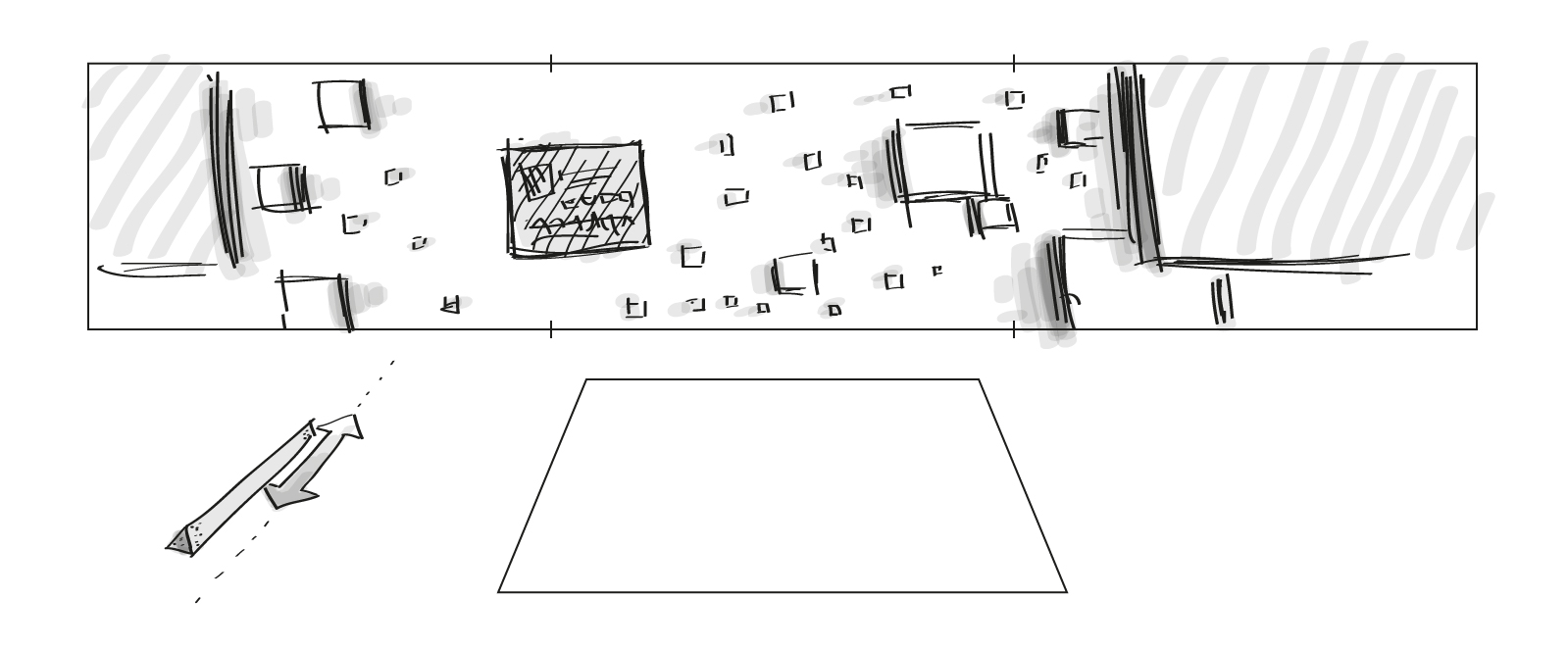
Rotating the wand could show the content sorted by popularity

Sweeping the wand from left to right could depict a historical view of content
In general we envisioned the relationship between the screens and the wands for navigation as
In general we envisioned the relationship between the screens and the wands for navigation as

Making the prototype
Twitter gave us the greenlight to create a working prototype of the complete experience of the Manifold tool. This involved multiple displays, dragging content across them in order to better explore at various levels of detail.
We partnered with Oblong who makes a technology called Mezzanine, that allows for multi-screen collaboration across networked offices. They have a proprietary controller, shaped a bit like a Wiimote, which allows users to grab software windows and drag them across screens. This controller is tracked by a grid of sensors hanging above, which emit subsonic frequencies that communicate with the wand to know where the user is in space. We decided to have our software listen to the same array of sensors and gyroscopes, and used the Oblong controllers as the user input to engage with our custom software.
We partnered with Oblong who makes a technology called Mezzanine, that allows for multi-screen collaboration across networked offices. They have a proprietary controller, shaped a bit like a Wiimote, which allows users to grab software windows and drag them across screens. This controller is tracked by a grid of sensors hanging above, which emit subsonic frequencies that communicate with the wand to know where the user is in space. We decided to have our software listen to the same array of sensors and gyroscopes, and used the Oblong controllers as the user input to engage with our custom software.
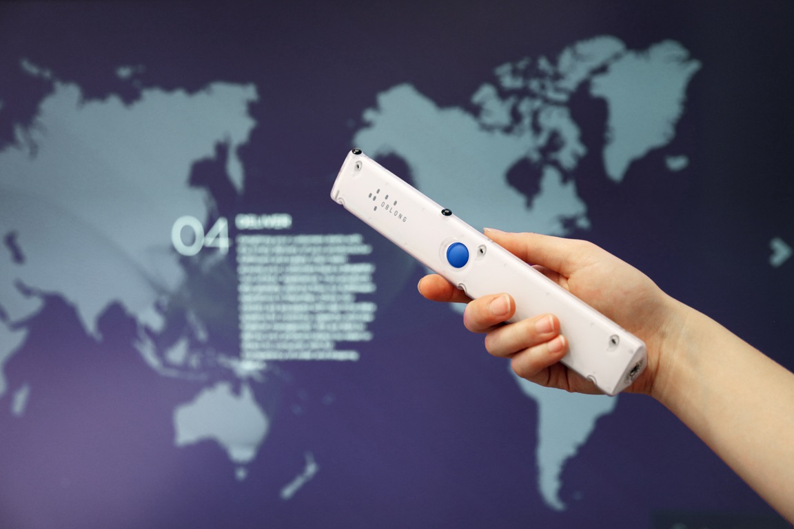
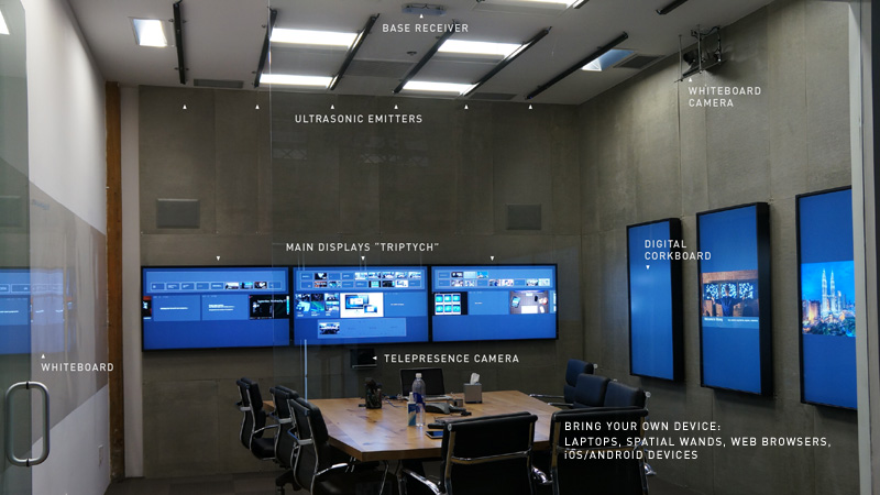
Oblong’s wand and the standard hardware for a Mezzanine system. We used Oblong’s hardware but built our own custom C++ software to communicate with it
We ended up having about six weeks to build a working prototype of the experience. We used a C++ framework called Cinder to build out our visualization layer that communicated with the Oblong wand and sensors to navigate the experience, dragging content across different displays to visualize patterns within the data.
Noa demonstrates the hardware powering the prototype
Chris demonstrates using the wand to fly through the triptych full of users, find a hashtag, save it to the pinboard, and explore it in more detail on the tabletop
Passive listening vs active exploring
Twitter was excited to continue developing the project. They wanted a design pass so that our visualizations would better match internal branding they’d be unveiling. They also wanted to move the project along before finalizing all the details of a permanent installation for the experience in their HQ.
As an intermediary step to gain traction for the project, we developed a passive version of the visualization, which was designed to be streamed internally across screens installed in Twitter’s offices worldwide.
As an intermediary step to gain traction for the project, we developed a passive version of the visualization, which was designed to be streamed internally across screens installed in Twitter’s offices worldwide.
Documentation of the passive Livemap version of Manifold. Footage shot in Twitter’s NYC offices
Designing for intuitive gestural control
After finalizing the passive experience, we returned to developing the interactive one. As UX Designer, one of the many challenges of this project was how to give the user feedback for the variety of things the wand could do. A primary function of the experience was "flying." To do this, a user held down the button on the wand while moving around in space. As they held the button longer than a second, the wand cursor became an arrow, indicating that they could fly and move forward, backward, left and right through the virtual space.
Pointing the wand upward indicated that the user could shift the experience between the "cluster view" and the "geographical view," toggling the users between where they were positioned according to their interest vs where they were positioned on the globe. Pointing the wand fully to the left activated a "back button," where users could return to previously selected views.
Pointing the wand upward indicated that the user could shift the experience between the "cluster view" and the "geographical view," toggling the users between where they were positioned according to their interest vs where they were positioned on the globe. Pointing the wand fully to the left activated a "back button," where users could return to previously selected views.
I designed a variety of visual indicators to tell the user what behavior would be triggered by a particular gesture




Designing for a permanent interactive installation
We proposed a variety of configurations for the permanent installation, taking into account multiple scenarios for Twitter to install the piece. The intention was for the piece to function as both a tool for discovery, as well as a demonstration of interesting threads on the platform. Some of the configurations accomodated seating, as well as the variety of screens and surfaces we envisioned for the project.
Renderings of Manifold in various rooms in Twitter HQ. Architectural modeling and rendering by Noa Younse
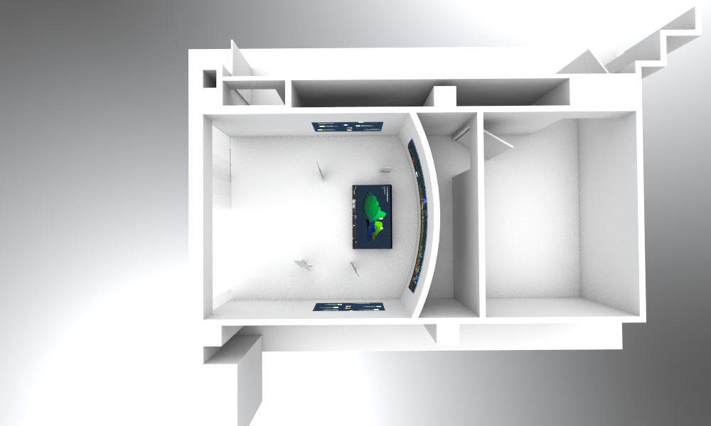
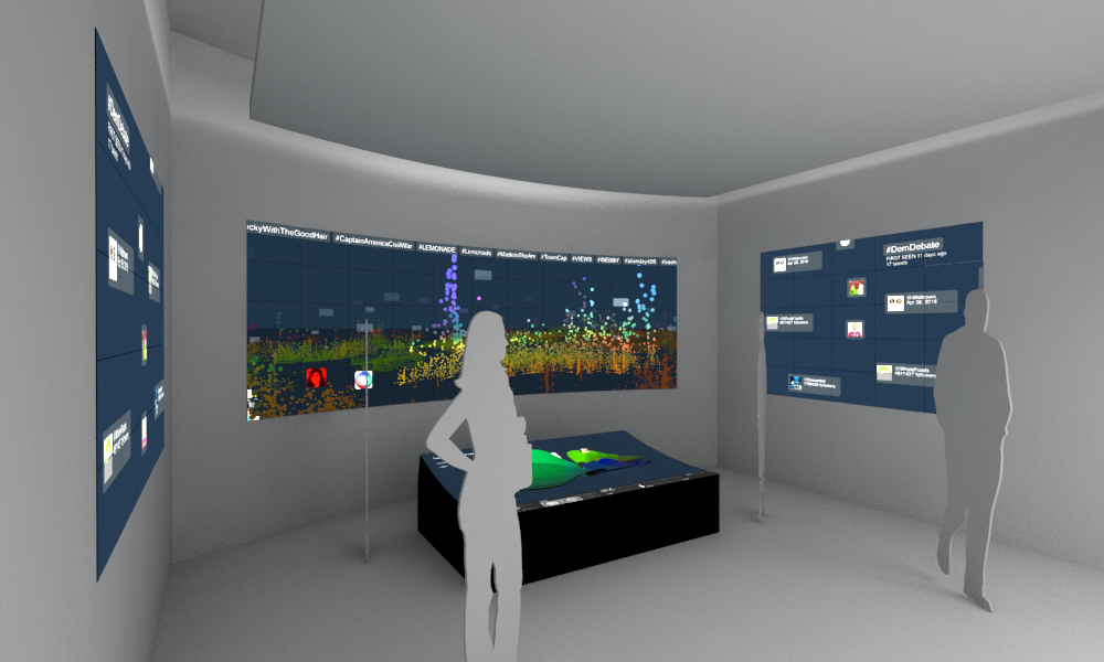


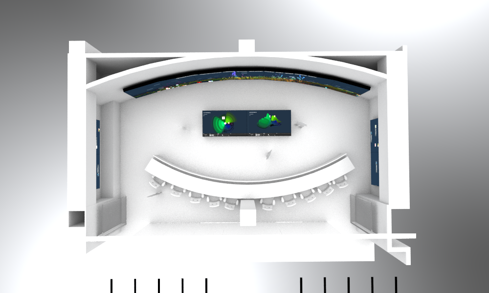


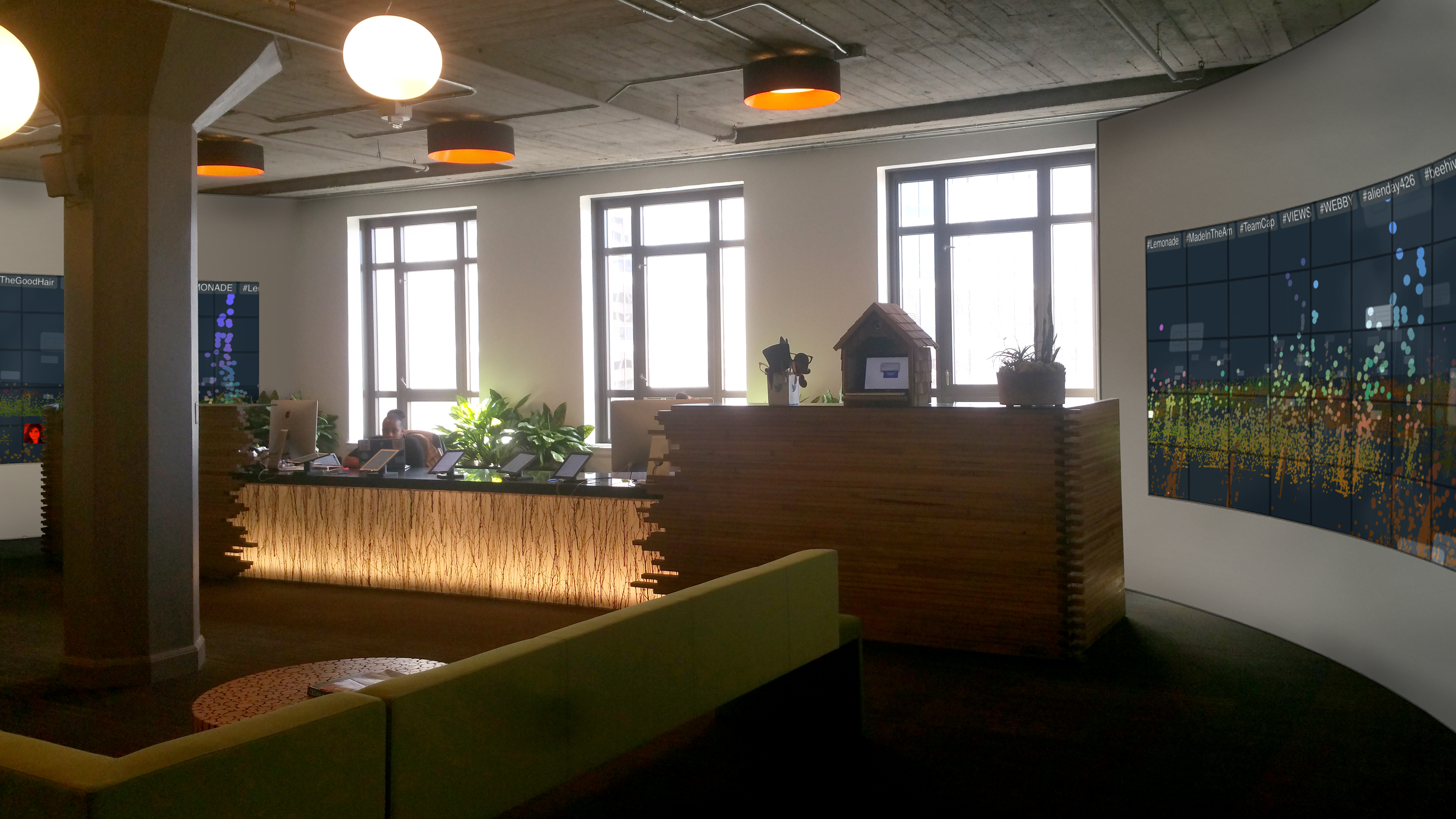
To save money and time, we ended up repurposing existing screens in Twitter’s lobby and installing the Triptych portion of Manifold. Two large screens faced one another on opposite ends of a large lobby area. One one side, we installed our grid of sensors for interactivity. On the other, a passive version of Manifold ran, much like it had on the smaller screens throughout Twitter’s offices in the past.


Photoshop renderings depicting various methods of modifying the existing space to accomodate pinboards and tabletop screens
Installing Manifold at Twitter
We ended up installing a pared down version of the full tool we’d imagined, focusing on the Triptych with the live map of twitter for people to explore and engage with. The visualization is situated in the main lobby where guests to HQ enter, ensuring that it’s a stop on most tours.
The final installation at Twitter HQ. A’yen demonstrates flying around the interest view
A tour group from Girls Who Code try out Manifold in the geographical view