

FLINT IS A PLACE - FPD MAP VISUALIZATION
Recreating a day with the Flint Police Department as a spatial experience of audio and data
Credits
Created by
Zack Canepari
Art direction + Graphic Design by
Guillermo Brotons
Interactive Design + Development by
Frederik Delmotte
Producer
Screen Projects
Interactive Map by
Genevieve Hoffman
Role
prototyping, data scraping, data analysis, data visualization, front-end development
Created by
Zack Canepari
Art direction + Graphic Design by
Guillermo Brotons
Interactive Design + Development by
Frederik Delmotte
Producer
Screen Projects
Interactive Map by
Genevieve Hoffman
Role
prototyping, data scraping, data analysis, data visualization, front-end development
Flint is a place is a cross platform episodic documentary series about Flint, Michigan. The project seeks to document a specific moment within this American city both as it’s perceived and experienced.
The idea is not to show people some place that they don’t know. The idea is to put them in a place that they think they do know. The FPD Chapter sits alongside other episodes that portray various stories of life in Flint - from teens going to their high school prom to a single mother trying to raise her son.
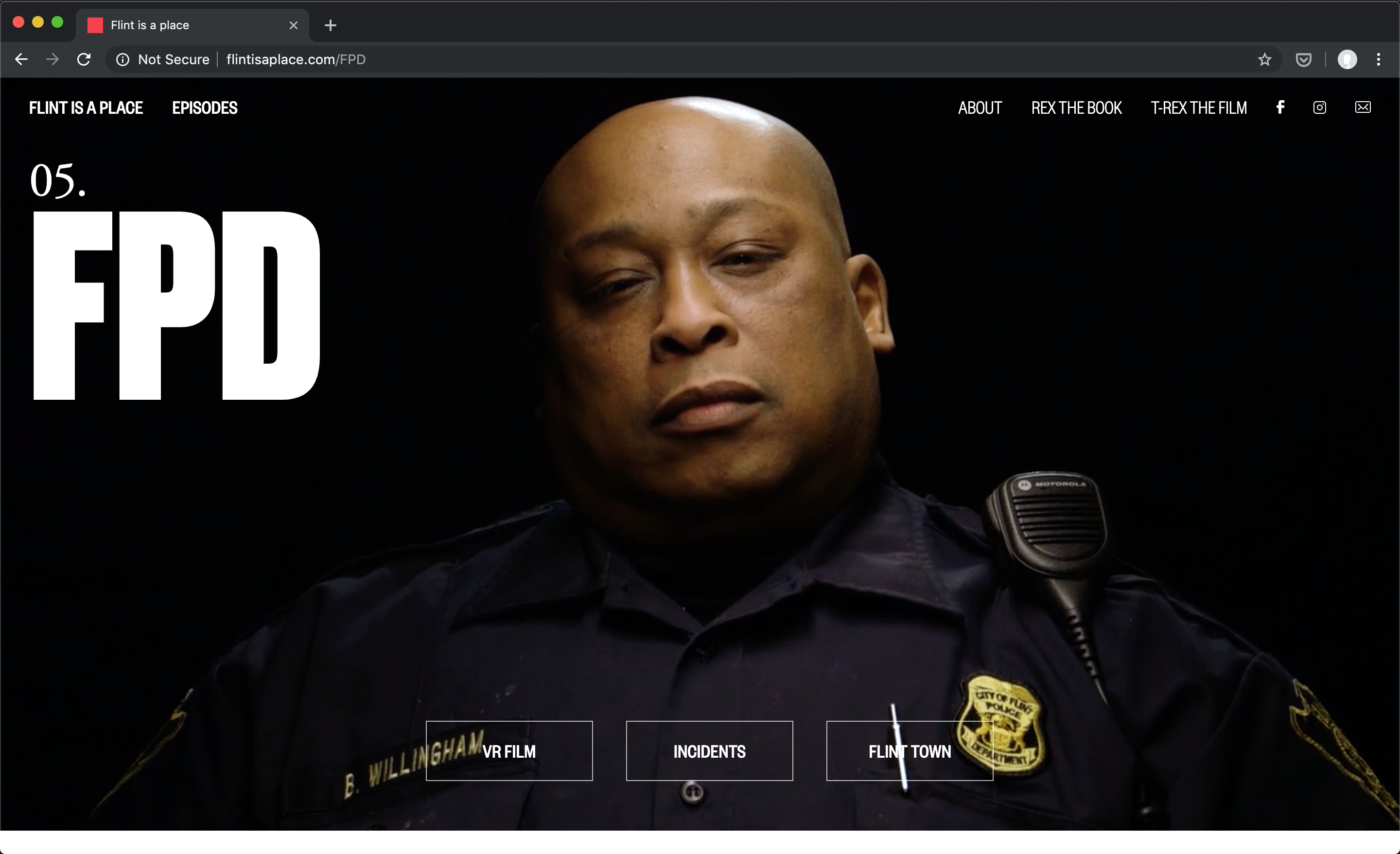
In 2016, there were only 98 Flint Police Officers serving a city of 100,000. That is the smallest number of officers of any comparable city in America. Between the high crime, the lack of jobs and the recent water crisis, the FPD is a department in crisis policing a city in crisis. The map documents one week of calls for service in Flint and the challenge the department faces as it tries to meet the demands of a community on the edge.
In 2016, there were only 98 Flint Police Officers serving a city of 100,000. That is the smallest number of officers of any comparable city in America. Between the high crime, the lack of jobs and the recent water crisis, the FPD is a department in crisis policing a city in crisis. The map documents one week of calls for service in Flint and the challenge the department faces as it tries to meet the demands of a community on the edge.
Background
Zack Canepari approached me after I gave a talk to his group at Screen Interactive, a workshop for photographers and filmmakers looking to bring more interactivity into their work. He was interested in creating a map of a week's worth of 911 calls in Flint, MI to accompany an episode about the Flint Police for his interactivity documentary Flint Is A Place. I mainly knew of Flint from Michael Moore's documentary Roger & Me, about the shuttering of the GM Plant that operated there, since this was in 2015, before the water crisis was made public. At this point, Flint was known more for once topping the nationwide per capita murder rate, a city half the size of what it once was at its peak. With a dramatically reduced tax base but the same area to cover, Flint Police officers were left sprinting to meet an increasingly unrealistic demand with the resources at hand.
Zack is the creator of Flint Is A Place, an interactive documentary showcasing aspects of people's lives who live in Flint. Some episodes are upbeat, like Prom, which follows a group of teenagers as they go to the most important dance of high school. Others are more introspective, like Briana's chapter, who is the younger sister of Flint's pride and joy, Claressa Shields, who at 17 won the gold medal in women's boxing the first time it qualified as an Olympic event, a journey that Canepari captured in his previous feature-length documentary with Drea Cooper, T-Rex (Claressa Shield's nickname).
Zack is the creator of Flint Is A Place, an interactive documentary showcasing aspects of people's lives who live in Flint. Some episodes are upbeat, like Prom, which follows a group of teenagers as they go to the most important dance of high school. Others are more introspective, like Briana's chapter, who is the younger sister of Flint's pride and joy, Claressa Shields, who at 17 won the gold medal in women's boxing the first time it qualified as an Olympic event, a journey that Canepari captured in his previous feature-length documentary with Drea Cooper, T-Rex (Claressa Shield's nickname).


The result of our collaboration is the Flint PD chapter's Incidents Map. The Incident Map follows a day's worth of calls made to the Flint police dispatcher. These incidents were recorded and broadcast over radio to officers on duty. Audio recordings of these communications were archived by Broadcastify. In order to recreate the sense of overwhelming demand and immediacy of decisions, we combined time-based data from the police department documenting the types and locations of the incidents, data from Facebook documenting the community's concerns and conversation around various events, and audio recordings of the dispatch communications to co-exist on a map of the city as we replay a day in Flint from the perspective of those trying to protect and serve it.
Context
The Incidents Map sits within a larger multi-format narrative about the Flint Police Department. Officers become characters in the documentary miniseries Flint Town on Netflix. Policing Flint uses 360 video to situate the viewer in their world as these officers make tough decisions about which calls they can attend. The VR film was featured in the New York Times and is viewable on their app.


Alongside the Incidents Map in the Flint PD chapter are the Policing Flint 360 video experience created for the New York Times, and the Flint Town documentary series, available on Netflix.
In addition, officers have written personal essays on what being a cop in Flint is like for them. This editorial grounds the chapter in their own voices.
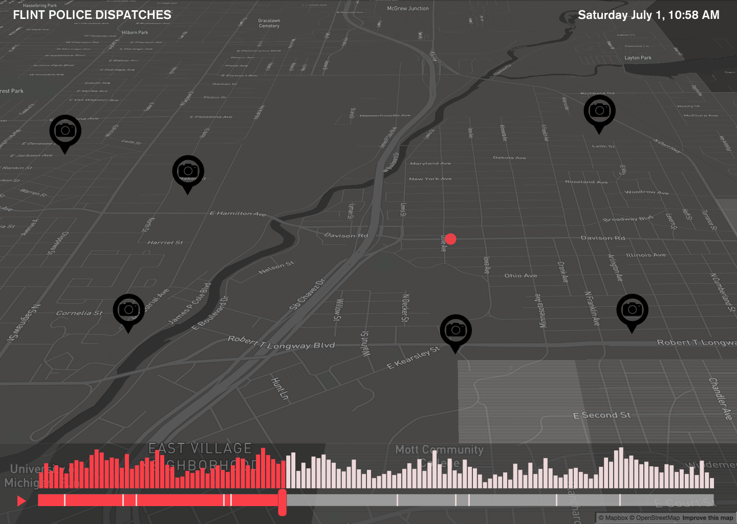
The Incidents
Incident data as well as audio form the basis for the experience. 911 calls are fielded by the police dispatcher, who enter them into the system and alert officers on patrol to what is happening and where. Both the dispatchers and the officers need to prioritize what they can actually respond to. As officers explain in the documentaries, the moment they start a shift they are already behind, and are forced to make hard decisions about what incidents will even be investigated. Many incidents in the dataset that the Flint Police Department shared with us were closed without any officer following up.
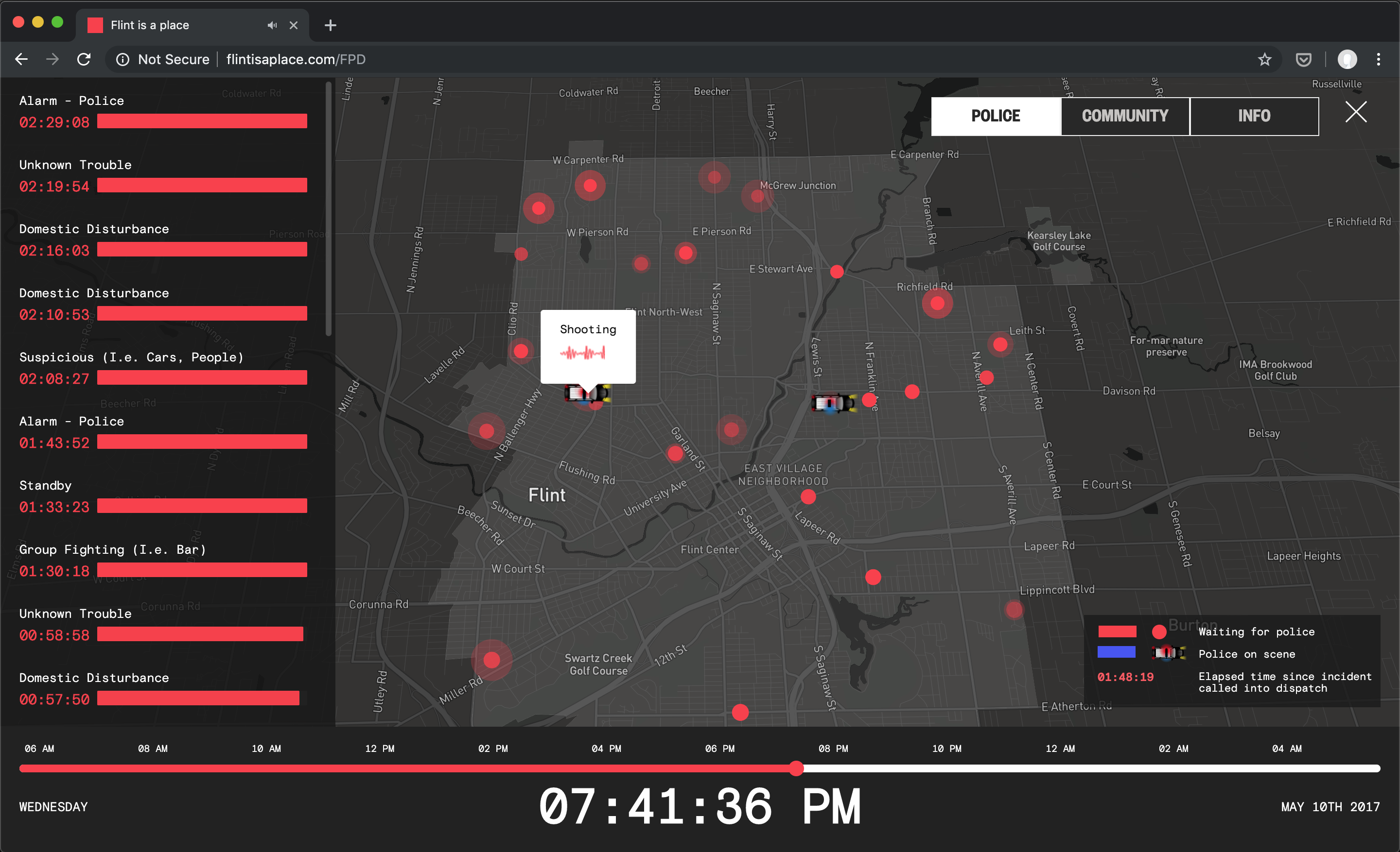
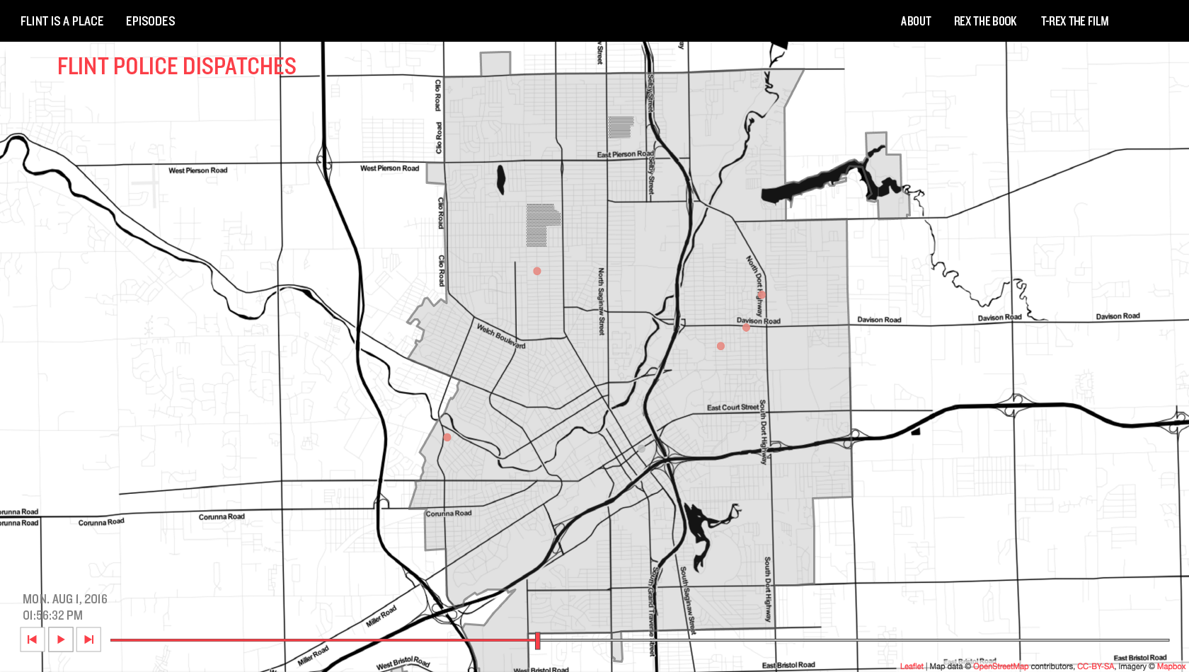
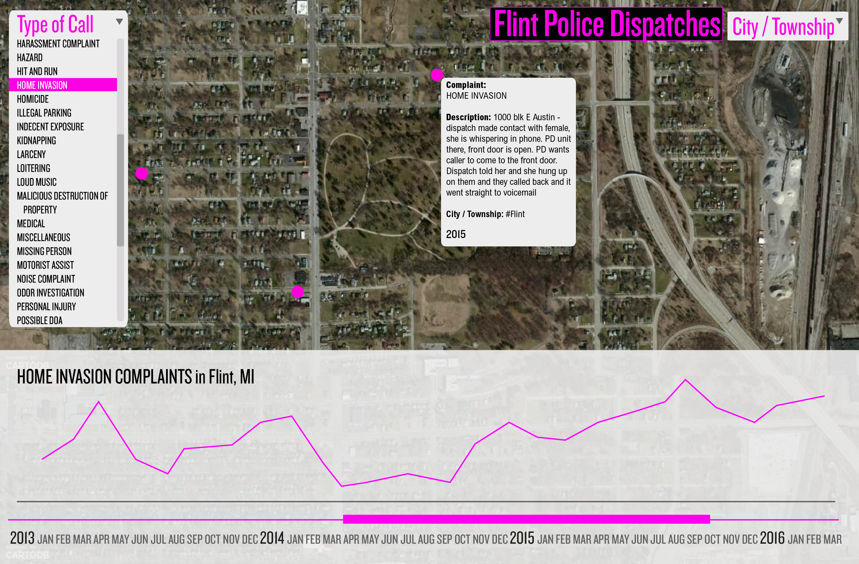
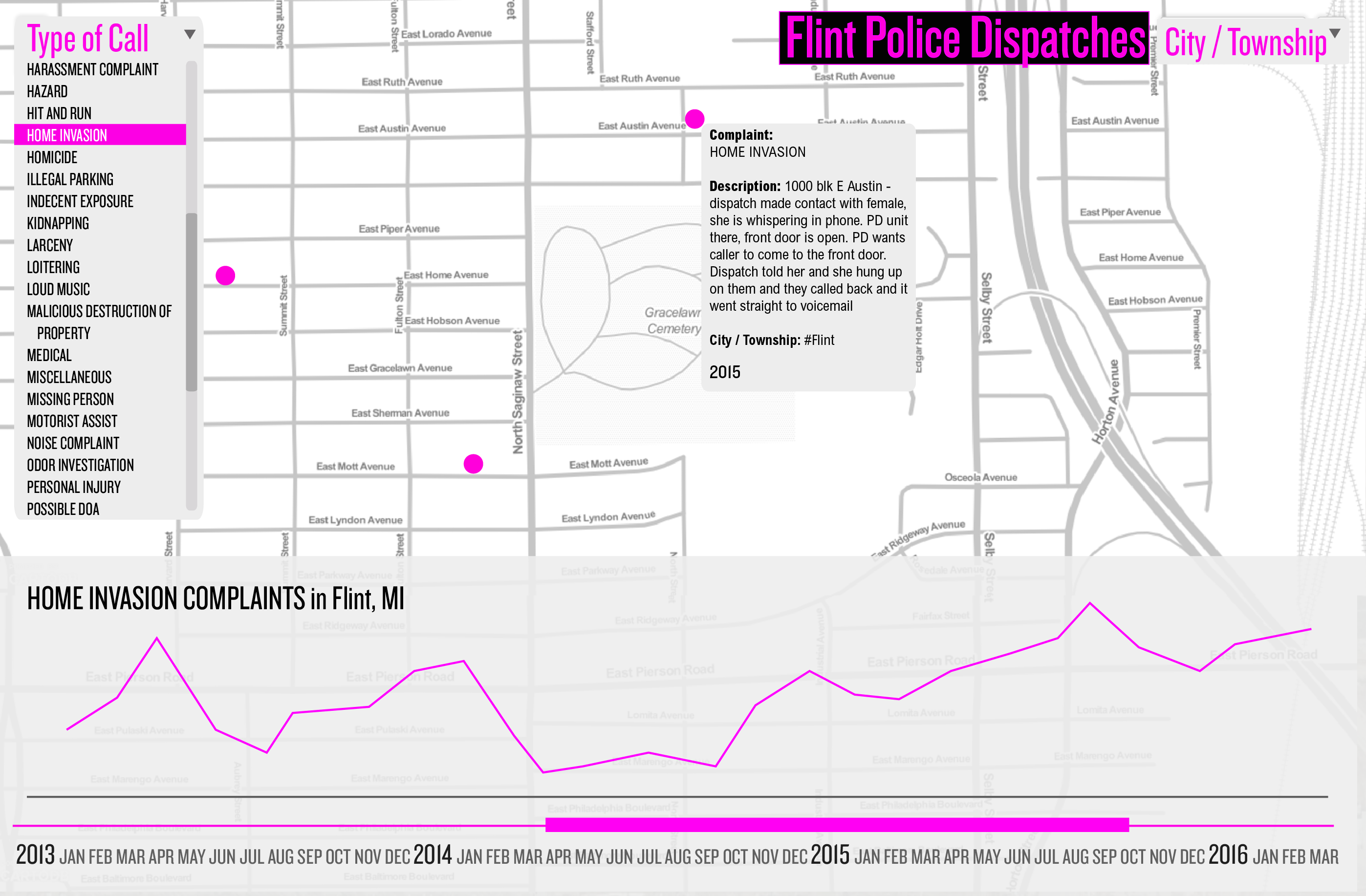
 The landing page to the Flint Police Department Incidents Map gives background about Flint and the budget crises the police department has faced in the midst of growing demands on their services
 The primary view of the Incidents Map shows active calls at a given moment within the 24 hour period, where blue incidents show where patrol units are and red incidents show which are still waiting for police to investigate
The Community
Data from a community watch group on Facebook was scraped and showcased on the map, highlighting which incidents prompted the community to comment on and what they chose to say. I used custom software to scrape and parse the comments into a usable format, then matched these comments to incidents from the police in order to locate them on a map based on corresponding timestamps and descriptions.
 The Community view shows plots a week’s worth of Incidents that had Facebook group engagement
 Clicking on an icon revealed the conversation, removing personal details and names to protect people’s identities
Sorting through the Info
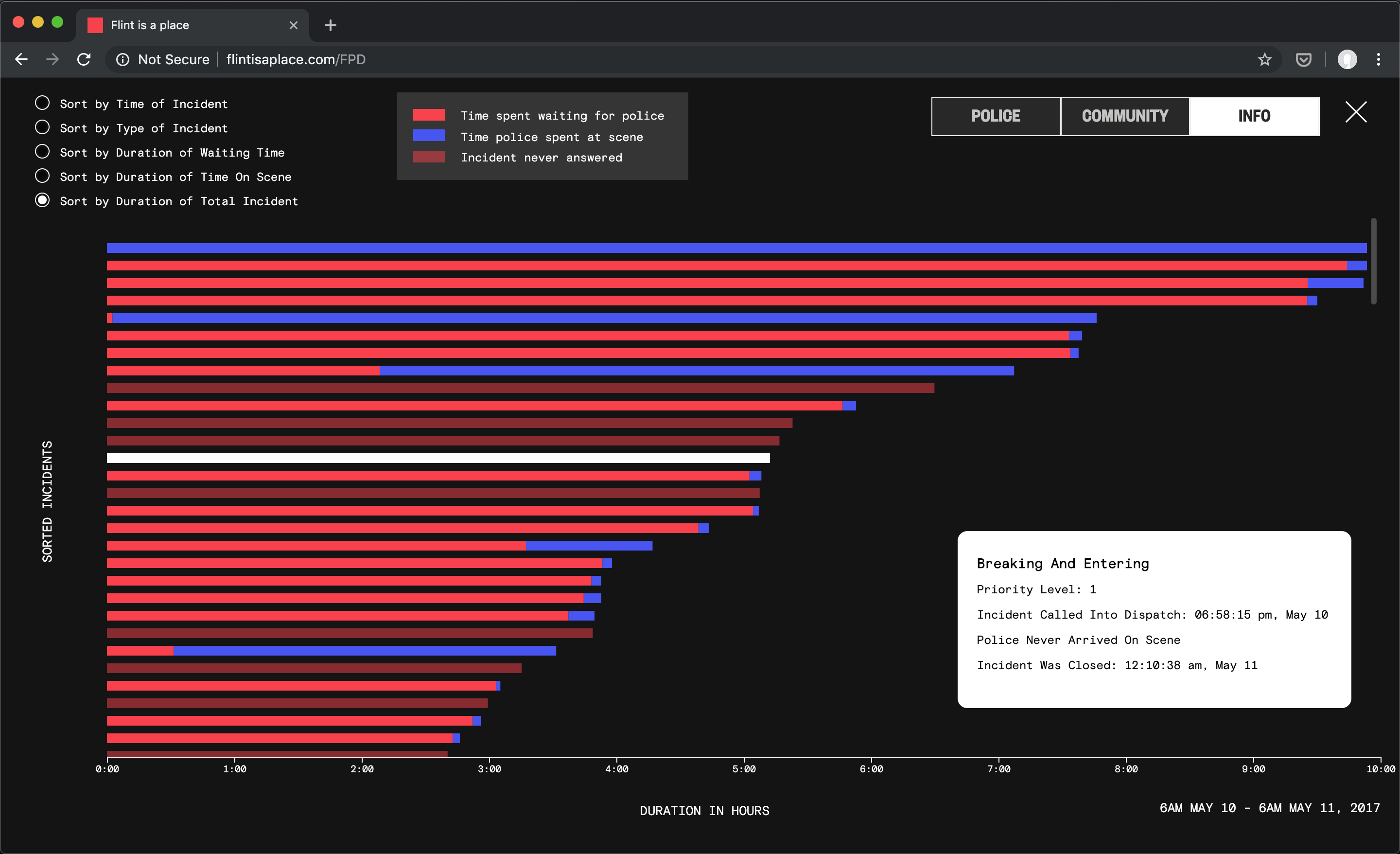
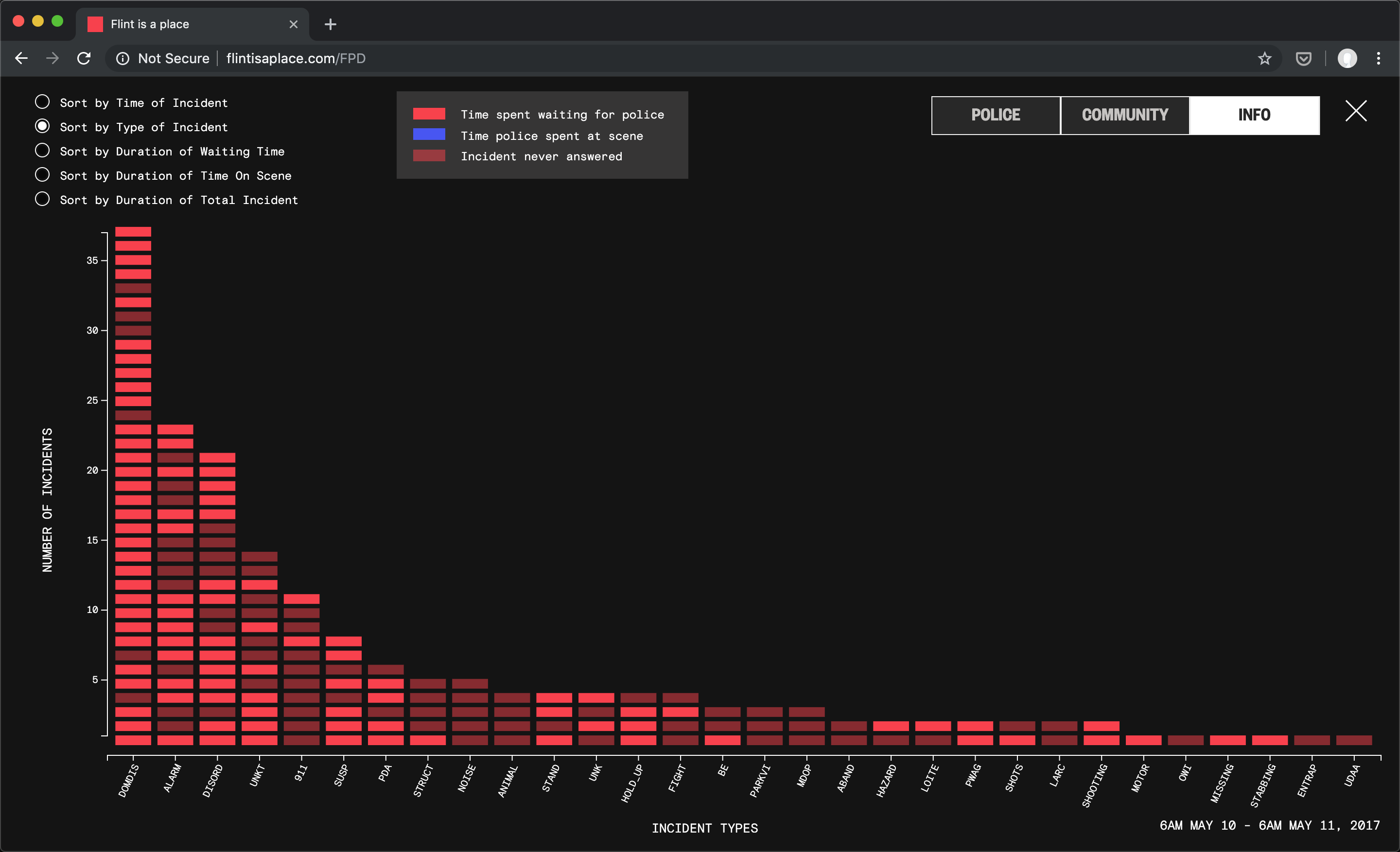
The last view allows the user to explore the incidents in more detail, digging into how long wait times were for various incident types, whether the police showed up (less opaque incidents show that a police unit never appeared and the incident was closed without followup).
The time-based view shows the incidents as they piled up and overlapped with one another. Some lasting almost a full 24 hours, and others barely registering.
The type-based view shows which types of incidents occurred more often during the course of these 24 hours.
The wait-time views sort the incidents both by the amount of time waiting for officers to appear (red) as well as the amount of time the officers spent at the scene (blue).
Highlighting a bar reveals the incident’s info, such as type, priority level, time called into dispatch and time it was closed. Bars with less opacity were ones the police were never able to follow up with.
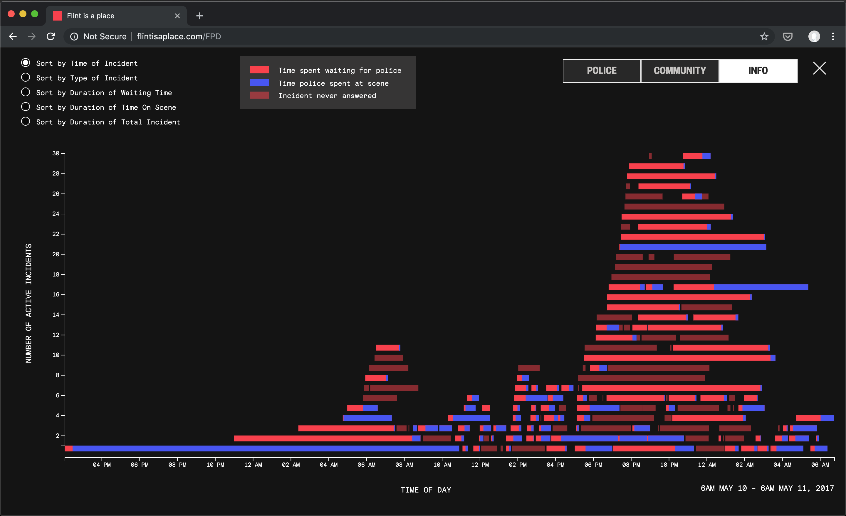

Time and duration view
Type view
Wait-time view
Sourcing and reconciling the data
As mentioned previously, the map incorporates three main datasets - the list of incidents with timestamp and location from the Flint PD, the community's reactions scraped from Facebook, and audio from Broadcastify, which archives all police dispatch radio for a full six-months after an incident.
The audio proved to be the most challenging to work with, both from a front-end development standpoint, as well as finding a way to match them to incidents. Early prototypes playing through the audio on the timeline, but having no way to connect it with the incidents on the map proved less effective and interesting. We worked hard to come up with a way to visually connect the audio clips to incidents they describe.
The first step in making this happen was running the audio files through custom software provided by Matthew Goldstein, which allowed us to transcribe the audio files with software trained on police dispatch radio soundbytes. Now, instead of 30 minute long audio files, we had shortened clips, trimmed to where the audio started and stopped, and tagged with the timestamp based on when the audio happened over the course of the day, as well as transcripts of the audio files generated by Matt's software.
Next I took these clips and wrote my own software to sort them into the incidents they could have pertained to, solely based on timestamps. This reduced the amount of clips we'd need to listen to in order to match them to incidents.
Then we manually matched police recordings to the incidents. Thanks in large part to the help of Flint native Layla Meillier, who was familiar with street names and other landmarks in the audio recordings, we were able to match audio to a day's worth of incidents.

Exploratory Analysis
In order to get a feel for the incidents data, I used software like python and Jupyter notebooks, d3.js and mapbox gl js to make quick visualizations of the incidents and how they broke down by type, time, and location.
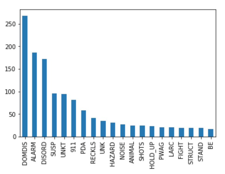
Counts by incident type over a week
![]()
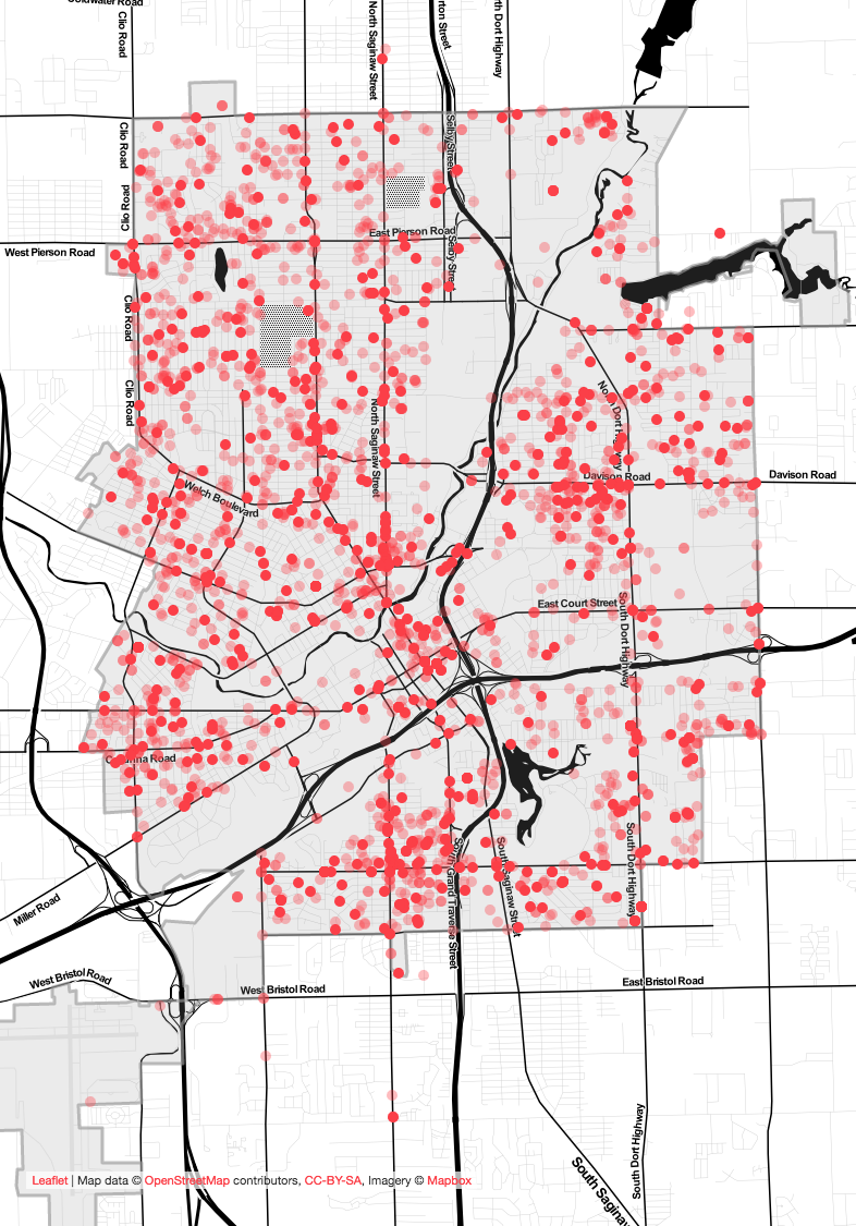
Density map of a week’s worth of incidents
![]()
Scatterplot of types of incidents over time
![]()

Design Iterations
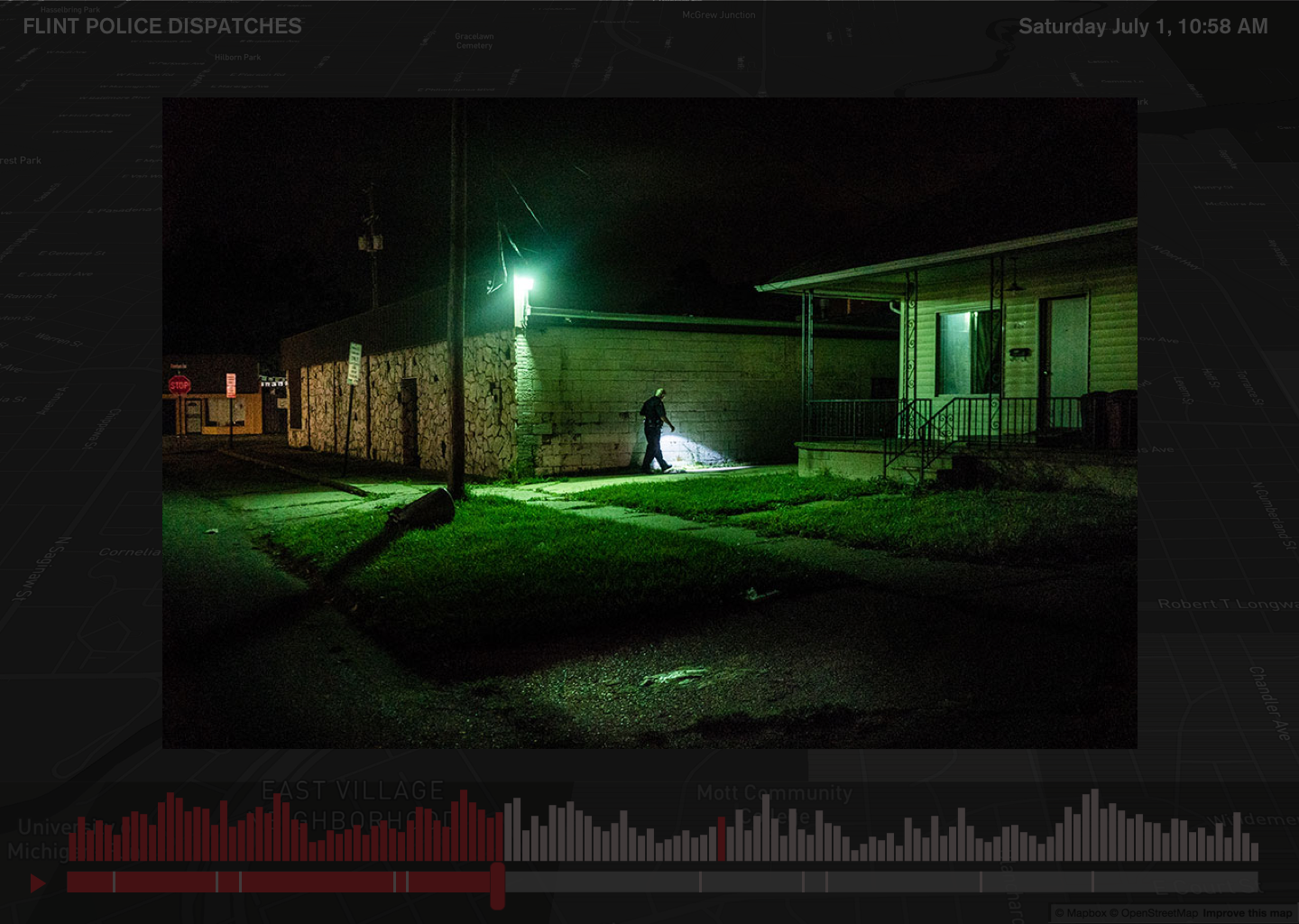
The prototype went through many iterations to understand how the data should co-exist. I also prototyped a way for the map to contain pins for various photos Zack had taken on ride-alongs.
Examining a patrol unit’s week for the OCR Journal
While working on this project I was also involved with creating the second edition of The Office for Creative Research's journal, a print and online publication with essays and art by staff and friends on interesting datasets and stories. I decided to use the Flint police incident data to see what it might be like to plot the stops a unit was able to make along the course of their patrol shift. These paths traverse all over the city, without much geographical logic or optimization. The piece also exists as an article on Medium.
