
EMPIRE
Experiencing the legacies of Dutch colonialism as an interactive documentary
Credits
Directed, produced, shot and edited by Eline Jongsma and Kel O'Neill
UX and Visual Design by
Clint Beharry
Web Development by
Genevieve Hoffman
Additional Development by
Sam Bailey
POV Technology Fellow
Brian Chirls
Exec. Producer for POV Digital
Adnaan Wasey
Exec. Producer for POV
Simon Kilmurry
Role
front-end web development and prototyping
Empire is an immersive documentary project that examines the still-unfolding legacy of Dutch colonialism. The project is truly cross-platform, displayed as multi-channel film installations in galleries, as a book, and as an interactive web experience.
I was approached by the filmmakers, Eline Jongsma and Kel O'Neill, to develop the interactive website. I worked with them to prototype interactions that suited each of the four organizing chapters - Cradle, Periphery, Migrants and Legacy. Since the films had first been experienced as multi-channel installations in physical space, I tried to create a web-based experience that would provide ways of experiencing multiple films at once, while still allowing the viewer to focus in on material they found compelling.
Empire:Interactive was featured in the DocLab new media exhibition of the 2014 International Documentary Film Festival in Amsterdam, won the 2015 Webby for Interactive Documentary and was nominated for an Emmy in Interactive Documentary. It is currently on view at POV (PBS's documentary arm), and is one of six interactive documentaries to be featured on POV's website.
Post-colonial themes told with a variety of media
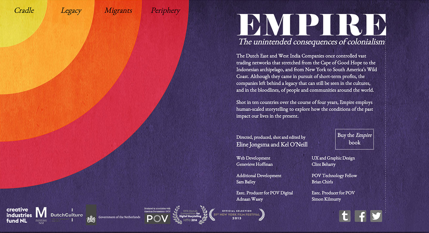
Empire is a multi-platform documentary that explores the unintended consequences of colonialism - specifically of the Dutch East and West India Companies, which once controlled vast trading networks that stretched from the Cape of Good Hope to the Indonesian archipelago, and from New York to South America's Wild Coast.
Although they came in pursuit of short-term profits, the companies left behind a legacy that can still be seen in the cultures, and in the bloodlines, of people and communities around the world. Shot in ten countries over the course of four years, Empire employs human-scaled storytelling to explore how the conditions of the past impact our lives in the present.
The project was also an experiment in multi-format storytelling, and exists as a series of physical installations, a book, and the web documentary that I developed. Read more about the project and various storytelling forms employed by the creators in this article by Beyza Boyacioglu on MIT’s docubase.
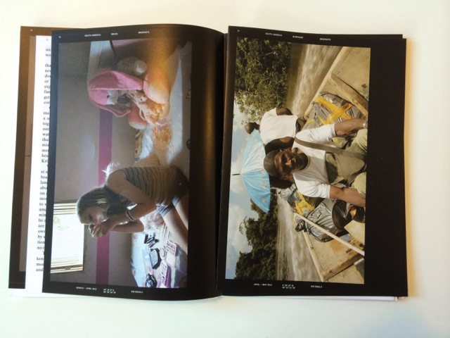
Empire in art book form. The directors are pictured wearing sanitary masks. Images courtesy of Jongsma O’Neill


From the film festival to the screen
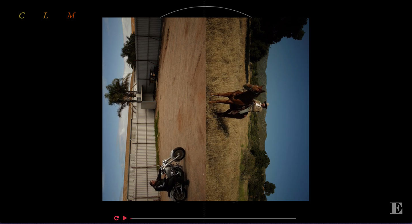
Empire had already had an evolution as short documentary films installed in galleries and festivals when I came onboard as a front-end developer to bring those films to the web. The challenge was how to create an experience of the media that would mimic how people had encountered the multi-channel installations in space. For instance, in the Cradle section, two visual experiences share the same soundtrack, and viewers had encountered the two "sides" of the film by walking around a hanging screen and choosing which side to watch. We mimicked this choice by using CSS3 animations and simple user input to flip the video canvas as the soundtrack and films play.
Screen recording of the Cradle section of the website, which flips the video along the z-axis with CSS3 animations
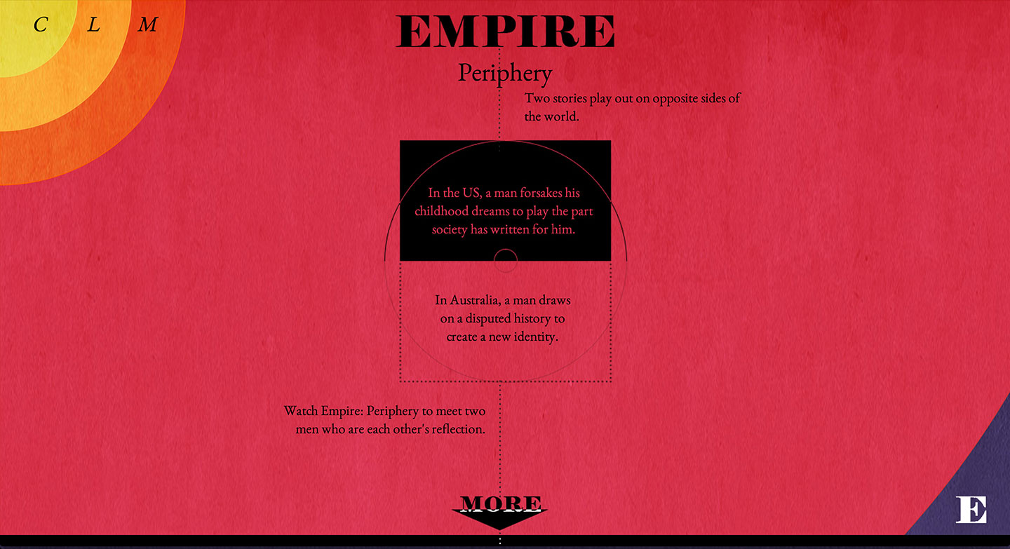
Screen recording of the Periphery section, where a similar technique was used to flip the video along the x-axis, revealing a different soundtrack depending on which character was rightside up
Visual and UX Designer Clint Beharry did an amazing job developing the visual look of the web experience, which referenced old maps on scrolls, harkening back to days when the Dutch East India Trading Company traveled the world and settled in these remote areas.
Moodboard by Clint Beharry of the visual design for the website
A visualization of the viewing experience
We wanted to leverage some of the advantages of the digital and interactive medium. For the Cradle and Periphery sections, viewers had to choose which video or soundtrack to watch or listen to. At the end of these sections, a dynamic image appears showing the viewer how much time they spent watching one or the other, forming a stylized kind of bar graph and pie chart depending on which side was in focus.


Screenshots from the end of the Cradle and Periphery sections
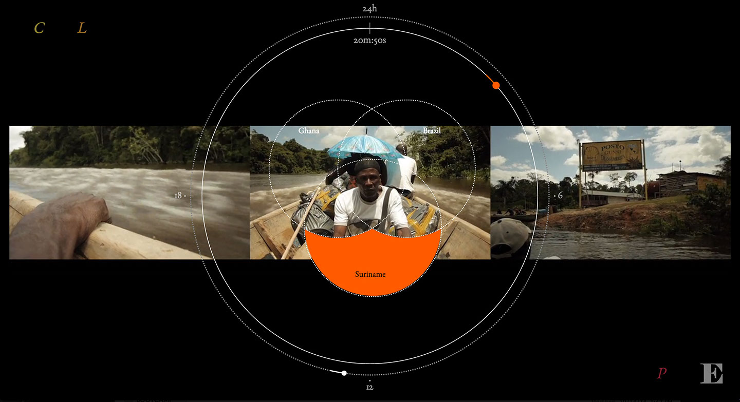
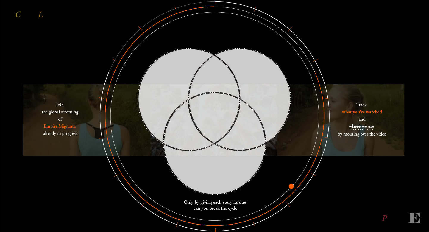
For the Migrants section, the longest in the series at 20 minutes, the concept to bring the three-channel installation to the web combined the films into one frame, but kept track of how much a viewer had watched.
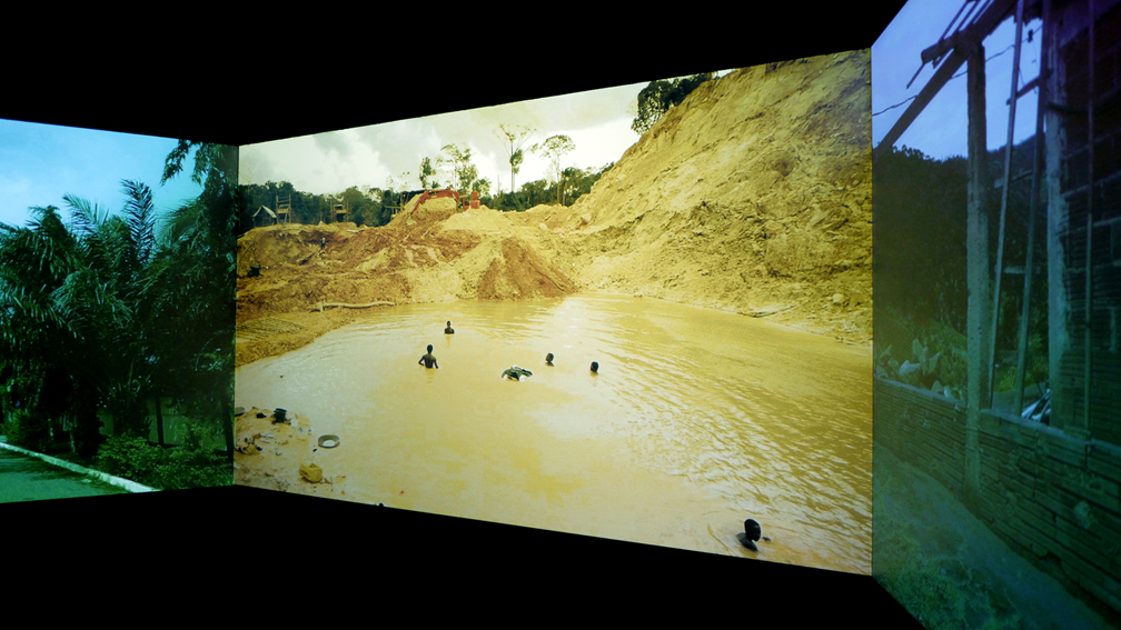
Migrants, a three-channel video installation, at IDFA Doclab in Amsterdam
The same view of Migrants on the interactive website with the visual overlay showing the editing map of which panel is depicting footage from either Ghana, Brazil or Suriname

Figuring out the visualization layer. We knew we wanted to keep the experience as a three-channel video sharing one soundtrack. The film combines subjects from three countries - Ghana, Suriname and Brazil - and layers their stories alongside one another. We wanted the user to better understand the editing decisions with a map visible when the user hovered over the map.

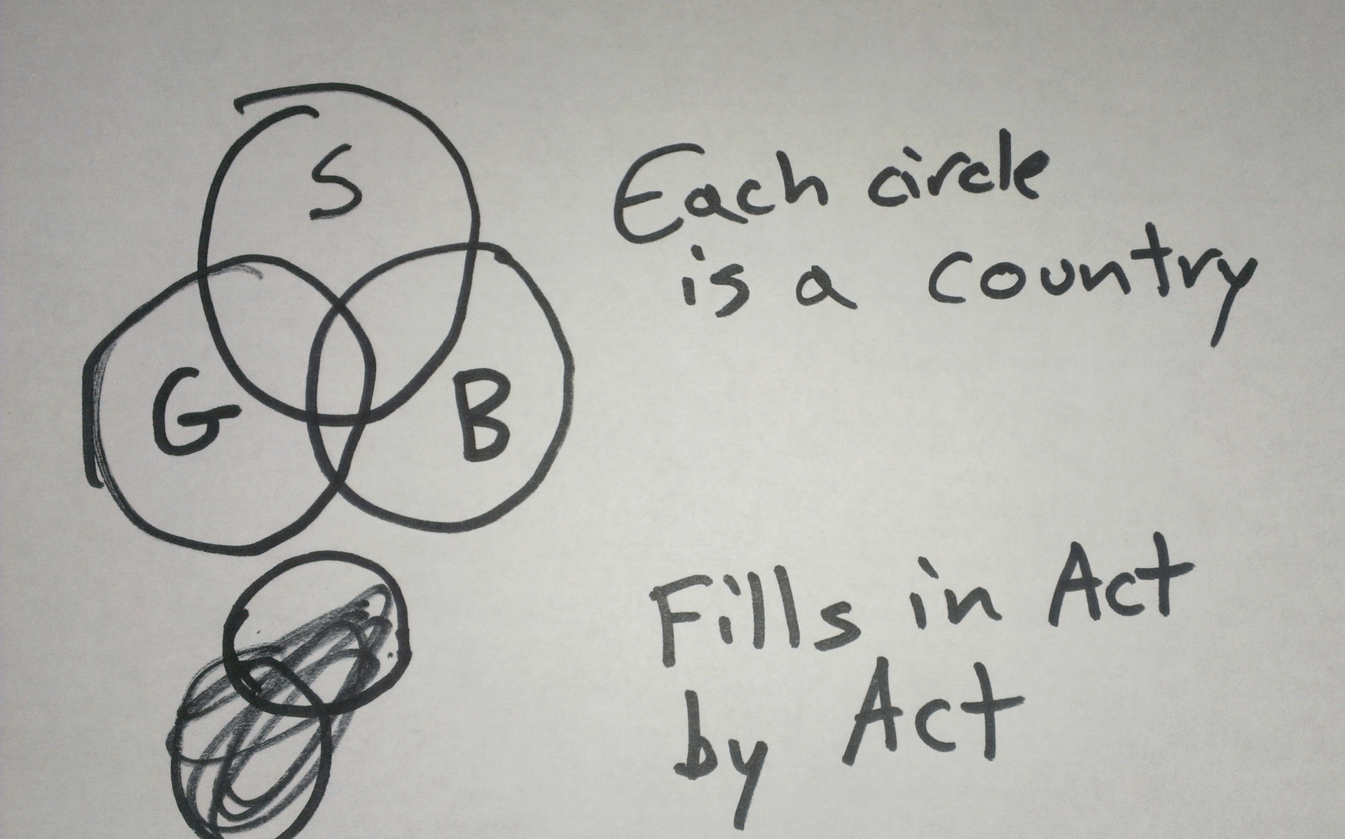
Sketches by Kel O’Neill summarizing the user experience and logic of the overlay map
Screen capture of the Migrant map overlay visualization
The film is set to play as a global screening, essentially as a loop so that no matter where or when you access it, it is playing the same content for everyone viewing it, looping 72 times in one day. We wanted to visualize this by depicting a kind of 24 hour clock, and showing you how much of the film you’d watched of a single loop, as well as where you are in its 24 hour, 72 loop cycle.
An early design prototype of the screen visible once the viewer has watched through all the loops. The reward for viewing was a downable version of the film
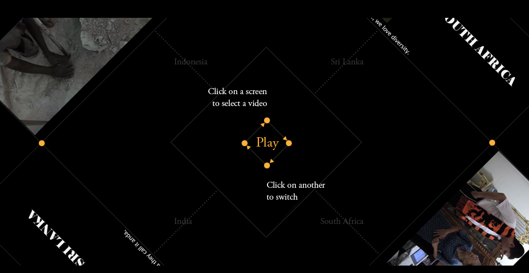
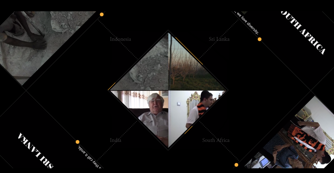
For the Legacy section, each of the four documentaries in the installation were installed with headphones for separate consumption, forcing the viewer to choose between the storylines.
We translated this experience of consuming the media into a web experience where people can zoom and rotate the videos to focus in on one video and soundtrack. When zoomed out the soundtracks overlap, forming a cacophany of stories about each place and people affected by Dutch colonialism.
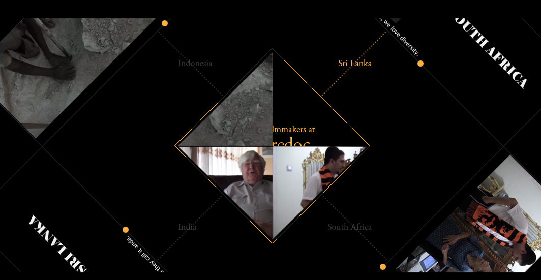
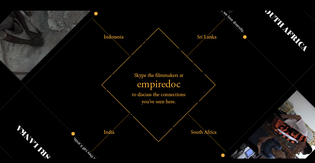
The visualization component shows the viewer which portions of the four storylines they’ve consumed. The payoff for watching all of them is to skype with the filmmakers, as a reward for perserverence.
We translated this experience of consuming the media into a web experience where people can zoom and rotate the videos to focus in on one video and soundtrack. When zoomed out the soundtracks overlap, forming a cacophany of stories about each place and people affected by Dutch colonialism.
The visualization component shows the viewer which portions of the four storylines they’ve consumed. The payoff for watching all of them is to skype with the filmmakers, as a reward for perserverence.
Screenshots of the Legacy visualization of the viewing experience as well as the reward for watching through all the sections